DWIV - 3D - Abe_Hokage
Latest updates:


Hello there!
thought i'd finally join this great competition...
so to start, i'm not yet sure what character i should go for, although it seems that it might be more a Demon Lord or and Abomination...did quick sketches and will post some, and hopefully, with your help, i'll choose one that isn't too boring or un-original!
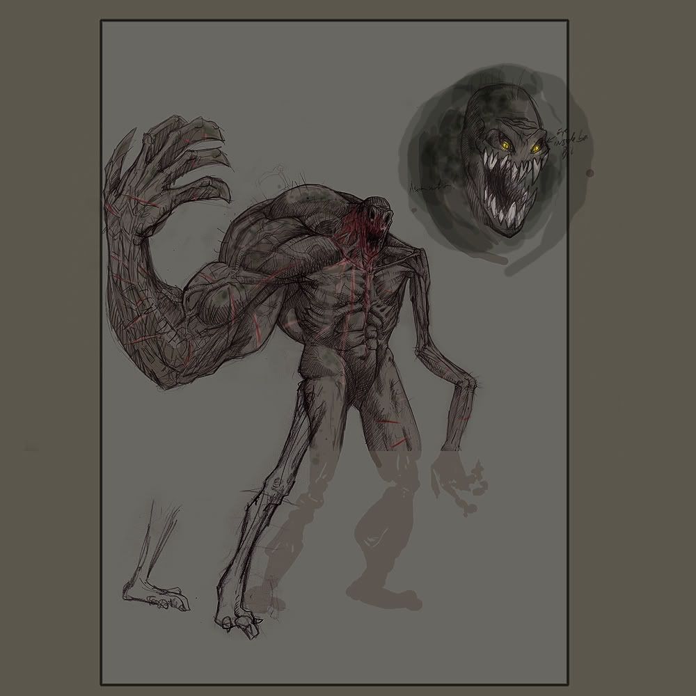
so here is the first sketch:

crits and comments welcome!
laters!
Abe


Hello there!
thought i'd finally join this great competition...
so to start, i'm not yet sure what character i should go for, although it seems that it might be more a Demon Lord or and Abomination...did quick sketches and will post some, and hopefully, with your help, i'll choose one that isn't too boring or un-original!
so here is the first sketch:

crits and comments welcome!
laters!
Abe
Replies
Reminds me of a Resident Evil style mutation, which is a good thing!
How about making the muscular arm like a burden? so that t drags him to the ground. but instead of fighting he hes a powerfull and destructive magician. Like his imense power are ballanced up with the oversized arm.
Liam Cullen : now that you mention it...o well, hard to make something that wont remind of something already don ebefore
Belltann:
If you check on the concept, i made his oposite leg (right) massive. The idea is he is lining on this muscluar leg, and carry the heavy part on it then bnallance on the other etc...
he is half muscular, half skinny on top, and the oposite on the bottom part....
Good idea though
Have you thought about giving him one massive leg similar to his arm so it looks like he's mutated on one side only? This could give the character a cool lob sided look and also aid in balancing his massive frame.
Jeremy: hey! good to see you here!thanks, will try my best
Arn't you joining the competition too?
Gavinneil: thanks Gav! yeah, if you read the answer i gave to belltan and have a closer look at the concept, he is half muscular and half skinny on top, and same for the legs but opposite...
o well, this concept will pprobably not be the one i end up going for, but still something to start on...
I should have probably put more explaination on that fella though
thank sfor the feedback peeps! will post something as soon as i got more....
Abe
the demon uses his mashed fists to massacre any thing passing his way
simple for now, but will probably end up adding him some kind of armor etc...
jhe also got eyes all over his body lol
I think that the concept of him underground, pulling things in is really cool, but now it seems a bit weird. Why have a meat crusher underground, and the monster that looks like its the one that should be feeding over ground?
Think you should just focus on the crusher. Its a really solid concept. How about giving him a huge chain with a meathook-isch to drag the victims in and crush them into something digested?
Belltnn: i see what you mean,i was actually seeing the big spider thing coming his back but also could get back to a "hiden" position, with the legs hanging on the sides
o well, another thing to meditate about
...
i like the idea of working on the crusher only, but might end up to plain and boring liek the abomination N1
...
here is another quick sketch of a more "crasy funny glutonny abomination"
he's a always hungry for fresh meet, using his worm arms as a way to make him move as well as catching human insects...
let me know what u think...
I like what you have so far, maybe add something other then tentacles coming out of him, or have them coming out of his stomach.
Or maybe one giant mis-formed arm that he grabs his victims with.
Killaball: adding some arms could be a cool idea
Liam Cullen: i think that's what Killaball meant?
i took the time today to test how the big demon Lord anatomy would look in 3d...so did a 3dconcept of it, might do the same with the two others, and see where it goes...
i also improvised a head for him,not sure it works yet but well, at least its a starting point...
didnt do legs etc...yet might do that tomorrow if i got the time
tell me what you think!
laters
ABe
and here is a close up of the head:
Belltann: thanks!
i did some more head 3dconcept, the first one is an evil version of the DW greentooth as a head , very ruff but you can see where its going...
the second one is closer to what i wanted to make in the 2d concept so here we go:
and
let me know what you think!
im not sure if i take the time to 3dconcept his legs or just start the other ones...will see how i feel
cheeers Abe
Really liking how strong the whole model is, I wish I could do this good. Can't wait to see what you're gonna do once the "3D concept" stage is done. Got my eye on this one, man. So kick some ass for the green horde!
will try my best to represent
Started on the Fat man 3d concept, hopefully ill get something out of it...although i should decide on my final design pretty soom, as i might have a limitted time to finish the whole challenge (only work on my spare time, and once a while during a saturday or sunday...
Will you join the contest as well?
Maybe some work on jaw area [Looks way small when compare to whole body]
thanks GAGAJAIN! are you talking abotu the last screengrab?
i worked ont he fat monster 3d concept today, let me know what you think...will concept him some legs and add somne arms at some point
did a quick polypaint as well:
time is runnign out for the competition, so i have to make a decision asap!
C&C welcome!
Abe
It'll be interesting to see your ideas for the lower half, maybe something octopus like?
First is a little too generic.
The latest has the most character and feels like the most inspired. Perhaps try that?
was thinking of him being on his knees, crowling at you using the help of extra arms and some more tentacle
the octopus thing is also an idea...
Coldkodiak: Thanks man
good point as well, although the frist two dont have all the bits i wanted to add (all those eyes on th ebod, and some kind of massive second body coming from his back ...
i have to finalise one and see where it goes, might attempt the fat guy..and if i finish it early enogh, give a try to the other one too.aand decide wich on eto take to completion
probably wont look too much like th edraft concept, as i add stuff as i model them....
cheers for the feedback !
A
thanks man! will try to get the concept to finalisation for this one, although it keep s me from giving hims some kinda of armor whitout him looking silly lol
i'm thinking of having him on his knees with all his fat comign from everywhere around them, trying to crowl using his fat (that would take shape and help him move/ grab vicitms),leaving a trail of ***t behind him and all around too hehe...disgusting
the other idea would be to get the crusher (the big muscly monster) on his back (geing the less smart one) as like siamoi demon brothers or something ...
just thinking of options lol
Abe
Keep it up dude.
i get
"In order to join this event, you must be registered and/or logged in with "remember me" checked."
is there somethign i do wrong?
o well, i've been playing at luchtime on the fatty boy
then played silly gettiing all teh concept made so far to make one big silly monster lol....
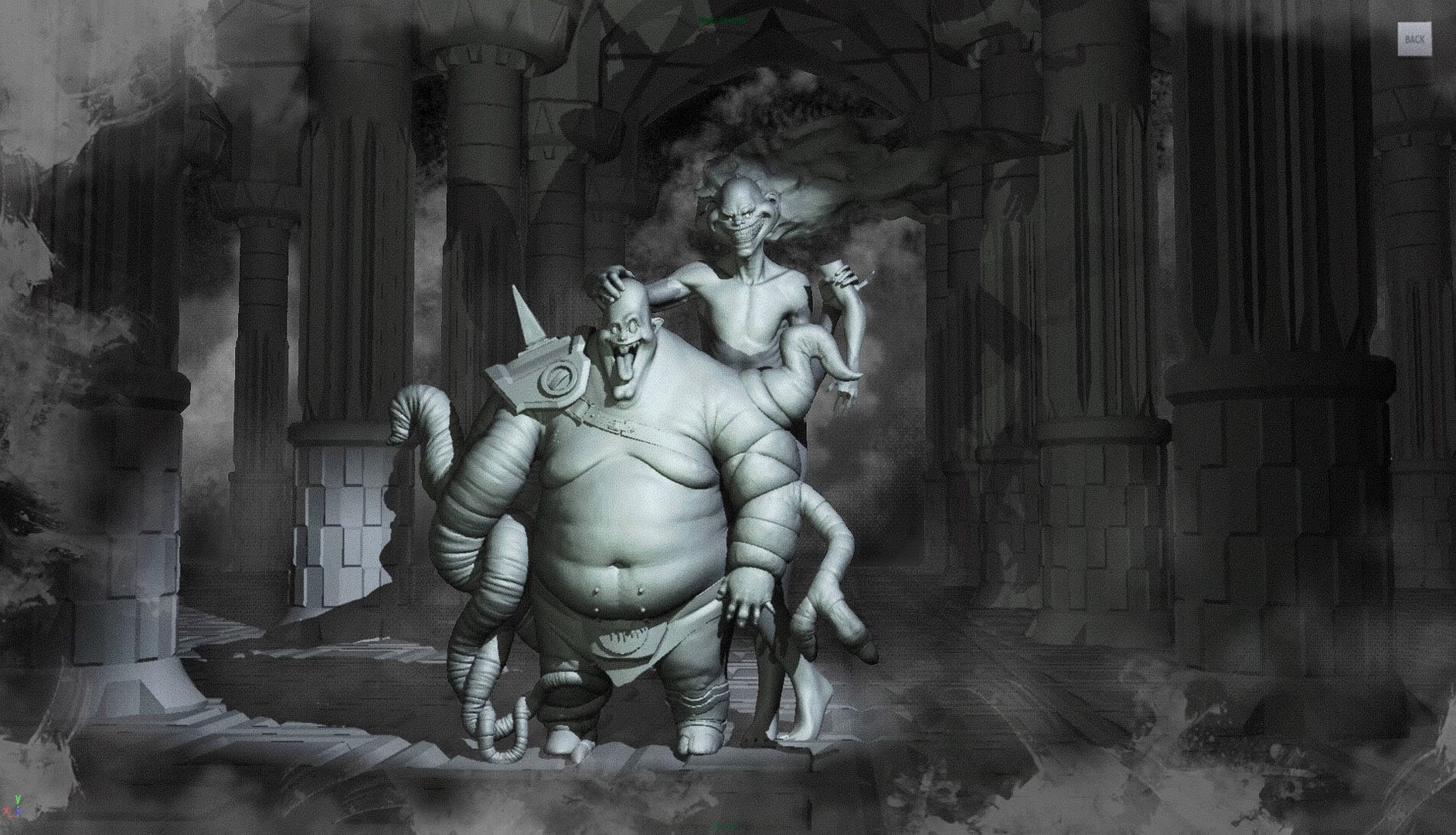
sot here is the result so far (3d scetch quickly put together)
the idea is taking fatman and adding on his side the spider head and polycount head....and leave the big demon head for the crusher....quick photoshop to give an idea:
and here is a quick concept for how all shouldlook in the end...there might be some armor thing added to it ...
big joke i know, but cant stop laughing at this lol
let me know what u think...
o yeah, the concept:
cheers
Abe
Maybe its just me but if it were something more then just skin holding them together, like chains or more mutated body parts.
Keep it up!
Might be interesting if the fat one was a little higher on the back and smaller. Maybe he is so fat because the stronger one has to carry him around everywhere and he just dangles back there. With all 4 feet on the ground, it seems they would have a hard time walking.
will do various test and see wich one works best
thanks for the feedback!
A
more focusing ont eh fat guy here...will see where it goes...
teh sketch:
the model so far (retopologuised it btu will ahve to rework the polys at some point)
not much time left thoguh
Anyway, hope you have time to finish him, whether it's before or after the dom war deadline, I wanna see this guy finished.
Jeremy: hey, nice to hear from you! just wetn through your gallery blog and found out the Butterball! Man, looks great! didnt realise you've already done something similar to what i wanted to do with those two brothers...And you did great already!
O well, will just focus on this Fat guy instead and develop his medieval armor more
how is yours going? will nose it in a bit
thanks for the support guys!!
Abe
But stick with the idea, man, it's really cool. And just cause there's a VAGUELY similar idea out there doesn't mean you should give up on this one. I say push forward with it. The belts idea will make it stand out.
About my entry.... Yeah I don't think I'm gonna finish in time. I started some texturing but it's not good. And I saw a lot of things that needed tweaking in the high res, and all that. I'm not giving up on it, I just don't think I'm gonna be finishing in time. I also need to find some work
Anyway, PLEASE move forward with the sticky backs idea. I think it's great, and I'd love to see you do it. Oh, and make the fat guy like super icky fat. I love that in game models
will go for the fatty only i think, even with the extention, wont get teh time to finish the whole thing as im in crunch period at work too!
will give a quick pass on the whole body, then his clothing+armor, and hopefully get the detail an dtexturing done in time
here is a biger shot:
http://i139.photobucket.com/albums/q305/abe_hokage/DWIV/Handswotrkbig.jpg
Back to it
thanks Johan!
here is another update...worked on the left part of the body, didnt got to the highest llevel of subdiv yet as i want to get teh whole model the same pass first..will aslo sort out what kind of armor he'll ahve...time is ticking
let me know what u think!
cheers Abe...
going to bed now
r
a little quato? sorry but can you explain what that is?
for the colors, yeah, im gonna try to keep simple color sheme, but add loads of element to breack it (dirt, cuts, cracks etc...)..lets hope i get tehre in time
Belltan: thanks man!
Liam: will try my best ...didnt go training last night
cheers
Abe
http://images.google.com/images?hl=en&rls=com.microsoft:*:IE-SearchBox&rlz=1I7GGLD_en-US&um=1&q=kuato&revid=272188722&ei=mZEJSsGGE6TitAOHuNXTCA&sa=X&oi=revisions_inline&resnum=0&ct=broad-revision&cd=1