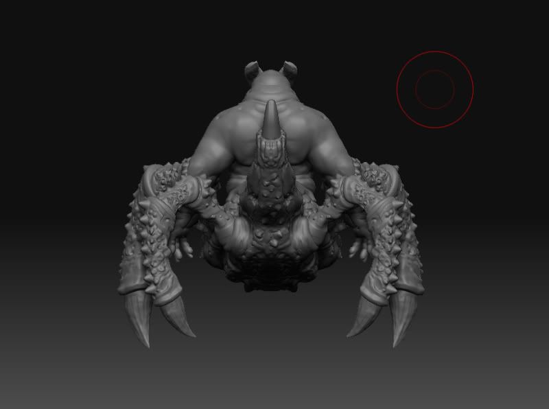
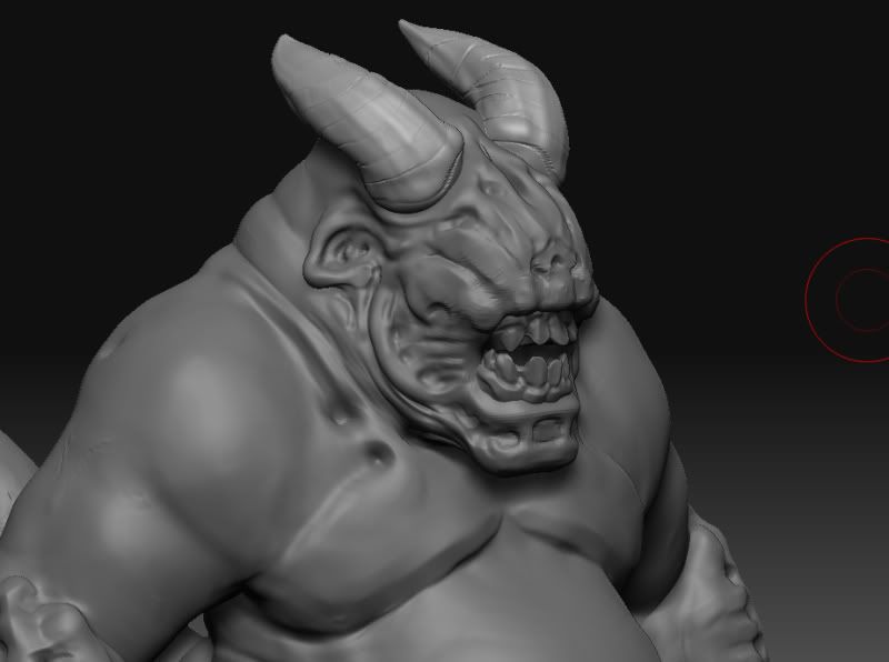
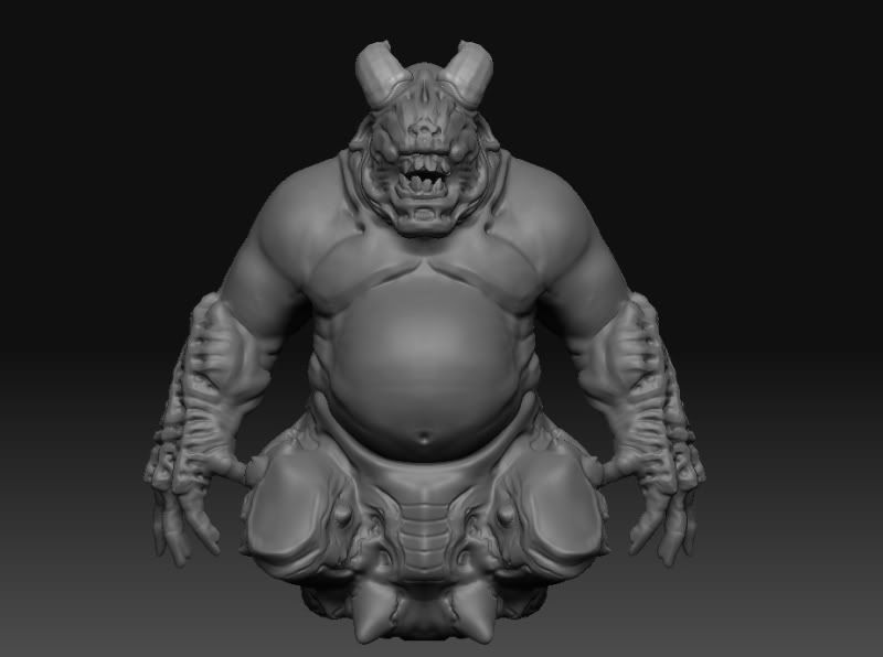
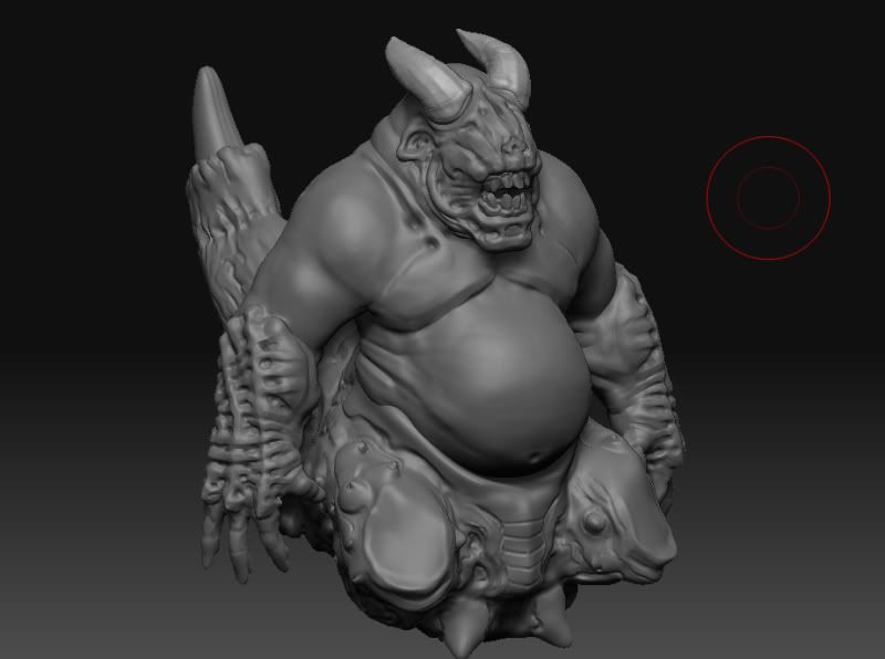
Yo, so its been a while since i do any modeling or anything. And i decided that prior dw i would get the rust of my gears and what not.
Is not the greatest, but here is what i have. Any comments and cc is welcome!
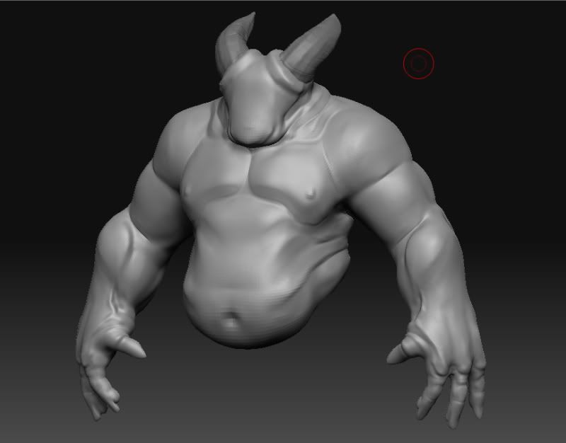
So basicly, is insect like demon. No is not a crab...,i will rid of those crabby legs, i really dont like them that much. Also, i have retopologized anything yet.
he he he. Thanx for the comments guys!, well, i never really even thought about the cyber demon. I was really more inspired out of the stuff from hell boy 2 and the vagary from doom 3. The rest i just kinda made in on the fly..Interesting tho..the cyberdemon
hahaha! who? dude back in 05 when doom 3 came out, i would play in the dark with my surround sound headphonens. And out of the NOWHERE!!! BOOOM! WHACK! AHHH! something would pop and scared! .....ah good ol days...
anyway. got some updates. I got rid of the crab legs.
made a little turn table...i think is done..lol....i might come back and bake normals and all that and make an actual buety render. I already have my xsi scenes set up. so might as well!
wow, really nice clean lines hes got on him, should bake awesomely to a normal map without any crazy micro details to get in the way. dope work man, texture it already
haha! finally someone noticed! Well, imrods model is so badass...i needed some reference to look at. And since when i started i didnt know what the hell i was doing. I kinda just did that.
This model has turned out to be a journy...sighs....i want to start another one as sson as i finish this one.
I can tell a lot of time and effort is going into your model. I tried messing around in ZBrush doing characters and didn't get far at all. I'll stick with environments from now on. But I admire your skills and this model. Keep it up! It will pay off.
Thanx guys. Yeah, well i have pretty much stayed at the office every day for the past 2 weeks working on this. Its such a refreshment from just doing TD stuff.
AnimeAngel - Thanx dude! I reworked it prolly 5 times till i got to where i understood that you really only want to sculpt the detail that you want the audience to spot from far away. Some of the parts in my model still need a little bit of tweaking, but that's it! im done! lol.
PopeAdam - Doom and hellboy were my biggest source of inspiration!
GOBEE - Thanx. Character Artits, in my opinion have the biggest load. Because their characters must look flawless since that's what everyone looks at. Not the cool tower behind them. Or the awesome texture in which they are standing. I would much rather also do enviroments. I honestly think doing props is more fun. Because i dont have to worry about if thing look right or not. At least not as much as when doing a character.
Looks cool man ,i like the way the face turned out.
Texture. hmm. First off I see Red Yellow and blue, all equally saturated... I'd say that's a no no.
Try chosing two colors at first to flesh out the texture with, and then choose different values of those chosen colors to accent all of the details. Go back in after that with a third color to add interesting variation.
I'd suggest going with something like Yellow Brown (maybe some greyish for the bottoms of the teeth) and then adding in some greens or blues afterwards to add accent. Any color pallette would probably do fine.
Also, try to start defining the different types of materials (in this case flesh, wet flesh, bone, cartilage) with different colors so that we can tell what is supposed to be skin and what is bone. LIke the cool little nastyiness right under his bottom row of front teeth that look almost like fingerbones, they right now seem to be colored as flesh.. maybe transition them more naturally from bone to flesh?
I don't do characters and I don't do character skins or anything but this is just waht I might do if I was taking a hack at it
thanx for the help man! I will that a try and see how it goes. I am honestly super lost as far as texturing. At work, i only rig characters, and worry about edge flows only. I let the modelers make them all pretty. hehe. This is a HUGE step for me, lol. but is getting there.
I will also say that these textures look awful, man, im serious ,character work is so hard! Well, again, thanx i will put some stuff up later when i get a chance to sit down and give it another go.
Here are two updates on the skin. I think i got the hang out it. Tho, i wouldn't call these done. I will probably have another pass at it later. And make them look more unified. I feel like the is more contrast in the torso. Specially the center part. I didn't really work on the arms, trying to figure out what to do with those.
Also, i know i was told to use material and stuff, but i am going to end up taking this one into xsi to render. So i don't think i need those shades, at least not in zbrush anyway.
Hey Guys, here is a preview of a turn table i made. I decided to turn this in for a local student competition. So we will see how that goes. Thanx to all that gave me feedback and tips! Very much appreciated!
As far as using this for my demo reel...i was thinking of going back and changing a few things such as
a) adding more stuff from zbrush. Like a polypaint turntable. or more screenshots
b) Maybe some retopology screenshots. Like from me building the mesh. I dunno. Is this something people look for on demo reels?
c) I definately need to finish my textures. That was a 4 hour texture jo bthere! All using polypaint. Didnt really use any textures or anything. Guess i should have...oh well, im still working on this..lol
d) My ligthing blows, need to fix that.
e) I want to play more with the sss shaders. And basicly all the other rest of the shaders. It was hard to get my normal map to show up properly in xsi 7.
f) I need to work on the content a bit more iguess. Put some music on and make it look more live. I dunno...
g) My ao pass for some reason dIdnt work. One of the guys at work told me is problably because i had already baked the ao to the textures. And i was not really setting up the ao intensity for the renders. Any tips on ao in general?
Originally i wanted to make this into a game model. but now i think i will go both ways and make a low poly and a high polymodel. See how that turns out.
By the way, the file format on which the competition requires me to render to made my textures look all washed up....errrrg! So everything on the video looks super brigther than it really is.
Replies
Spiderdemon
+
Cyberdemon
I agree with you on the crab legs, I don't think they work so well with that awesome torso.
i think you should keep the crablegs. if you blended the two together a little more it would look very nice
anyway. got some updates. I got rid of the crab legs.
Brilliant model.
Looks awesome... loving the turntable.
This is what i got so far.
This model has turned out to be a journy...sighs....i want to start another one as sson as i finish this one.
AnimeAngel - Thanx dude! I reworked it prolly 5 times till i got to where i understood that you really only want to sculpt the detail that you want the audience to spot from far away. Some of the parts in my model still need a little bit of tweaking, but that's it! im done! lol.
PopeAdam - Doom and hellboy were my biggest source of inspiration!
GOBEE - Thanx. Character Artits, in my opinion have the biggest load. Because their characters must look flawless since that's what everyone looks at. Not the cool tower behind them. Or the awesome texture in which they are standing. I would much rather also do enviroments. I honestly think doing props is more fun. Because i dont have to worry about if thing look right or not. At least not as much as when doing a character.
This is my 3rd pass, and i can honestly say it looks at lot better than the 1st one. lol. Maybe i need to just watch the video a few times.
http://www.veoh.com/search/videos/q/scott+spencer#watch%3Dv851708WcEQPerQ
and here is my preview
Texture. hmm. First off I see Red Yellow and blue, all equally saturated... I'd say that's a no no.
Try chosing two colors at first to flesh out the texture with, and then choose different values of those chosen colors to accent all of the details. Go back in after that with a third color to add interesting variation.
I'd suggest going with something like Yellow Brown (maybe some greyish for the bottoms of the teeth) and then adding in some greens or blues afterwards to add accent. Any color pallette would probably do fine.
Also, try to start defining the different types of materials (in this case flesh, wet flesh, bone, cartilage) with different colors so that we can tell what is supposed to be skin and what is bone. LIke the cool little nastyiness right under his bottom row of front teeth that look almost like fingerbones, they right now seem to be colored as flesh.. maybe transition them more naturally from bone to flesh?
I don't do characters and I don't do character skins or anything but this is just waht I might do if I was taking a hack at it
GL man, love the sculpt!
I will also say that these textures look awful, man, im serious ,character work is so hard! Well, again, thanx i will put some stuff up later when i get a chance to sit down and give it another go.
Also, i know i was told to use material and stuff, but i am going to end up taking this one into xsi to render. So i don't think i need those shades, at least not in zbrush anyway.
[ame]http://www.youtube.com/watch?v=G-XYEN8Yg4U[/ame]
As far as using this for my demo reel...i was thinking of going back and changing a few things such as
a) adding more stuff from zbrush. Like a polypaint turntable. or more screenshots
b) Maybe some retopology screenshots. Like from me building the mesh. I dunno. Is this something people look for on demo reels?
c) I definately need to finish my textures. That was a 4 hour texture jo bthere! All using polypaint. Didnt really use any textures or anything. Guess i should have...oh well, im still working on this..lol
d) My ligthing blows, need to fix that.
e) I want to play more with the sss shaders. And basicly all the other rest of the shaders. It was hard to get my normal map to show up properly in xsi 7.
f) I need to work on the content a bit more iguess. Put some music on and make it look more live. I dunno...
g) My ao pass for some reason dIdnt work. One of the guys at work told me is problably because i had already baked the ao to the textures. And i was not really setting up the ao intensity for the renders. Any tips on ao in general?
Originally i wanted to make this into a game model. but now i think i will go both ways and make a low poly and a high polymodel. See how that turns out.
By the way, the file format on which the competition requires me to render to made my textures look all washed up....errrrg! So everything on the video looks super brigther than it really is.
Again, thanx for the support guys!