DWIV - 3D - Aravindan
Congrats and good luck to everyone who finished and good luck to those who are still working on it, keep on going. For those who don't get to finish it remember that there's always next year.
Here are my finals
Text Image:
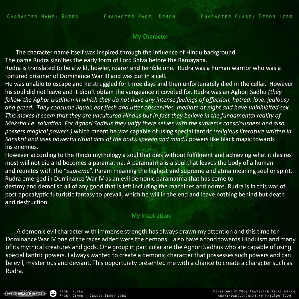
Beauty Shot:
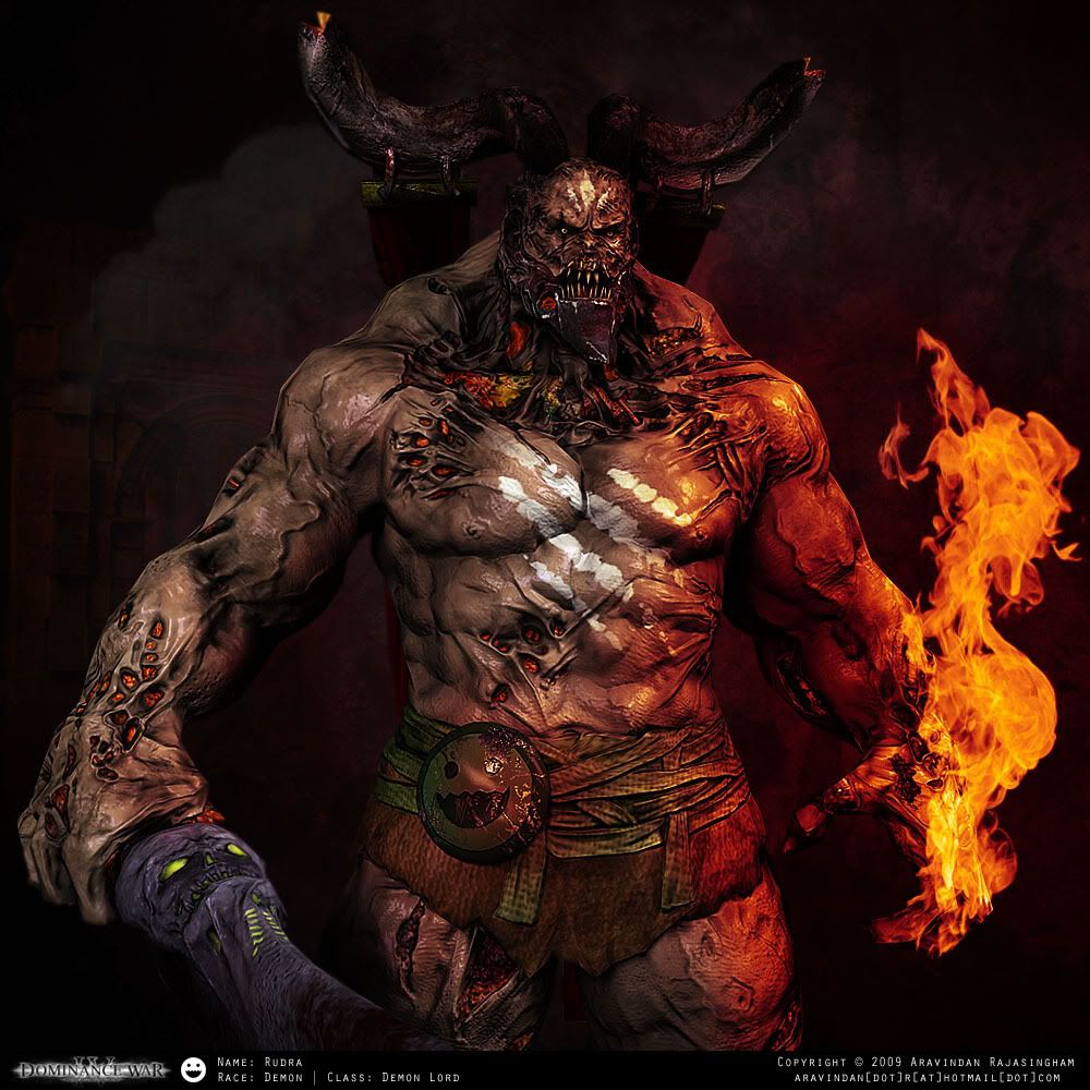
Presentation Shot:
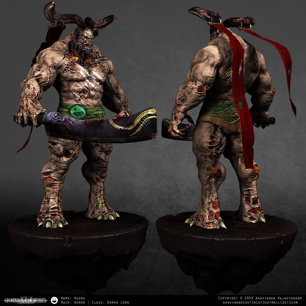
Construction Shot:
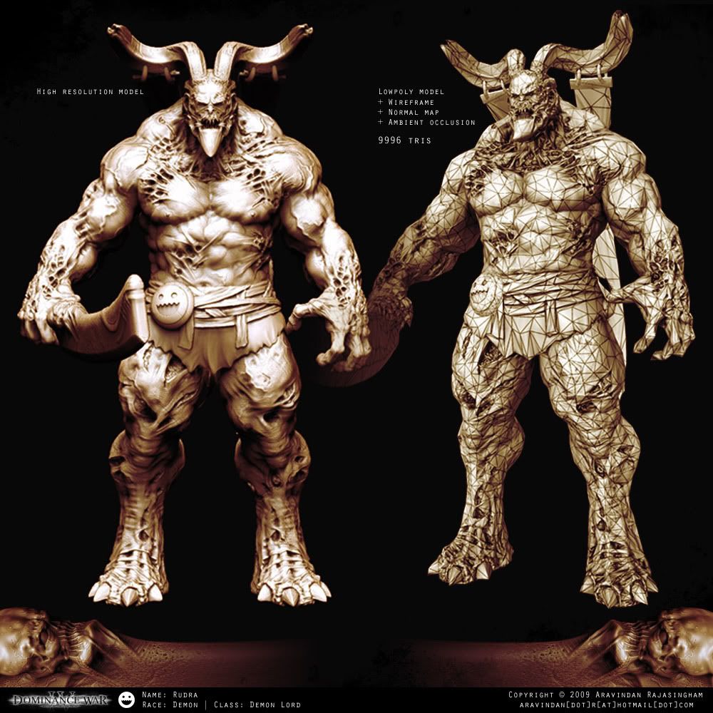
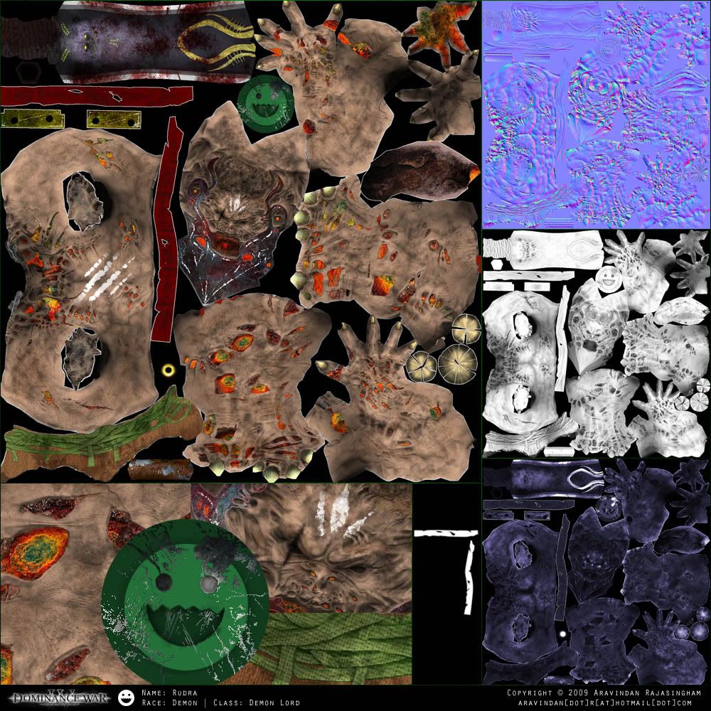
Texture Sheets:
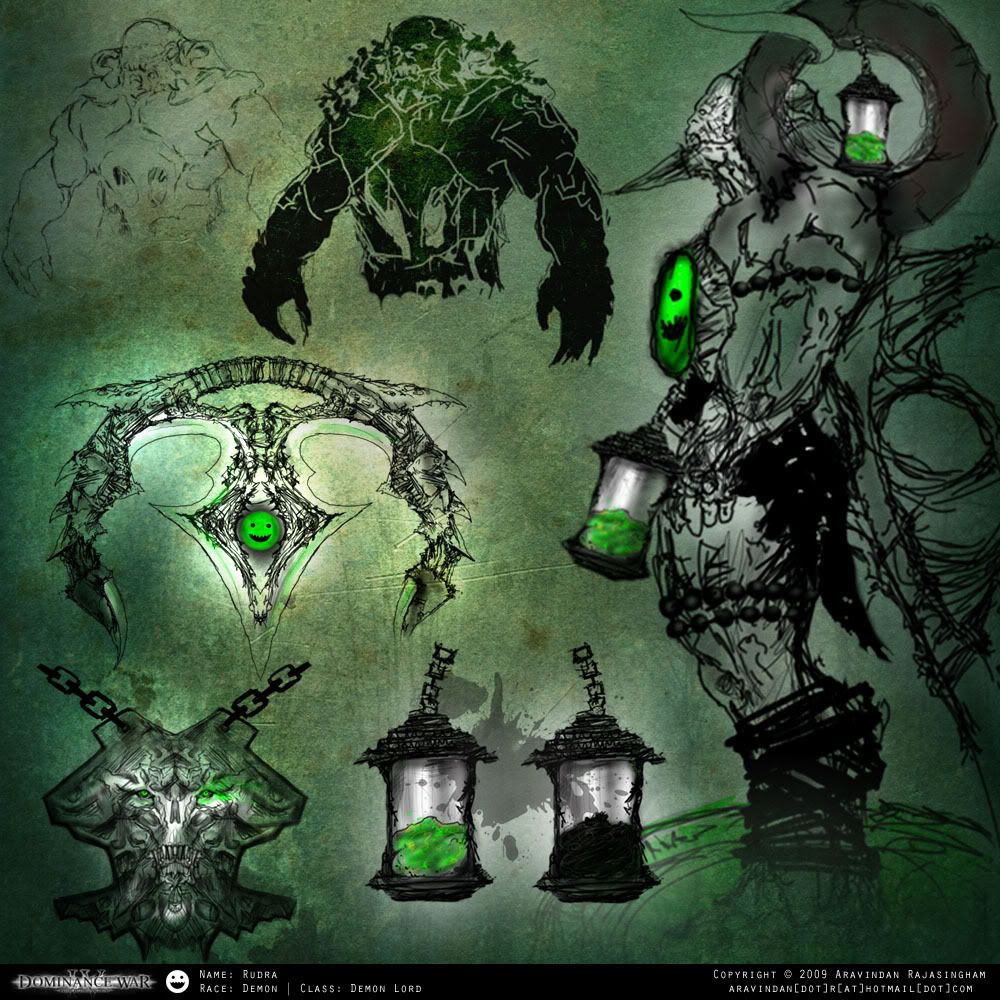
Concept Image:
Hey everyone,
I'm new to this forum.
I want to be on the green team this time.
Last year I was in CG society, but I didn't seem to get any feedback or help from the team mates,
which I really needed. Hopefully that will change this time around.
Here's what I have so far.
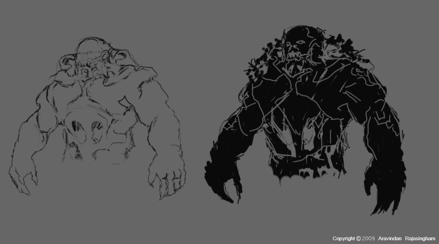
I'm trying to do a Demon Lord, hopefully there's more concepts on the way.
Here are my finals
Text Image:

Beauty Shot:

Presentation Shot:

Construction Shot:

Texture Sheets:

Concept Image:

Hey everyone,
I'm new to this forum.
I want to be on the green team this time.
Last year I was in CG society, but I didn't seem to get any feedback or help from the team mates,
which I really needed. Hopefully that will change this time around.
Here's what I have so far.

I'm trying to do a Demon Lord, hopefully there's more concepts on the way.
Replies
I started on the head and I hope to get more done soon.
Here's what I've been working on.
I might make one hand bigger so it can hold the weapon and also rest it in the back. Containers are just ideas that occurred to me. The idea of the containers are to collect norms souls and machines oil after killing them.
And maybe have him use it against them. But still working at it...
Also, we haven't seen a full body silhouette yet.. what do you have planned for the legs?
And I agree with kosh, a full body view would good to see, and i'd give us more to critique
You guys are right, I do have to come up with the entire body but I just need to figure out what the lower body will be. Hopefully I figure something out soon.
As for the blade I might take up on the idea of making the hand into the blade, sword or some sort of weapon. I will try to put up some more concepts.
Here's my latest update on the face.
My only critique would be that all the organic shapes in the jawline and neck seem a bit random, maybe ground some of it using some anatomical reference.
Zatoichi touched on something there, i think he has a bit of driftwood neck going on< lots of holes> it looks cool but it might work better feeding into the body if he had some smoothed structure in the area.
-Woog
i think that:
a. u should incorporate more monkey/beastly/hairs-ly elements into the rest of the design
b. incorporate a mechanism in the armor, over the elbow, that will allow it to bend along with the arm
c. a really cool face for the armor design may distract from the main head. try somthing different? maybe he has some soul-releasing feature in the front of the armor where he can shoot out the tormented souls he captured as offensive weapon...
in the initial concept u have these tubes-things connecting to his head, i like the idea of it feeding off some tubes, the canisters may work with that...
Zatoichi- thanks I'll keep that in mind when modeling
woogity- thank you and I'll definitely keep a form without too many holes
shotgun- I thought of that myself and I'm sure ur right about it. I do want to incorporate a soul releasing feature but I haven't determined everything yet.
Azimn- I'm glad you liked the ears, I still need to work on his face more, and I should have some pictures soon.
iatriki- Thanks for the kind words
Here's a side view,
I was having hard time figuring out what his legs were suppose to be and I kind of settled on this. But I'm still not 100% sure on it, I'm still working on it. The big circle things on his shoulder is a big circle stone and for the soul tanks I just want it in one place but I'm not sure so I have it put in both so you guys can tell me which is better; inside the circular stone or hanging on the hip. The back piece I don't know what I was thinking but I thought it might look cool on him. I also thought it will be a cool place for his weapon to rest on, although it looks like a weapon it self. I should have some rough 3d concepts hopefully by the end of today. C & C are welcome as always.
Gav
This is what I have so far and if the leg still seems weird please let me know, I'll fix it up.
Here are my latest updates:
what mat is that by the way?
I've been having some internet issue's but I went ahead and worked on my final stuff.
Here's the shot of my progress... almost done the final images I will post it in a bit.
Here are all my final images
Text Image:
Beauty Shot:
Presentation Shot:
Construction Shot:
Texture Sheets:
Concept Image:
Please let me know if anything needs to be fixed.
I was wondering about the image below and if I would get disqualified if I use this background for my presentation shot?
I've decided to go with the all grey background just because it brings him out more. Thanks once again for the feedback.