[Portfolio] Mark Abadier, Environment Artist.
Hi my name is Mark Abadier and I will be graduating from the Art Institute of California- Orange County on Wednesday March 25th. I am looking for a Job.
Here is a link to my Portfolio page. Tell me what you guys think, Enjoy !
!
www.MarkAbadier.com
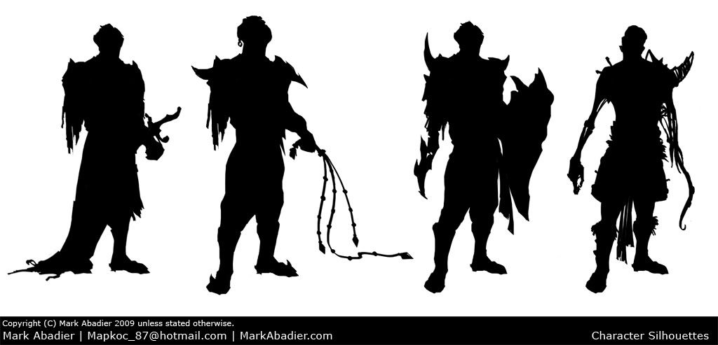
And for the sake of not making another thread, here is few character silhouettes I did for fun this afternoon. I am not sure If will make a 3d version or stick with the original plan, which is paint it and keep it 2d. (Sorry if this annoys anyone/ being a huge image.)

Here is a link to my Portfolio page. Tell me what you guys think, Enjoy
www.MarkAbadier.com
And for the sake of not making another thread, here is few character silhouettes I did for fun this afternoon. I am not sure If will make a 3d version or stick with the original plan, which is paint it and keep it 2d. (Sorry if this annoys anyone/ being a huge image.)

Replies
the mushroom town is amazing. I thought your overall render shot was actually your concept painting. Just simply amazing work there.
as for crits you seem to have a lot of extra polys that can be terminated out of the roofs in your mushroom town.
also your Category 3 project is defantly your weakest work. most of the buildings just seem to be lego brick placed in your environment and dont seem to fit at all. Very middle eastern style buildings surrounded by lots of bad looking grass. I know that those countrys arnt devoid of grass but they buildings just dont fit with the enviorment. One way to make the buildings look more like they belong in the ground instead of just being placed there would be to add some dirt near the bottom. Buildings tend to accumlate dirt where they contact the ground.
not only that the quality of work on those peices seem very weak. an example of this image http://markabadier.com/CategoryRender4.jpg where there is a huge texture shift from one side to the other. also in that image it seems that the windows are just textured onto the wall, they might not be but it looks that way from your screen shot.
also the buildings in those scenes are very boring. they look just like boxes with textures on them. try and think more about there silhouette to make the buildings more interesting.
finnally if you are going for an Envio/Prop artist scrap the character concepts from your demo reel/folio. If you really want to have them in put them in a 2D section otherwise it can look like you just want to do enviorments untill you can switch over to characters.
As for the concept, like I mentioned its just for fun not related to my website. Seems I chose a bad time to post it :P If anyone else has ideas how to show those pieces as follow up/practice, let me know, was just afraid if I made two Threads it will seem very rude. Thanks again!
I also like the way you've set up your webpage - very easy to see all the art. The images take a surprisingly long time to load, though.
Thank you guys for your kind words. As for the images it loads quick anywhere else, maybe it is your connection, sorry about that though dude
oh and some spec on the windows would look nice too.
As for Arabia, it looks a real mess which is a shame because the props are really ace! It doesnt read well at a first glance and everthing looks like its floating. Use some shadows for the props! Also think about how things would be used by te owner, everything looks scattered around not placed there for a reason. Also the lighting in the concept really shines, it has the feeling of a dark tent that makes it feel calm and secluded whilst the sun outside is beating down. You have lost this in your lighting, it all looks too bright to give off that in a tent feeling. Possibly push the shadows darker and make the gaps in the tent where you can see the outside world smaller. Better lighting is really going to make those props shine!
I would setup a second uv layer and look into a rendering a color occlusion map. One of the things that makes prefer the concept over the model is the soft colored lightning that gives the whole image a fairytale look which is very charming.
As cf have already suggested, make more types of foliage! It could simple alpha planes layered on top of each other with different textures to capture the lush feel of the concept.
Not to keen on you using the concept as a background, would prefer to have seen it modeled.
I would have gone with Sparth lightning and mood for the final result if you are going to base your work on his concept. I like the separate props, but the mood is lacking. One big things is the fact that your cloth doesn't simulate the translucency of the cloth the concept, an idea could be to brighten the insides of the tent near the entrance that sun is hitting directly.
I would cut out category 3 from your portfolio and just presented the props that you are happy with separably. The others work is dragging your stuff down and it is very unclear what you have done in these images.
And you got permission to create these images based on their concepts, right? You didn't just ask? Either way, I would change the text to "created with permission by" or something similar to avoid confusion.
The category 3 I personally do not like, it was only up there to show that I can work with a team and make a demo in 11 weeks which most companies do not do.
As for the tent I will go back and fix the shadows, the lighting I wanted my own feel, because when you give it that orange lighting, everything darkens and you cannot see anything at all, people told me I had to light this one up, *shrug* I say fix the shadows and move on to a new project.
The mushroom town I got a ton of positive feed back. I thank you guys again for the support, I do have a colored occlusion on it, but because it was rendered in 3ds max it will look the way it does, so I will go back and try to play around with it in photoshop to give it the more hazy look.
The shrubs I intentionally kept it the way it is to be as close as possible to the silhouette of the painting.
The backdrop with 5 classes and 2 projects plus GDC, I wish I had time myself to model the background but we can not have everything
So to sum it up I will definitely take what I learned from these projects and your awesome critiques and implant it into my next projects. I will take out cat 3, maybe put a video and take out home.
Thanks again guys!
Yea AI OCs GAD and VGP (Video Game Programming) programs are BS and all the rest are BAs. Not exactly sure why i just know it is do to how they changed our curriculum.
Yea Mark you know how i feel about your stuff, i've been over it enough times with you =P
I guess you beat me to posting our sites but I am still cleaning mine up. And you still didn't give me credit for helping you light the shroom scene =P i kid i kid
Best of luck to ya bro, see ya at GDC
Thanks zach.
So...despite that this is a portfolio thread, how come no comments on my character silhouettes :P Not sure which has the strongest silhouette so I can start painting it, any idears? or crits on the art for that matter.