Home 3D Art Showcase & Critiques

WIP-Male Half demon for adventure Game

Game Title: GRYPHON: the Prophecy

Character Name: Alkia

Race: half-demon / half-human

Story: Alkia is starting to turn full demon, but wants to stay human is told that he must kill the demon king in order to stop the transformation and fulfill a prophecy

Powers: he is able to wield magical spells while in his human form, he can also transform into two demon forms 1) lion/beast 2)eagle/bird each transformation has its own powers and abilities.

Weapons: He will either wield two tonfa swords or a falcata sword (the ones used by the spartans in 300)
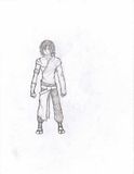
th_Alkia2.jpg

I will post a colored pic, images of the 3d model and weapon designs as soon as possible

please tell me what you like, don't like, any ideas will really help thanks

Replies

  • Deathelmz
    I hope. the 3d model is better

    Wow, Just checked out your photobucket, and the 3D models are Better :thumbup:
  • Tumerboy
    Offline / Send Message
    Tumerboy polycounter lvl 17
    geez Death, way to piss on the guy's work.

    Raiskul, it's a fine start, but there's not much to crit at this point besides the 1 drawing. It's not bad, but not amazing. He doesn't really look "demonic" to me. I know your story is that he's trying not to change. . . but it doesn't read currently. keep going and it'll flush out.
  • Deathelmz
    Im not Being Rude in anyway- Im just telling him that the proportions are off. Heres proof'

    Articles_anatomy_full.jpg
  • Quaggs
    Offline / Send Message
    Quaggs polycounter lvl 19
    Deathelmz wrote: »
    I hope. the 3d model is better


    how is that not rude? and where is your comment about his proportions being off?
    seems to me you're going out of your way to be a dick to him as you were also being rude to him in the WAYWO thread.

    Proportions aren't terribly off anyhow. you just need to bulk the character up some, and maybe make the head a bit smaller. and make him .5 to 1 head taller.
    prop.jpg
  • Deathelmz
    Im not Being Rude guy' Just look at the proportions, I bet if you draw similar body shapes, you will Love your sketch so much more-

    akira.jpg
  • The_Kozmonaut
    Unless he is going for hyper real there is no reason to have exact proportions. And from the style of the sketch it doesnt look like that is what he is goin for.
    And that first reply of yours was extremely rude
  • Deathelmz
    Why' I just hope its going to be better' Nothing wrong with hoping it will be better guys, COme ONnnnn.... His pictures still needs some better form of proportions. If the Moderator Ban's me because I feel that the proportions are horrendous, then that's not my problem. If you don't wish to accept my help that's fine, But I hope you will understand that Human proportions still needs to be applied to his warrior. He Stated in "What are you working on 2009" Topic, And he asked for Critique- So I am trying to be as helpful as I can here. Take it or leave it. But I'm done with this conversation. Sorry for any intrusiveness- Ive seem to stepped upon a Snare, I hope I don't bleed to much from it.
  • Quaggs
    Offline / Send Message
    Quaggs polycounter lvl 19
    except when you say that it makes you sound like a dick.
  • Joseph Silverman
    Offline / Send Message
    Joseph Silverman polycounter lvl 17
    There's something wrong with offering useless or non-constructive criticisms, deathelmz. learn a bit more about art before you start brutalizing the new guys.
  • Deathelmz
  • cep
    Offline / Send Message
    cep polycounter lvl 18
    Deathelmz wrote: »
    Why' I just hope its going to be better' Nothing wrong with hoping it will be better guys, COme ONnnnn.... His pictures still needs some better form of proportions. If the Moderator Ban's me because I feel that the proportions are horrendous, then that's not my problem. If you don't wish to accept my help that's fine, But I hope you will understand that Human proportions still needs to be applied to his warrior. He Stated in "What are you working on 2009" Topic, And he asked for Critique- So I am trying to be as helpful as I can here. Take it or leave it. But I'm done with this conversation. Sorry for any intrusiveness- Ive seem to stepped upon a Snare, I hope I don't bleed to much from it.

    You know if he copied the likes of Craig mullins as much as you, he might produce something that you don't feel like jumping all over him for.

    I hope you get banned from here, as we don't need someone with your character.

    raiskul: I hope this doesn't turn you off of polycount in anyway.
    I think your characters silhouette has a lot of style. A couple things I think would help is shortening the torso (along with the arms), and making the legs a bit longer. The hips could also be a bit wider.
    You have a good start for a character model sheet, some of these things might translate better in 3d.
  • Tumerboy
    Offline / Send Message
    Tumerboy polycounter lvl 17
    Alright chill guys. Death, I think you were pretty harsh, but I don't think anyone needs (nor will be getting) banning for anything. Lets drop it and focus on helping Raiskul making his Demon dude MOAR AWESOMER!
  • cep
    Offline / Send Message
    cep polycounter lvl 18
    Tumerboy wrote: »
    Alright chill guys. Death, I think you were pretty harsh, but I don't think anyone needs (nor will be getting) banning for anything. Lets drop it and focus on helping Raiskul making his Demon dude MOAR AWESOMER!

    He's been banned from various art forums for good reason (conceptart.org, and a few others).
    The guys a nutcase, and it's about time it catches up with him.

    Even acting like a goof on the internet has its consequences, as you should already know the art community is quite well knit Ryan Walsh.
  • raiskul
    Aight so here's the deal, I posted this thread in hopes that I could get some constructive crits, so anything other than that please do it somewhere else. That said I move on.

    I realize that the demon side of my character isn't very blatant in this image but keep in mind that he transforms into a demon so this is an image of his human form, though I too didnt get the feeling of "OH MAN this guy could transform and kill me" from this concept. If you check my photobucket,http://s690.photobucket.com/albums/vv267/raiskul/, out you'll see that this is an improvement on the previous concept.

    As to the proportions I was wondering about those and thanks for the pics Death and Quaggs. I want him to be younger in age so his head is better proportioned for a younger look I think. I agree with you Cep the arms and torso do need to be shortend I think that would fix how the legs look.

    The biggest thing that I've been having problems with is the style cause I cant really find concept art of what im looking for, if you've seen any half demon concept art i would love to see them (no Dante, Inuyasha, or Naruto types though).

    Thanks for the help so far I'll continue to try out more concepts and post them before I start working on the 3d model so please keep posting. Anything that helps me achive that WOW factor is a plus so thanks again.

    ps. I'm also going to start posting some of the concepts for the demons that will appear in the game
  • Lord McMutton
    Offline / Send Message
    Lord McMutton polycounter lvl 17
    I'm liking this guy. He looks pretty cool. Try referencing some demonic features and incorporate them into the design. Maybe like a horn on one side of his head or something. Keep it up!
  • Tumerboy
    Offline / Send Message
    Tumerboy polycounter lvl 17
    wasn't that guy in that show Angel half demon or something? Never got into it, but might be worth a look-see.
  • raiskul
    So I came up with a new design for the main character (kinda feel like I need to find a median between the two designs) and plugged in a weapon design with him there's also concepts of three of the demons that that i'll have in game: forest Demons (grunt and Brute), and Goblin (Brute)

    With the Alkia sketch I tried to fix up the proportions

    th_Alkia3.jpg th_forestDemon_concept.jpg th_goblinBrute_concept.jpg

    crits are always welcome
    thanks
  • Ninjas
    Offline / Send Message
    Ninjas polycounter lvl 18
    The main character is a bit too much in the Naruto direction. I would recommend looking at original source material of people or things that are scary rather than other art with half demons-- making art based on art is only worth doing if you are trying to be ironic. Otherwise, you really should take your inspiration from reality, even if you plan to stylize it afterwards.

    On a side note, I have noticed a trend of people giving rude and unconstructive criticism, ie shitting on people's work, for really minor issues-- where did this trend come from? Deviant Art?. The original art had some narrow hips and ribcage for a standard human being, but it seemed like stylization. Basing every character on some "perfect" physique is not very realistic.
  • raiskul
    Ninjas wrote: »
    The main character is a bit too much in the Naruto direction. I would recommend looking at original source material of people or things that are scary rather than other art with half demons

    yeah i showed my friend the pic and he said the same thing about it looking like something from naruto. wasnt on purpose might be because of the hair and pants (or just the way I've learned how to draw). I'll be coming out with more concepts for the character.

    thanks for the tip about what to look for cause ive just been having a hell of a time trying to find anything.

    what do you guys think of tonfa swords as his weapon i feel like they fit with his character, being that they are able to change (close to mid range) and they would be energy blades.
  • notebookguy
    one good way to beat the animation look is to use a photo of someone or yourself to model the face from then tweak the image in Photoshop so it is different. Also the animation look can be changed by adding the right textures the more realistic the textures the better the model then of course there is the lighting but it can be done.


    "Change is the improvement of one's self not others."


    Quote by me just know later
  • raiskul
    Thanks for the tip notebookguy, the only problem is that I dont have a tablet so anything that I do on the computer (w/ the mouse) would not come anywhere near as good as when I draw it by hand.

    On another note here is another concept for Alkia this is actually the first one I had come up with but for some reason it didnt feel right but I think I'll go bacvk to it and tweek it for a bit.

    th_Alkia4.jpg

    I feel like the skinny look suits this character better than anything.
  • raiskul
    I came up with a new design for Alkia as well as the starting thumb for a demon spirit type of character

    th_concept_thumbnails01.jpg th_concept_thumbnails02.jpg

    I like the flow between the two especially since he gains his powers after defeating certain opponents the energy spikes behind them would work for his flying/bird transformation.

    what do you guys think
  • Joseph Silverman
    Offline / Send Message
    Joseph Silverman polycounter lvl 17
    This is moving in the right direction, man. The proportions are better, there are a lot more interesting shapes in this costume, and it looks like you have a pretty cool variety of surfaces/textures in it.

    Model something!
  • Ninjas
    Offline / Send Message
    Ninjas polycounter lvl 18
    Yeah, I am liking the new direction more also-- nice work
  • BradMyers82
    Offline / Send Message
    BradMyers82 interpolator
    Yeah, I think its looking much more interesting now also. Its hard to crit atm because your drawing is very stylistic, but I think your ready to move on to 3d now. Start flushing some forms out there. Get after it!
  • raiskul
    Hey sorry for the wait I decided to start with a highpoly of the body that I will turn into a lowpoly model so for now the polycount is at 7108

    please ignore the colors i am using them to section off the body for later unwraps

    I am having a little trouble with the face so if you guys know of any good tutorials on face modeling please post it will really help me out

    once again thnx for posting

    th_Alkia_highpoly_baseMesh.jpg
  • raiskul
    EXTRA: I had a poster project for my computer graphics class so I decided to come up with a poster for the game and here it is...bumpudumdum...

    th_Gryphon_theProphecy_poster.jpg

    used this as an oppurtunity to come up with some color ideas
  • raiskul
    while im working on the 3d stuff here is some concept work for a deacon like character in the game. This character will only play a background role as a sort of gaurd to the village temple.

    th_deacon_concept002.jpg

    thnx again
  • raiskul
    so after searching and not finding any reference images that I like I decided to draw some my self and here they are...use them if you like

    th_human_male_reference_back.jpgth_human_male_reference_front.jpgth_human_male_reference_side.jpg
  • Avanthera
    Offline / Send Message
    Avanthera polycounter lvl 10
    good start with the reference pics, you might wanna touch it up a bit, he has skinny hips and bowed legs, Not trying to be an ass or anything, just saying that your 3d model is showing the same trend, would be a good idea to add a bit of meat to the thighs.

    P.S. Blender, aaaaaaaaaaaaaaaaaaaack!
    Props to ya for being able to use it! I'll stick to silo cause blender makes my head spin!:poly122:

    keep it up:)
  • raiskul
    thnx for the comment shrew, but im actually going for a skinny hips look something like: th_Hollow_Ichigo_Etapa_2_by_imaniadesi.jpg

    this is the body type that im going for, Ill fix the bow legs in the model i had some trouble drawing them out
  • raiskul
    heres my go at the model now that I've got my reference image, just the head so far.

    th_Alkia_head.jpg
  • raiskul
    so ive finished the body and im going to start on the clothes im thinking of giving him a shirt instead of the shawl thing, will seem when I get to it. Here are the screens of the front back and side.

    -shrew81 - I tried to fix the bow leggedness what do you think? anyone.

    th_base_mesh01_frontOrtho.jpgth_base_mesh01_backOrtho.jpgth_base_mesh01_sideOrtho.jpg
Sign In or Register to comment.