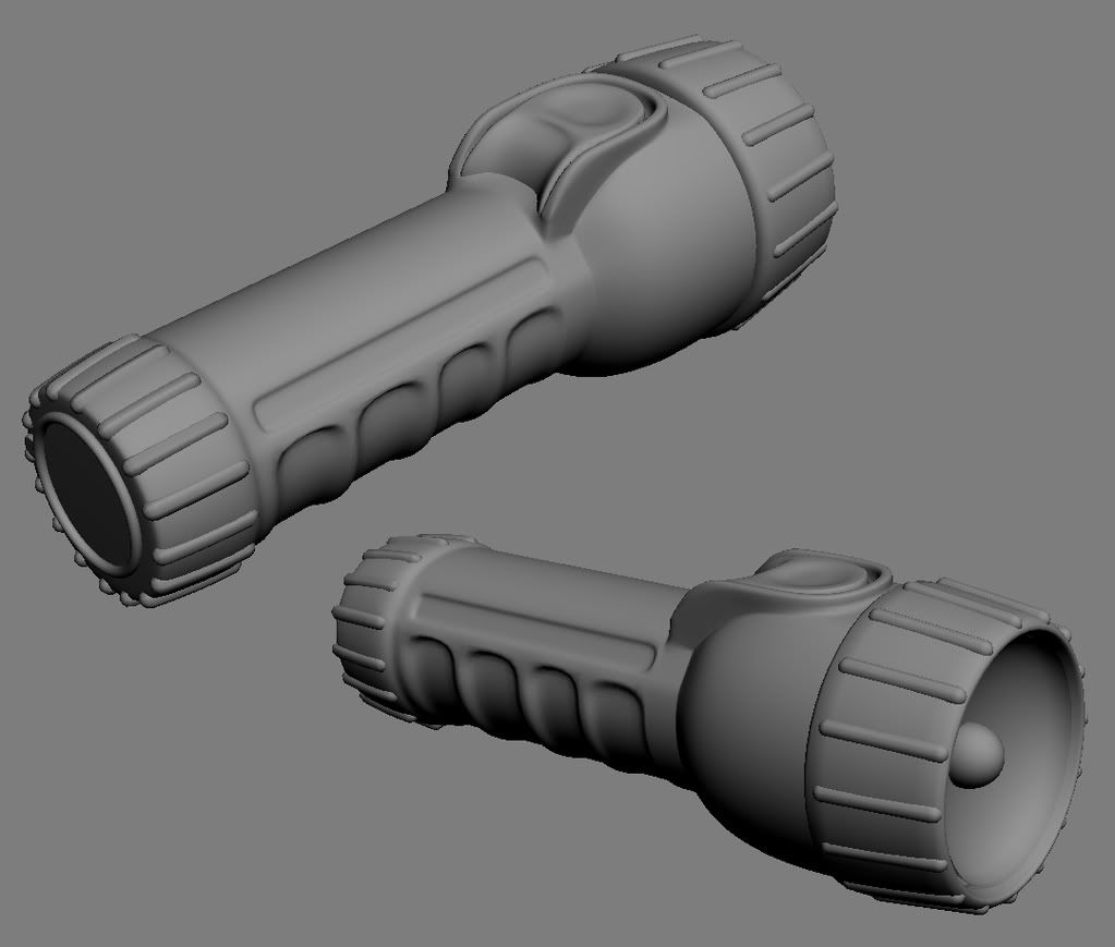
flashlight WIP
yawwwwn... It's a flashlight right?
I wanted to cool down and just grab an object around the apartment and make a normal mapped model out of it. So I found this flashlight and made the a high poly for it. Low poly and normals to follow.
Also tomorrow I'll post my reference some time.

Its really WIP, but crits welcome.
I wanted to cool down and just grab an object around the apartment and make a normal mapped model out of it. So I found this flashlight and made the a high poly for it. Low poly and normals to follow.
Also tomorrow I'll post my reference some time.

Its really WIP, but crits welcome.
Replies
jk looks good dude... posting the reference would have been beneficial. 'm assuming that the cap at the bottom is removable to put batteries in, so i'd suggest showing that the bottom cap is a separate piece from the body.
good forms though. anxious to compare it to the reference!
http://www.venusgraphics.com/Consumer_Products.html (I think this is the firm that designed the flashlight? WTF?)
thanks for the feedback guys. Here's my preliminary bake, I'm not happy with it but realized it had been a few days since I'd posted. Got too busy with real-life shit.
So yeh, I think I will work on the hipoly model some more to bring out that rim around the light.
thanks Pope Adam and Firecracker197! Appreciate the feedback.
Crit away, please.
And if the low is supposed to be a first person flashlight, then it looks good to me, but if its just a random environment prop or a third person light then you might could bring the detail down a bit cause it seems a little high.
Just some suggestions, use them or not, but awesome job dude.
thanks for the feedback guys!
Now I'm bored... Killzone 2 time.
Ive seen alot of small objects in games, for example.. Like Counter-Strike Source, and I literally got down on my hands and knees to expect a "Fire Extinguisher" And how it was texture- and my god, I couldnt beleive how shitty of a job the texture was- But' You can pull it off with small objects becuase--- You really dont ever see or notice detail in those sorts of things when your playing, Get my Drift?
I'm working on sharpening some edges on the highpoly right now. Can anyone suggest I do something with the color map? I agree that it's super boring.
I couldn't really think of anything to do to it other than cover it with blood and feces.
HEY THAT'S IT!!!!
Try and get the information that you see in the reference in there. Unless you're planning to put this in an engine using some kind of superadvanced plastic shader, get some of that yellow -> orange hue shift gradation you can see in the ref.
Otherwise just dust and light wear style grime. Don't do anything silly, just make the surface more believable. Bake some AO as a base and work from it.
Is this kind in the right direction? I might play with a different overlay.