Home 3D Art Showcase & Critiques

Space Wolves cathedral

Hey Guys

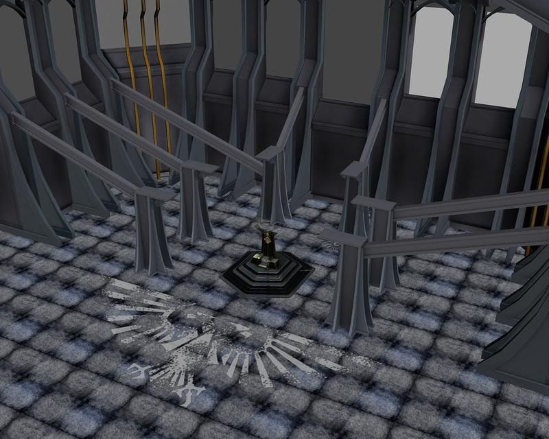
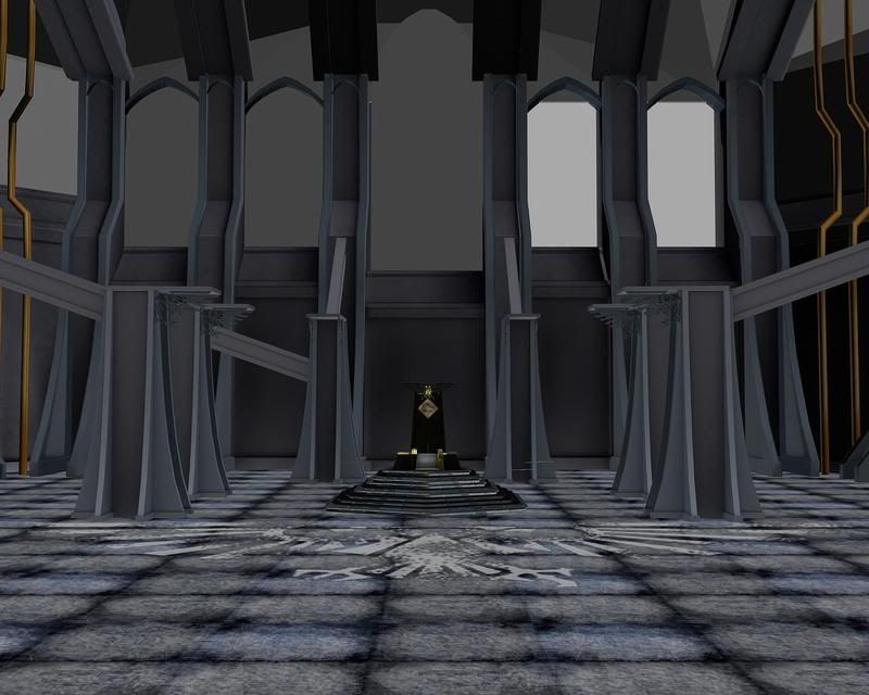
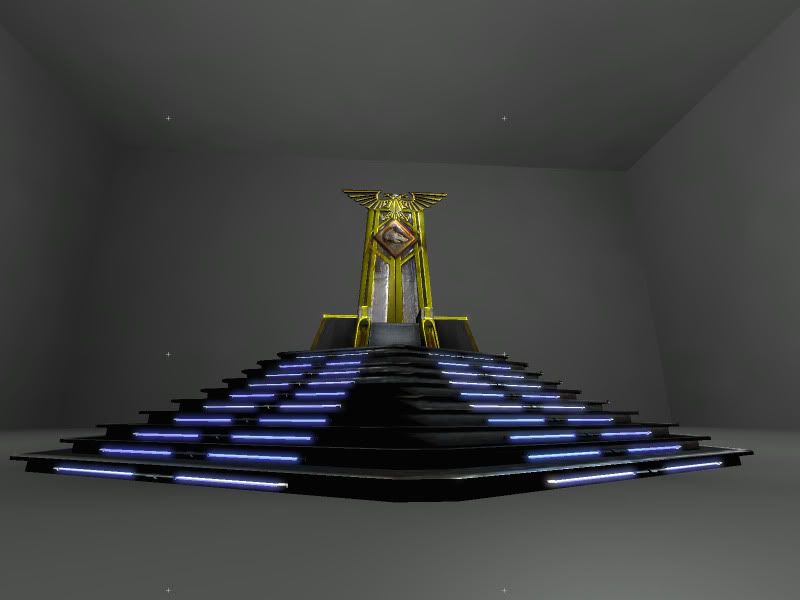
Im in the process of making this Space Wolves Cathedral from Warhammer 40,000 and wanted to get some critiques before i went further

Not completely finished and haven't put in lighting, the shading you see is baked in ambient occlusion.

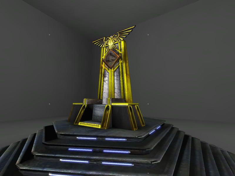
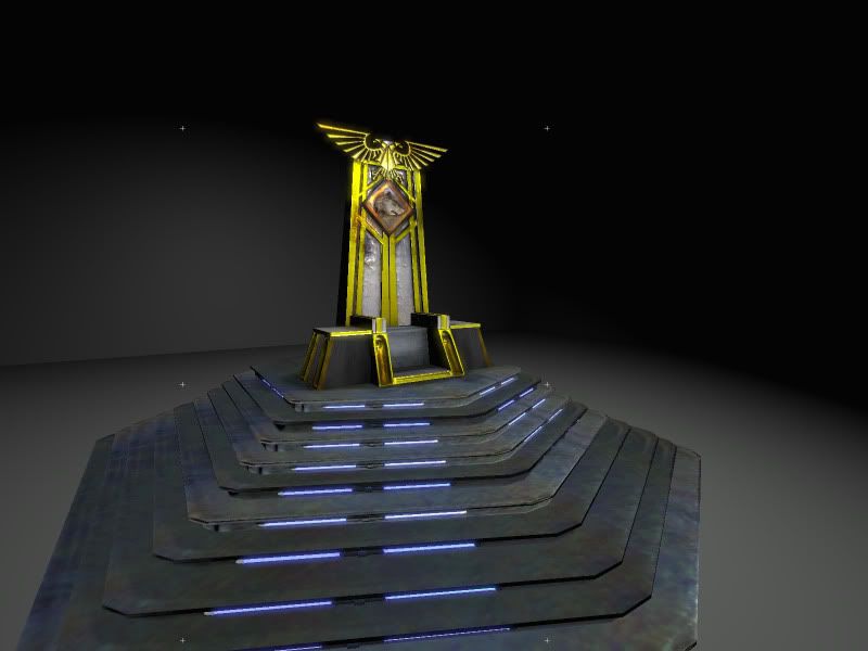
im going to add a wolf pelt to break up the modularity of the chair and steps, and im in the process of making a torch, held by a chain, between the pillars to the left and right of the throne

im trying to figure out a way to make stained glass windows in Unreal editor


the throne renders are taken in unreal editor


as usual, all comments and critiques are greatly appreciated


Render1.jpg
render2.jpg
Highres_Screenshot_00000.jpg
Highres_Screenshot_00002.jpg
Highres_Screenshot_00001.jpg

Replies

  • mikezoo
    Options
    Offline / Send Message
    mikezoo polycounter lvl 14
    I love the attention to detail the Warhammer artists put forth into their miniatures. Iam liking what I see so far, but currently its looking pretty empty.
    Also the throne looks way to small compared to the rest of the environment. I haven't see whatever concept your working off of. But yeah, pretty much just keep adding more!:thumbup:
  • Reich
    Options
    Offline / Send Message
    Floor texture is way low rez compared to the rest of your textures so far.

    Eagle alpha on the floor looks a bit to photoshop brusy. Change up your noise brushes a bit, that should help.


    Otherwise looking good. Just work on filling up the space.

    Oh and, Death to the Space Wolves >.>
  • Valandar
    Options
    Offline / Send Message
    Valandar polycounter lvl 18
    The gold looks a bit too tinted towards brass to me... maybe shift it a touch more orange, a bit warmer?

    And the Craftworlds will stand and watch as your puny Imperium crumbles under its own weight.
  • Mark.N
    Options
    Offline / Send Message
    Yeah I would definitely suggest up-rezzing your floor texture and give it more detail along with less noticeable tiling. The floor in general is just fairly hard to read as to what kind of material it is.

    Looking forward to see how this turns out.

    -Mark
  • renderhjs
    Options
    Offline / Send Message
    renderhjs sublime tool
    gold looks like urin,- maybe study some photo references of that material because like now it just looks wrong. Thats all I can say atm.
  • Justin Meisse
    Options
    Offline / Send Message
    Justin Meisse polycounter lvl 18
    Gold is described as a yellow metal but It helps to use rich warm colors, like a brown base. In photoshop I used color balance to bump the reds way up and took some of the yellow out, I'm not posting the image because everything else looks psychadelic!

    I'd also recommend for metal, putting most of your detail into the spec, this is what Earthquake does and his stuff looks sweet. I did a quick test, mostly for my own amusement because I'm still working with "last gen" tech all the time.

    Don't mind the sloppyness
    goldspec.jpg
  • Josh_Singh
    Options
    Offline / Send Message
    Josh_Singh polycounter lvl 18
    Justin, You got it man. The Spec can bring your metals to life.
    Try putting random splats of Purply pinks and saturated blues and crank the contrast, and you get fun results.
  • Reich
    Options
    Offline / Send Message
    Agreed with Justin. Let your Normals/Spec do your work. Try to put as little of detail in the diffuse.

    From the DA crest i did a while ago, more of a bronze then gold but same concept. (sorry for the size)

    specref.jpg
  • BoBo_the_seal
    Options
    Offline / Send Message
    BoBo_the_seal polycounter lvl 18
    Space Wolves are one of my favorite chapters. The eagle wing end-caps on the pillars are a little week at the moment. I'd suggest a thicker more solid design. Maybe wolfheads like these:
    http://www.fightingtigersofveda.com/moshiko3.jpg

    Keep it up!

    - BoBo
  • Agent Michael Scarn
    thanks for the input guys

    I agree, the metal is wrong, its colors are too vibrant in the diffuse map. im fixing that right now.

    Bobo_the_Seal
    great suggestion for the wolves head for the supports, ill get working on that soon. it'll tie in with the space wolves theme even more.

    Reich and Mark N.
    the floor is pretty sloppy, ill work on cleaning it up and making the tiling more subtle like you suggested. I was trying to go for a slightly destroyed tile but I went way overboard.
  • diablos_demie
    Options
    Offline / Send Message
    Space Wolves are also my favorite chapter, 1st army I ever played in 40k.

    I would suggest throwing some tattered war banners with the insignia on them and portraits of the past hero's like Bjorn, and the different companies directly on the walls with that huge empty spot. I think this will not only add more visual interest, but also integrate some of the lore and history which is usually prevalent in a cathedral.
  • Agent Michael Scarn
    Thanks for teh tips guys
    ive been working feerishly over this, particularly on the textures. my main thing now is getting the lighting done in UE3 and making a good glass shader for the windows
    this is my work in progress, wanted to get it critiqued before i went further

    anyone know way to make a nice glass shader in Ue3?

    critiques and comments are always welcome
    Highres_Screenshot_00003.jpg
    Highres_Screenshot_00004.jpg
    Highres_Screenshot_00005.jpg
  • Mark.N
    Options
    Offline / Send Message
    That's looking awesome man, as for a good glass shader. I can't remember off hand, but if you just dig through the unreal pack files and look for a glass shader, then depending on how well you know the mat editor, try and emulate the base glass effect that they get in their materials, and use theirs as a reference for making your own. They'll probably be fairly complicated, but if you can pull it off it'll work exactly as you want it.
  • renderhjs
    Options
    Offline / Send Message
    renderhjs sublime tool
    I cant help but I keep thinking that the colors are just not very good. E.g the green why is it like that,- is it a paint or because some light? - and if it were light why would anyone use such a disgusting light. Usually lights are more in a warm or cold color (orange, yellow, blue,..) but never did I see green light other than perhaps disco or so. That beeing said I think the green kills the scene.

    The window textures look cheap - they dont connect at all with the rest- give it at least some minimal dirt at the edges so it fits more in the frame of the window- also maybe try to increase the resolution there.
  • System
    Options
    Offline / Send Message
    System admin
    Disagree, I think the green light looks really cool, just needs toning down a little bit, edit do agree on the window design, lets it down, desaturate the colours more and try to swap the black for some other colour as you rarely if ever see black in stained glass windows as it blocks out all the light.
  • Agent Michael Scarn
    Thanks for the critiques guys. the green light is from the fire between teh pillars. Here are some new renders. im playing around with lighting for the mood, along with post processing. had a freind help out witht eh galss shaders and now its looking far better than before. the emissive lights may seem too prominent, i know, but im fixing that right now, its just a post processing thing.

    c and c welcome

    Highres_Screenshot_00001-1.jpg
    Highres_Screenshot_00006.jpg
    Highres_Screenshot_00008.jpg
    ScreenShot00002.jpg
    ScreenShot00003.jpg
Sign In or Register to comment.