[Environment] Room of Damnation (Warhammer 40k)
Update 3/24
So for now it is done for GDC. Off to get it printed (Kinkos is going to hate me) Enjoy.
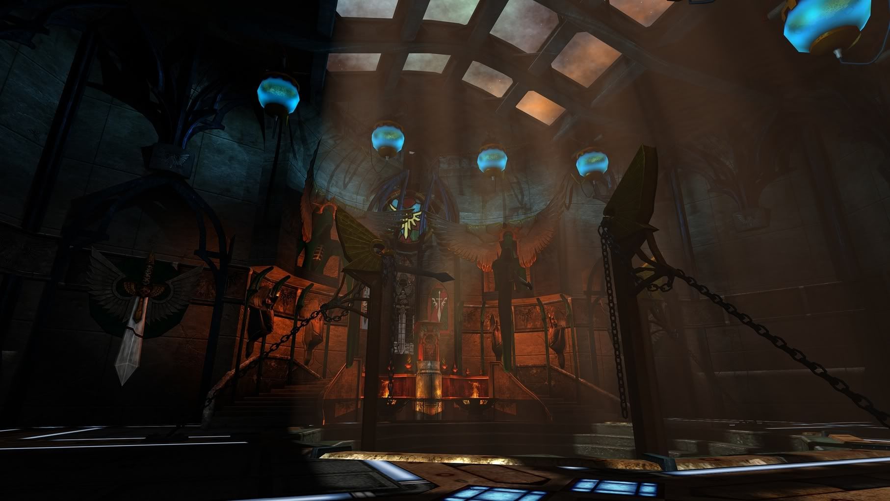
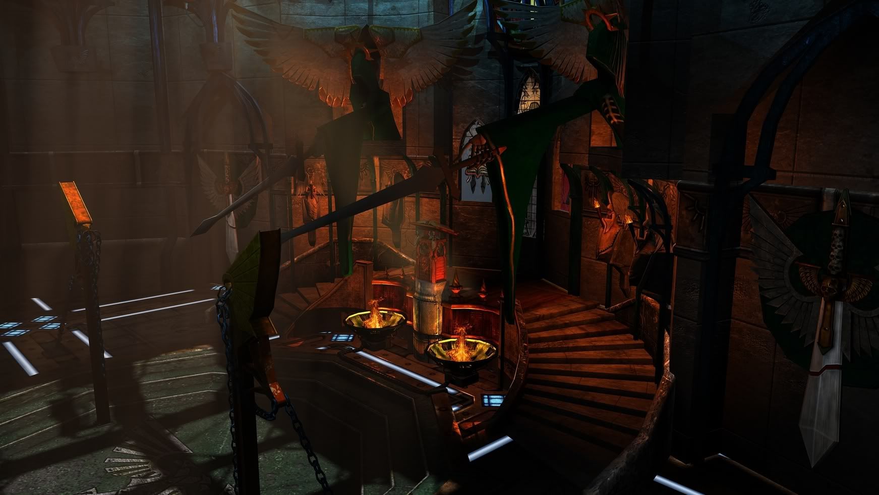
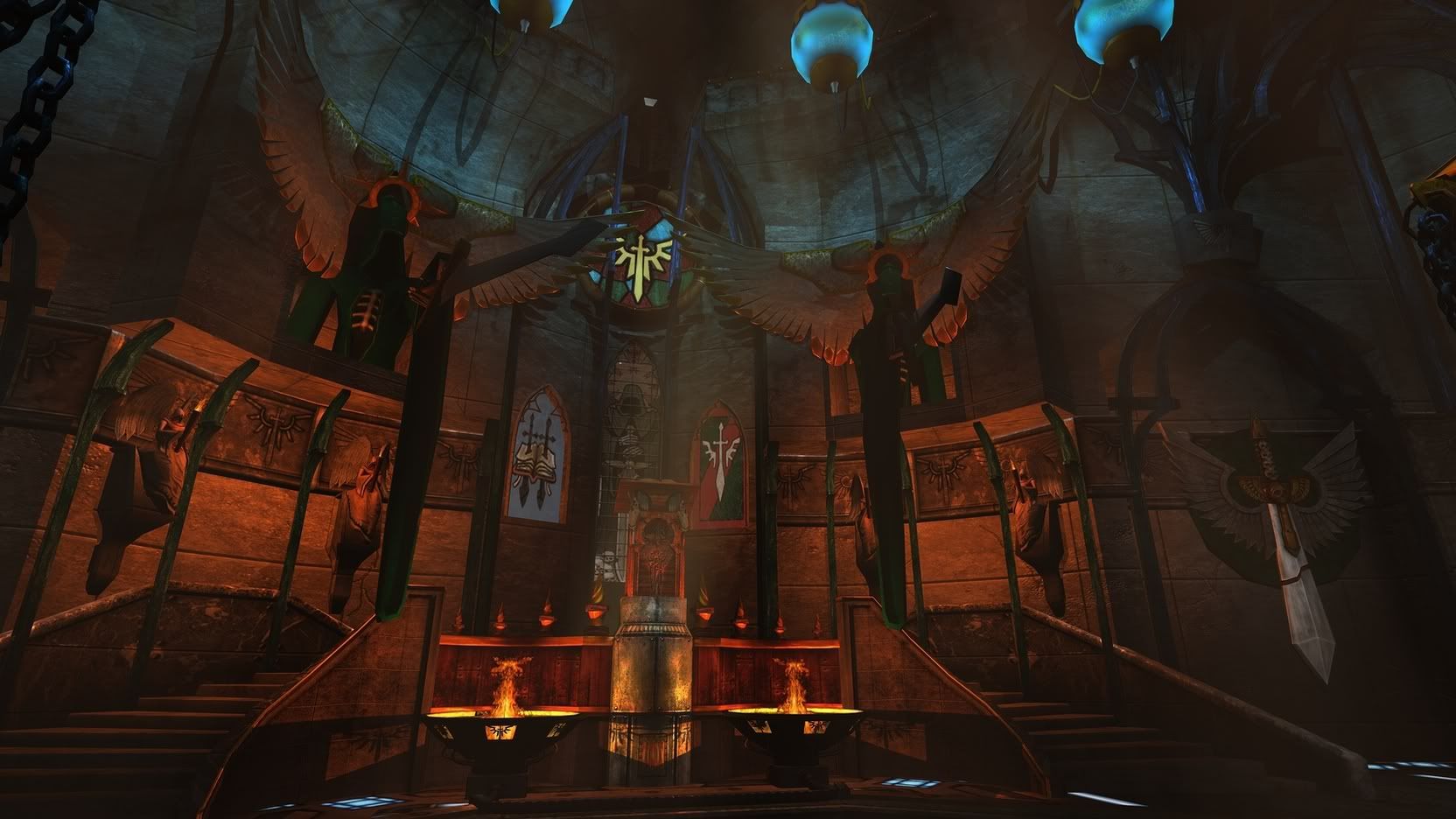
===================================================
Hey polycounters long time no chat. Been swamped with things to do and getting ready to graduate...get's overwelming fast.
Well here is my last piece my school will get from me. Please note it's not 100% done and the Textures are justs tests and have no spec/normals, also UVs are a little funky in some spots.
Overview of the environment:
Well a fast Warhammer 40k history lesson so you can understand where this is coming from.
The Dark Angels home world was destroyed, however a large force field protecting their main base saved a very large chunk of the planet. the Dark Angels took this and tunneled in and made it their new home. They integrated warp drives and everything. this is known as The Rock.
One of the Dark Angles main goal is to capture and bring to justice all of their brothers that fell to Chaos. So that's where this scene comes in. It is on the rock and a room where the Book that holds the names of the fallen lies and where the Librarian of the chapter will condem the fallen.
so here is what i have so far.
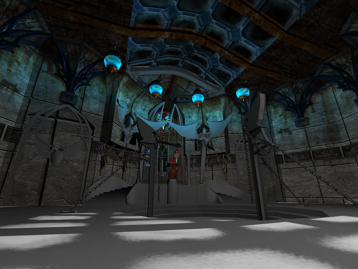
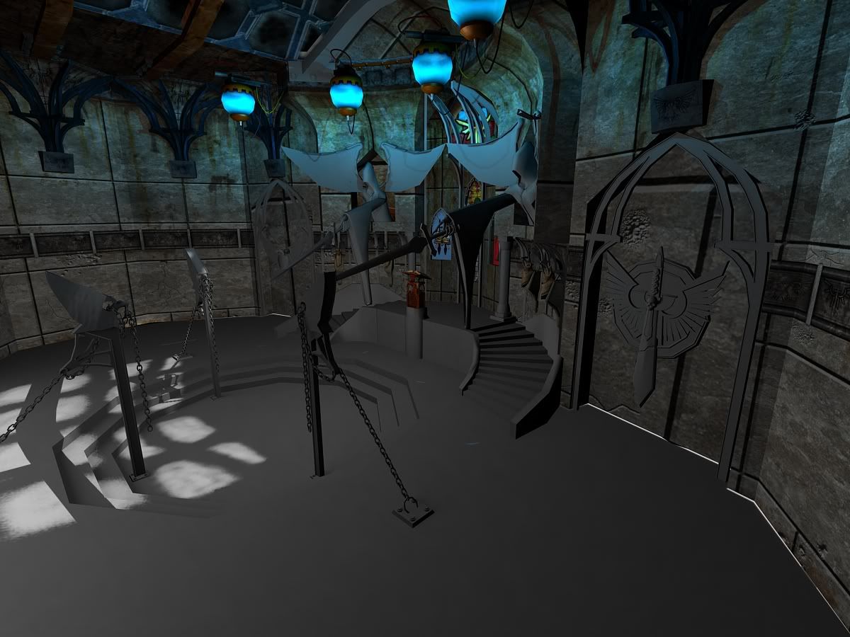
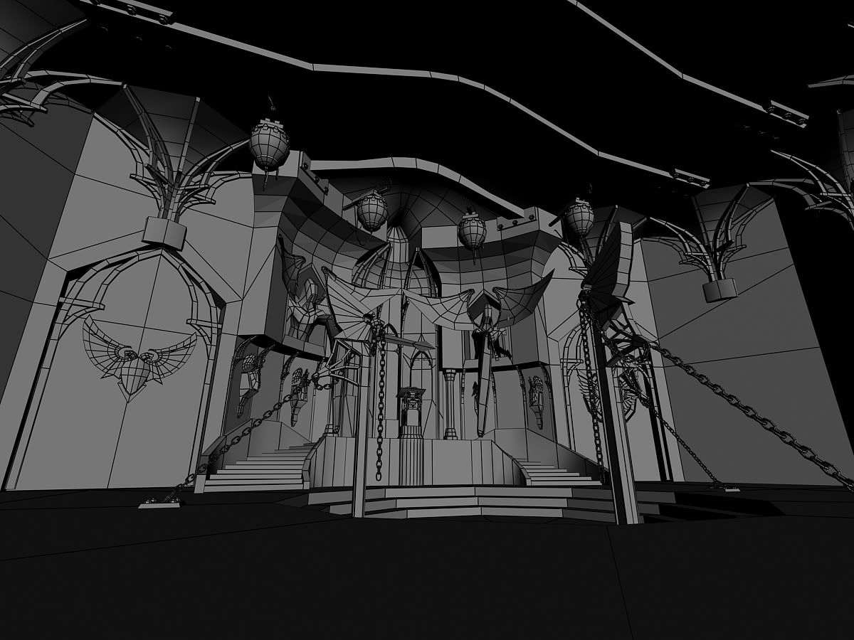
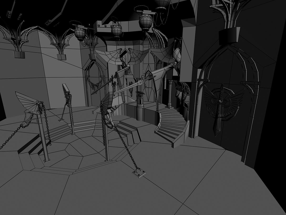
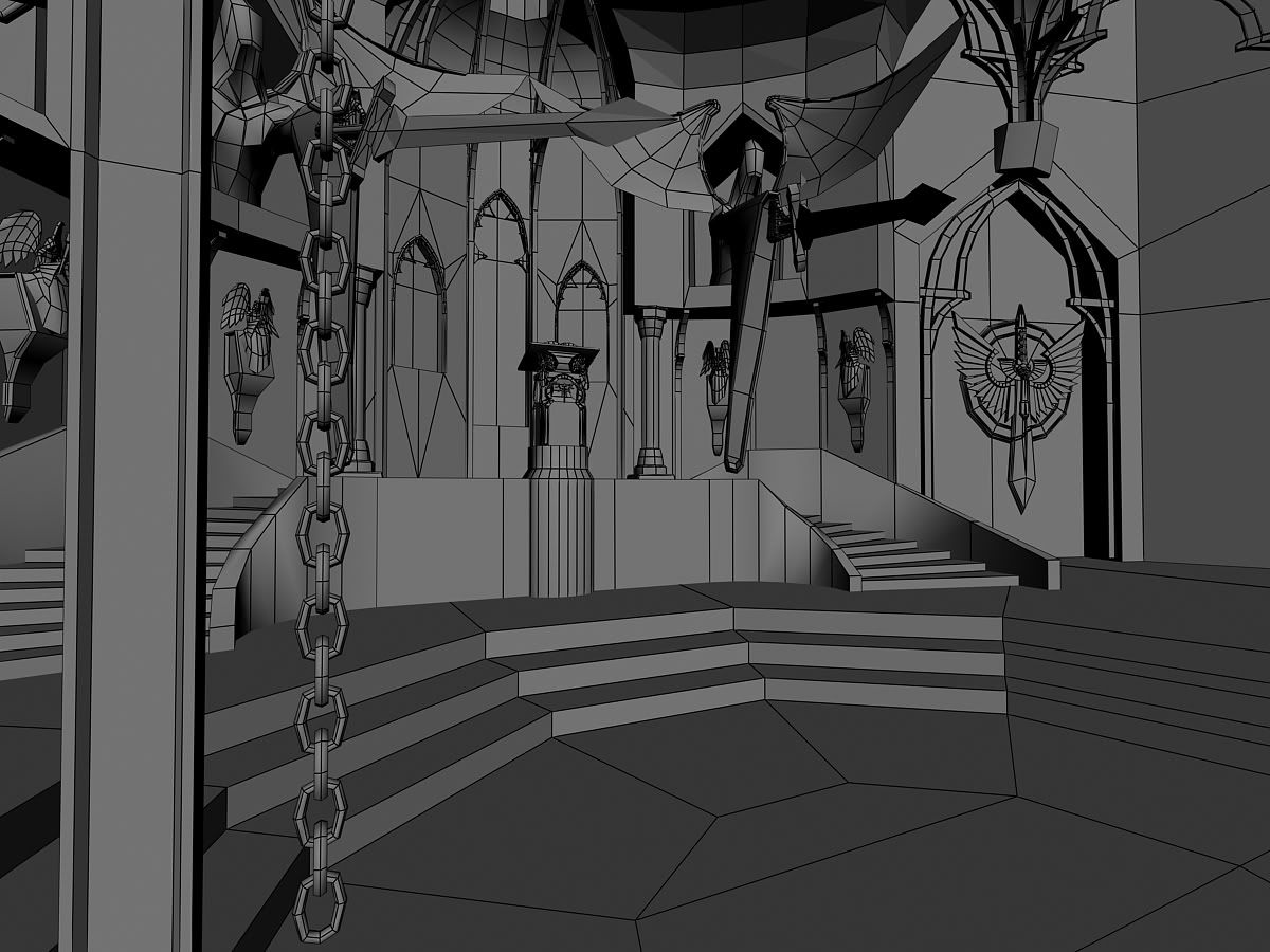
Full scene is sitting at 80k Tris at the moment and there is still the entrance way that hasn't been added to the main file.
A struggle i am having is what to do with the front of the podium area. Not sure if i should model some stuff or just do some nice normal map design. Kinda at a design loss. I think i have been looking at it for far to long.
As always Comment and help are welcome.
So for now it is done for GDC. Off to get it printed (Kinkos is going to hate me) Enjoy.


===================================================
Hey polycounters long time no chat. Been swamped with things to do and getting ready to graduate...get's overwelming fast.
Well here is my last piece my school will get from me. Please note it's not 100% done and the Textures are justs tests and have no spec/normals, also UVs are a little funky in some spots.
Overview of the environment:
Well a fast Warhammer 40k history lesson so you can understand where this is coming from.
The Dark Angels home world was destroyed, however a large force field protecting their main base saved a very large chunk of the planet. the Dark Angels took this and tunneled in and made it their new home. They integrated warp drives and everything. this is known as The Rock.
One of the Dark Angles main goal is to capture and bring to justice all of their brothers that fell to Chaos. So that's where this scene comes in. It is on the rock and a room where the Book that holds the names of the fallen lies and where the Librarian of the chapter will condem the fallen.
so here is what i have so far.


Full scene is sitting at 80k Tris at the moment and there is still the entrance way that hasn't been added to the main file.
A struggle i am having is what to do with the front of the podium area. Not sure if i should model some stuff or just do some nice normal map design. Kinda at a design loss. I think i have been looking at it for far to long.
As always Comment and help are welcome.
Replies
AK
Don Ott made some good suggestions to me yesterday about adding more to the walls and making them more interesting then just textured planes. Completely agreed and have been busy doing that. Also started to integrating the blast door hallway.
AK i like the idea of braziers you had i think they would fit nicely in the curve of the stairs. And one they are lite it would give a nice red under highlight on the large angels...thus making them a bit more intimidating.
I'll update again later tonight.
the wall teture looks really nice, it'll look even better when you put in UE3
AK
agree w/ mr AK
Yea i started to set up the side angels that are holding torches so i threw a few red lights to see what it would look like and yes it is a very good mix.
As for the roof the light is actually in the glow orbs and passing through the alpha so that's why it isn't hitting the roof. I'll probably throw a bounce light in there when i am actually lighting it so that the roof can catch more light.
As for UT3, it's Long term goal will be there. do to time for the actual project it will most likely be a max render until after the graduation shenanigans and GDC.
VikingJim, Ask and you shall receive. Still not 100% done in the texturing but it's close. (and the shadow of the bone hand after i moved the light is sweet.)
The light from the cieling is good, but i woul change teh color and make it more subtle. if toned down it might make the setting even cooler just because it sets the tone of gloom.
Maybe I'm blind, but im not seeing where the red light near the podium is coming from. The "windows" are so far saturated they look more like paintings than anything.
The floor needs more resolution. Next to the green center the main overall floor panel looks low-res and too photo-shoppy.
Not really seeing any spec, which for surfaces such as metal is almost more important than the color.
I know you are trying to cram this in before GDC, but you would do a better job focusing on a small area and making it super-cool than getting a half-finished rush-job trying to do the entire scene. I'd say zoom your camera in on the podium area, make that look sick and take it all the way to completion for now, then spread out once that is done.
AK
For the Spec/Rez issue on the floor it has been taken care of. I was working on by business cards earlier and forgot to switch back from CMYK. I didn't notice this until I tried to put the actual PSD into Max. It yelled at me for that one. So i went back changed it to RGB re ajusted all the layers and i got that working.
As for the Spec map i guess i had to blow out the Specular lvl. Somethign with all the geomatry out that was causing the spec to dissapeer. Once i hit all the geomatry and was looking at one thing isolated the spec would show. None the less i worked around it.
the scene is coming a long. So far the fire looks like planes duplicated around, make sure the sides are not symmetrical on the photo/ texture. You need dark purple for bounce light, the reason why shadows are never dark because of Global Illumination, light bounces so it makes the shadows lighter.
Keep at it and make sure to increase the light brightness.
thanks AK, and thanks for your input on this so far.