The BRAWL² Tournament Challenge has been announced!
It starts May 12, and ends Oct 17. Let's see what you got!
https://polycount.com/discussion/237047/the-brawl²-tournament
It starts May 12, and ends Oct 17. Let's see what you got!
https://polycount.com/discussion/237047/the-brawl²-tournament
WIP Satellite Computer Case
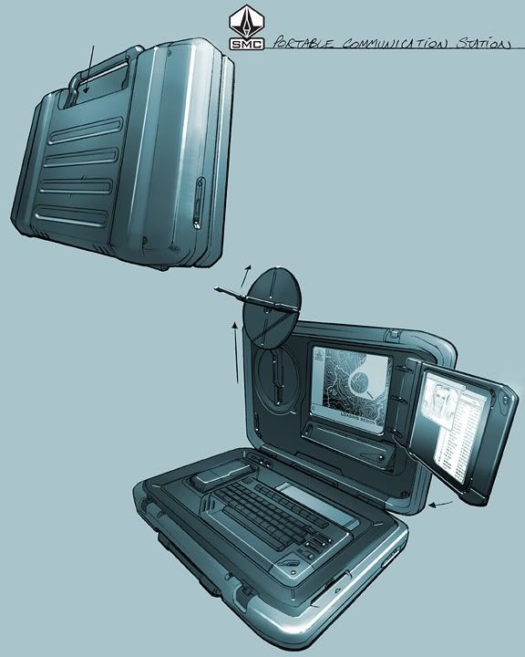
Here is another model I'm building now. The concept is from Paul Richards, awesome guy. His site: www.autodestruct.com (if you don't know him you need to!)
Reference:
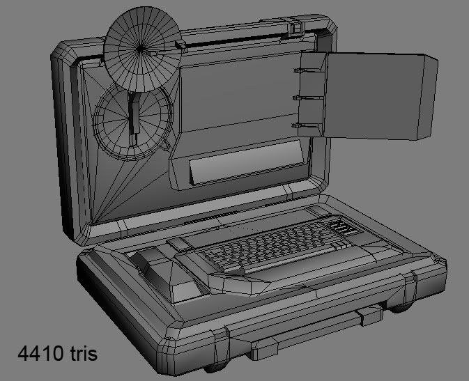
Renders:
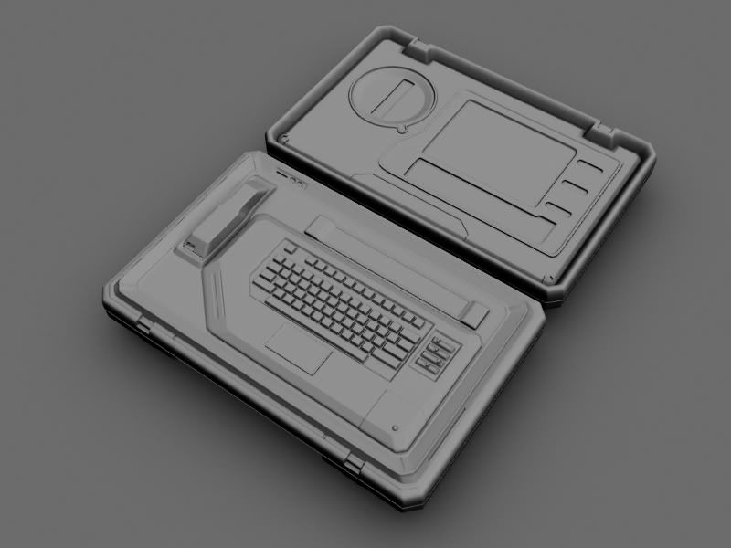
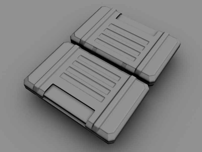
I'll switch these out with completed ones in a few days. Just wanted to see if I'm on the right track.
So far, I am thinking the phone is too little, I'm already planning on making more room for it.
***Update***
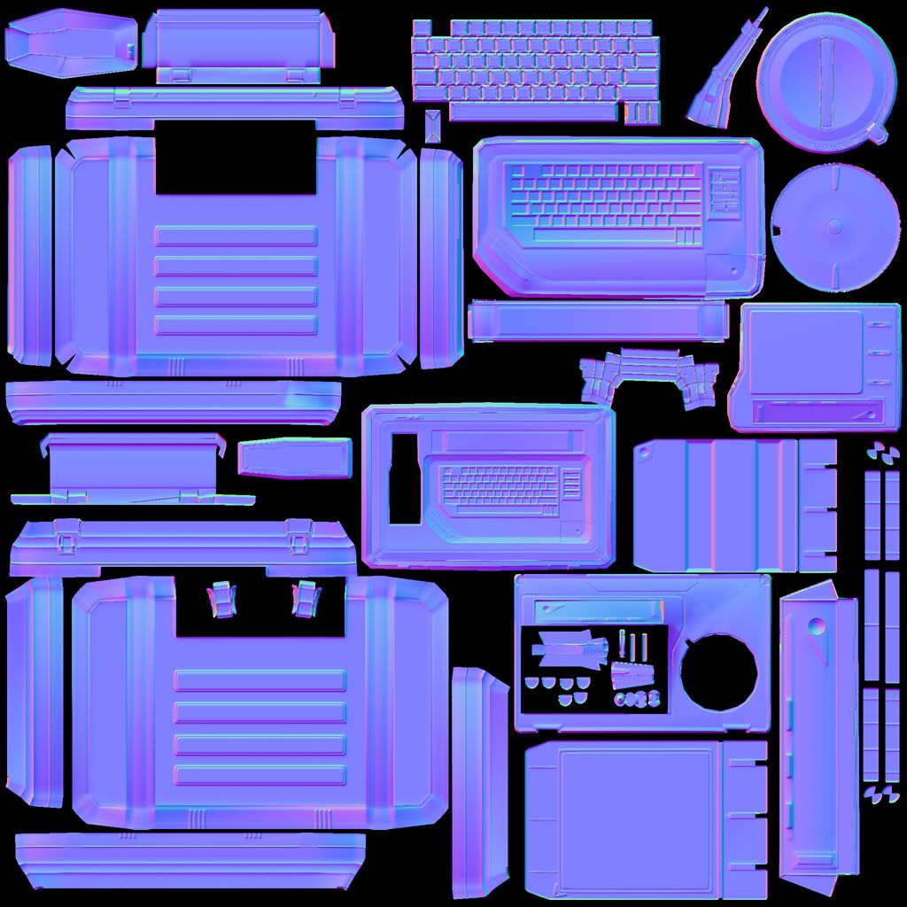
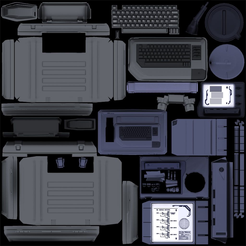
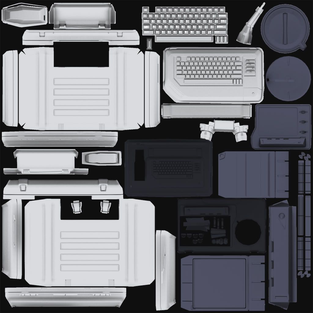
Finished with a reflection, and a self illumination for the screen, along with your standard normal diffuse and spec.
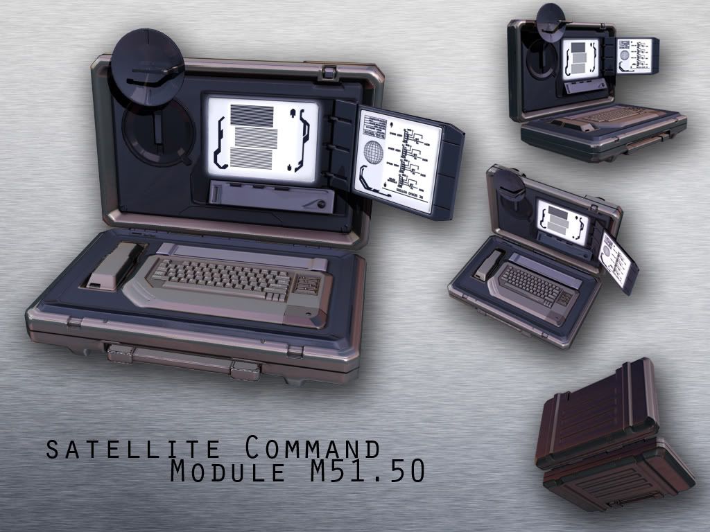
Reference:

Renders:


I'll switch these out with completed ones in a few days. Just wanted to see if I'm on the right track.
So far, I am thinking the phone is too little, I'm already planning on making more room for it.
***Update***
Finished with a reflection, and a self illumination for the screen, along with your standard normal diffuse and spec.


Replies
I would think about expanding upon the concept and adding a bunch of usb ports somewhere near the keyboard maybe? I see there's a few ports above the phone. The card reader slot on the right of the keyboard looks less pronounced than it should be..... mmmmmmmmmm.... yeah man, it is looking great! It would be cool to animate this thing opening up!
I think you've deviated from the concept a little too much (mostly with the keyboard/phone area). To me its lost most of the compact feel it has in the concept. Also, your model is pretty hard edged (the phone, the corners of the case, the rectangle indention's on the outside of the case) whereas these areas are more bubbly and more round in the concept.
I'll leave the rest of the comments out as I think they are a side effect of what I mentioned above.
I agree with Firebert though, animation of it opening would be pretty epic. The little radar dish can scan around after it opens haha that would be good.
Anyway, fix it. >:]
Yeah I definitely need to go in and remove some loops, they got kinda crazy as I was adding details, when I started out the edges where a lot smoother and the corners weren't as sharp. I'll go back and try and smooth things out again.
Thanks for the crit!
btw... I'd also love to see it animated.
maybe try making some plan views before you model?
1) Notice the angle of the corners. You are pretty close on the bevel, but I think it still needs to be a little smoother, but on the top right corner of the case on the concept... look how the degree of the angle. Also, right below that on the concept, i wrote in yellow "FLAT"... you've added in a recessed section that shouldn't be there.
2) Look at how smoothed off the clasps are on the concept and how rigid yours are on the model, particularly the ones on the base/keyboard side of the case.
3) The hinge is divided up into sections, not one liner piece all the way across.
4) Little pieces like the flip out screen, you've added in indentions on the right side and overlooked the detail in the top right corner.
There's more on there that I've scribbled, and I am sure you can make sense of the rest of it. There's also a bunch of little details you need to add in. It may just be the shader you are presenting your WIP images in, but run over this thing with a fine tooth comb until you know it like the back of your hand. You're getting really close to wrapping this up, just dial in those fine points and you'll be on your way to caging this bad boy out!