Home 3D Art Showcase & Critiques

Old Cart

polycounter lvl 11
Offline / Send Message
Firecracker197 polycounter lvl 11
Ah its been awhile since I posted..I need to get better about this, I guess I don't really like to post my stuff a whole lot, but I know it helps so here it goes!

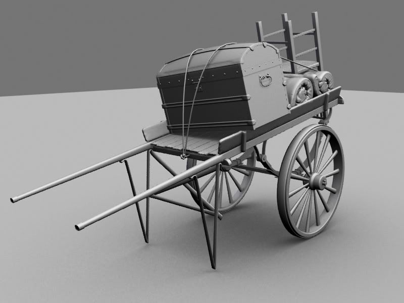
Here is a model Ive been working on, so far I have the highpoly and lowpoly completed. I'm working on textures now.

here is the reference
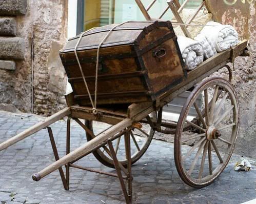
prop5.jpg

and the Render

highpolyRender2.jpg

Let me know whatcha think!

Replies

  • killingpeople
    Offline / Send Message
    killingpeople polycounter lvl 18
    I like it, cool model. There are very subtle proportion differences from the reference but it still looks good and I would think you'd be fine to move forward with the texture.

    Just to mention the differences, the wheel and hubcap look thicker, the spokes taper, the handle bars look thinner and longer, the "V-rests" are longer, the top of the chest buldges evenly rather than flare or straighten slightly at the ends.
  • A.Kincade
    Offline / Send Message
    A.Kincade polycounter lvl 9
    I agree. There are subtle proportional issues but I think you should always try to change it a little from the reference. Maybe even add some extra items in the wagon or something. It's pretty spot on though so don't worry about that. It's going to be nice to see the textures on it as well. If you have a wire-frame shot of it too that would be good to see.

    AK
  • art911
    It looks great, I'd really love to see it textured. Do you have a shot of the lowpoly you can throw up to?
  • Harry
    Offline / Send Message
    Harry polycounter lvl 13
    these rolled matresses, zbrush?

    And stuff that would be cool to add would be cups and pots and stuff, That kind of stuff always looks hilariously gypsie

    edit: i dont think ill ever get over how awesome leaf spring suspension is
  • Firecracker197
    Offline / Send Message
    Firecracker197 polycounter lvl 11
    Harry wrote: »
    these rolled matresses, zbrush?

    And stuff that would be cool to add would be cups and pots and stuff, That kind of stuff always looks hilariously gypsie

    edit: i dont think ill ever get over how awesome leaf spring suspension is

    Yes, a quick zbrushing it didn't take me very long, the mattresses are identical but I made each end different so you cant tell when I rotated them.

    I might add more stuff later if I have more time for detail.

    Funny story about the suspension...I didn't know the name of it at first, and it took me awhile to find reference..finally I found someone who knew what it was called and they helped me out...lol now I'll never forget!
  • Talbot
    Take a look at the rope... there is no sign of tension in the rope on your model. Maybe fool around with that a little. Other than that... looks good!
  • Mark Dygert
    Talbots got a good point with the rope. You might want to distort and twist or FFD some of the pieces to give them age and character. A lot can be said with some gentle bends and pushed around verts. But even then its a great model the way it is, really nice work!
  • Firecracker197
    Offline / Send Message
    Firecracker197 polycounter lvl 11
    Final Update: Just thought I should update these threads now that I'm finishing up the folio. I used a normal map filter on the diffuse, and there's a later version on the model, I haven't updated the texture sheet just yet.

    View the quicktime turn arounds here: turn arounds
    rendersheetcopy.jpg

    cart_texturesheet.jpg
  • ErichWK
    Offline / Send Message
    ErichWK polycounter lvl 12
    hmm.. someone correct me if I am wrong, but it seems like all your geometry has unique UV space, I see plenty of room to duplicate a side or two (only UV one blanket, one side of the chest, one wheel etc). could make your UV layout better. What size is your Texture? Doesn't seem to say (neither in your portfolio.. )
  • Firecracker197
    Offline / Send Message
    Firecracker197 polycounter lvl 11
    ErichWK wrote: »
    hmm.. someone correct me if I am wrong, but it seems like all your geometry has unique UV space, I see plenty of room to duplicate a side or two (only UV one blanket, one side of the chest, one wheel etc). could make your UV layout better. What size is your Texture? Doesn't seem to say (neither in your portfolio.. )

    Half of the cart is duplicated, there's only one wheel, and one plank, there was only one blanket but since one is turned differently than the other I couldn't duplicate them because of the AO texture, there was a large black spot visible on one of the blankets. Now that I think about it, I probably could have cut them down the middle, but now at least each end is unique.

    Textures in the render are 2048, just to make them pretty for the portfolio, and I will definately remember to post that info on my site.
Sign In or Register to comment.