Futuristic Assualt Rifle
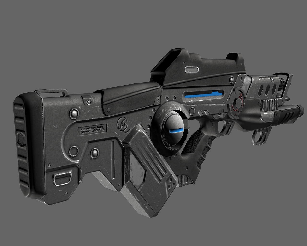
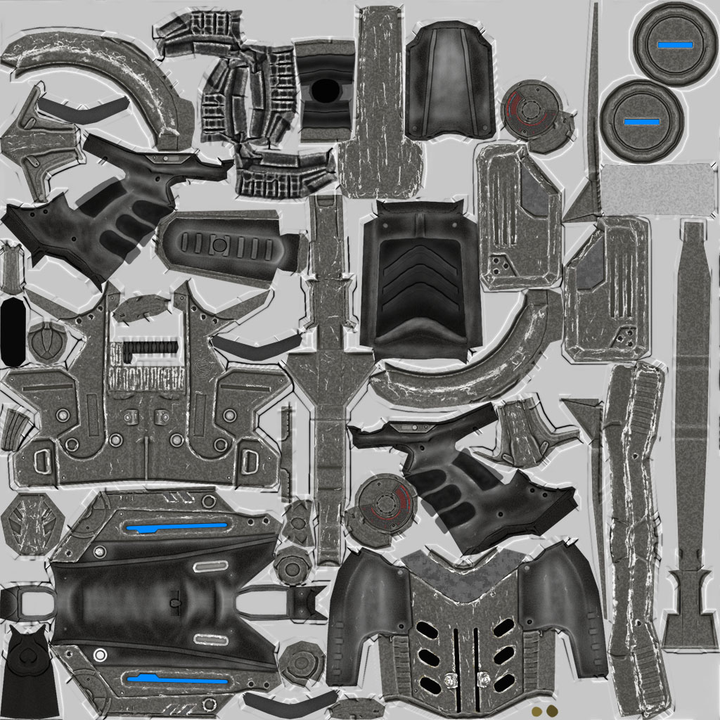
Here is a weapon I have been working on for almost 2 weeks now, I'm tweaking the textures and details at this point. I want is to have a somewhat used look. At this point I'm most concerned with the textures and what I can do to make them really shine. Specifically the spec map.
Currently the spec map is pretty noisy. It wasn't giving me the results I wanted when it was flatter with just the edges highlighted for the most part.
Keep in mind too that this is designed as a 3rd person view weapon.
The weapon is going into UT3 as part of a mod so the blue parts will be glowing.
3ds Max Render
Diffuse Map
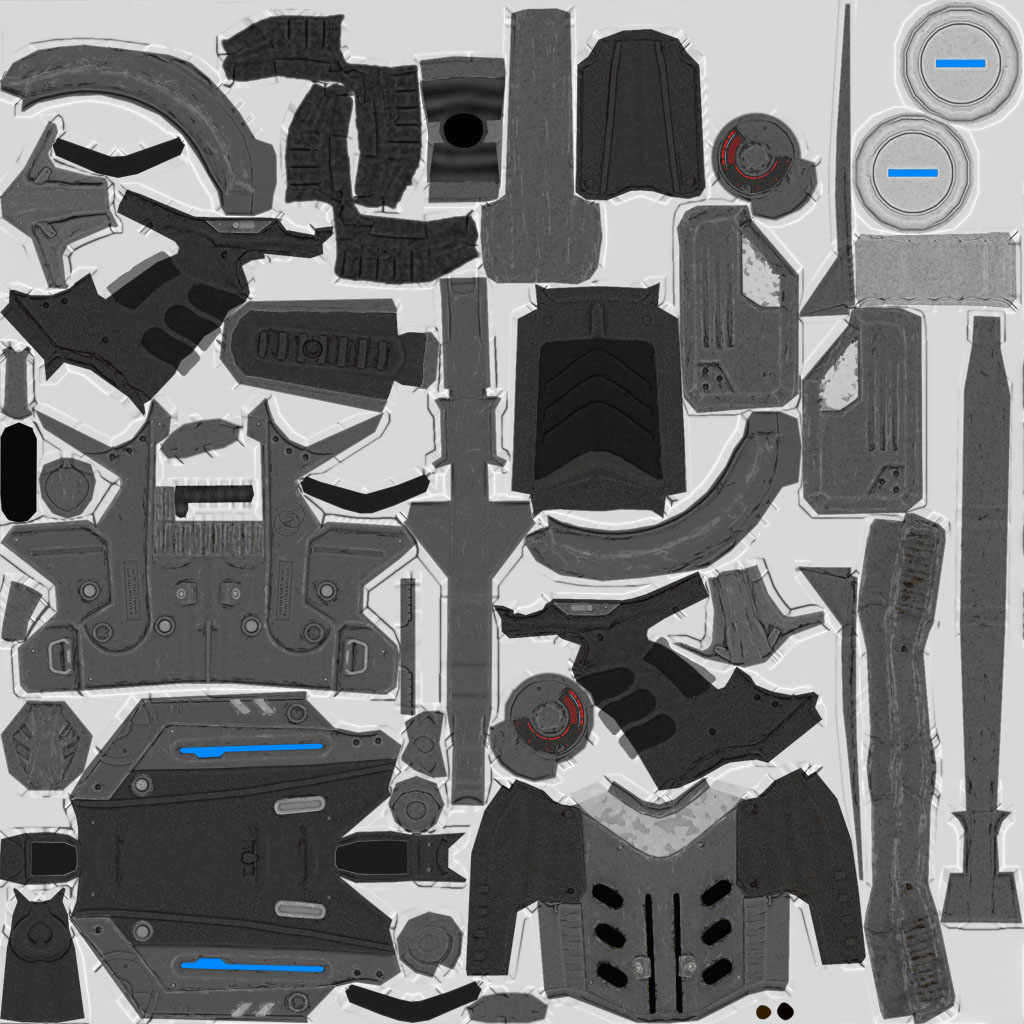
Spec Map
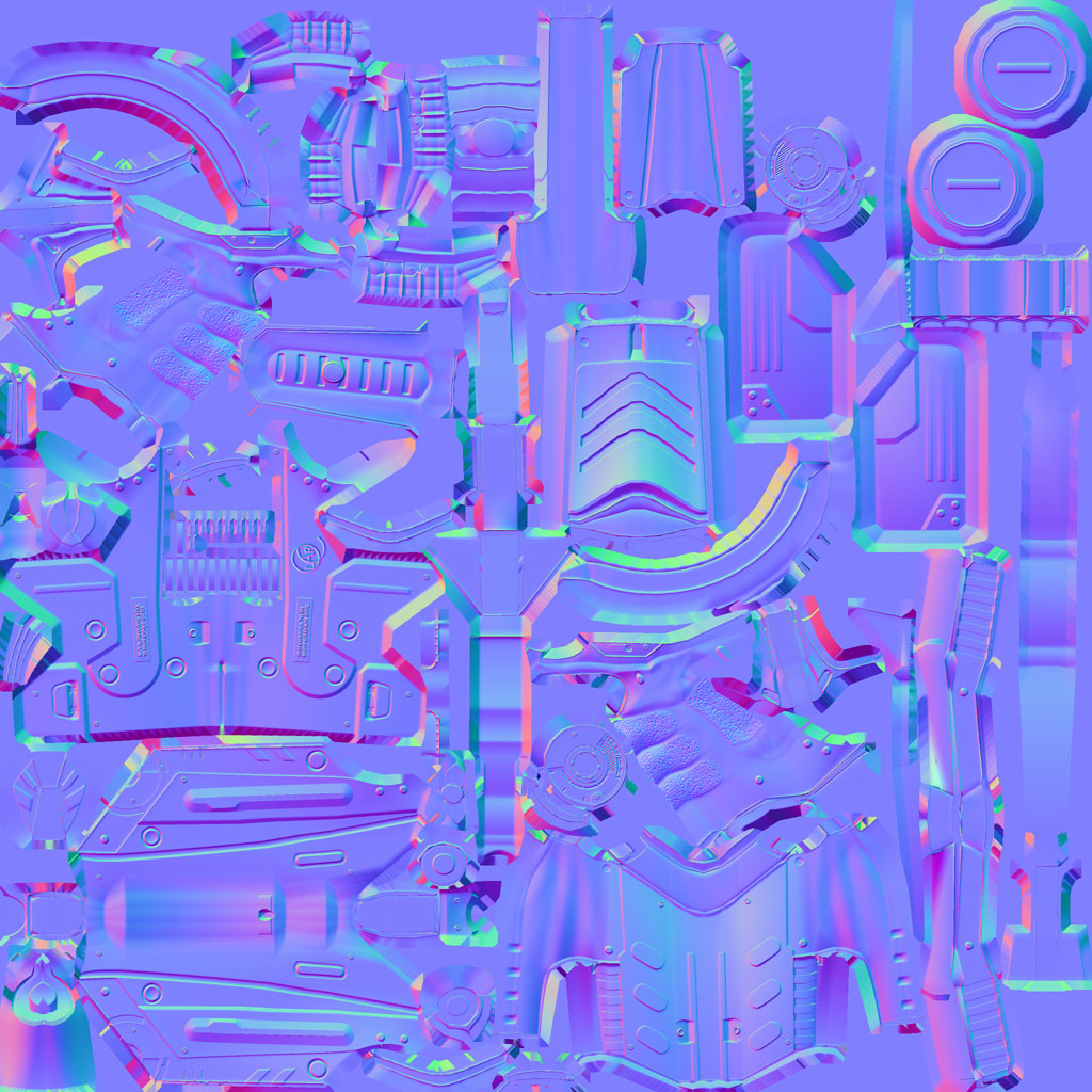
Normal Map
Currently the spec map is pretty noisy. It wasn't giving me the results I wanted when it was flatter with just the edges highlighted for the most part.
Keep in mind too that this is designed as a 3rd person view weapon.
The weapon is going into UT3 as part of a mod so the blue parts will be glowing.
3ds Max Render

Diffuse Map

Spec Map

Normal Map

Replies
Naturally
Nice rifle! Spec needs work though.
Seriously that unwrap needs some rework. You are missing out on a huge amount of texture res.
I will fix up the UV's. Just have to re-project the textures after I fix them up.
here is a screengrab from UT3, I opted for a cleaner look with the rifle.
I realized I spelled "bullpup" wrong after the fact. but its going unnoticable in 3rd person.
First off, some stuff that is really nice; I dig the heat shield over the barrel. The grenade launcher and overall shape of the scope/"digital sights" is cool too.
For the simple stuff, I think the rifle overall is a bit thin. I'm not sure what's going on with the back of the scope-ish area, is that going to be a glass lens or a screen? It looks something like a long red-dot type sight so maybe mixing a bit of that + a small screen for ammo or barrel temperature or something like that would be cool (since you said it's 3rd person you wouldn't really have to define that so much as have the screen and some data on it).
The glowy bits are nice too, but some detail to them would be nice. Imagine the glow is emanating from a light, is it an LED? Some kind of glass shield to diffuse the light with some grime around the inside ring would be nice, something to interrupt the perfect blue light. Might not be that noticeable in 3rd person though...
Something more serious though is that the barrel doesn't line up with the magazine, there's no ejection port (firing standard bullets?) or method to arm the weapon/chamber a fresh round. Yes we've had the form vs function debate to death, but looking at this from another perspective, think about whoever has to animate this. It's gonna look very boring if they have nothing to animate for a reload/rearm cycle. The barrel lining up isn't so important for this...it's just something that bothers me design wise.
The textures look like a good base, though they're a bit bland. The scratches and highlights get very strong in the more recent renders, I think they actually looked best in renderfinal1.jpg
heres how the barrel/rail looks
The scope is a video screen of what is in front of it with a crosshair over the video, also with random ammo counter and things. I need to figure out what it is going to take to get something like that to work in UT3 so I left it blank until I get it in game.
as for animations there will be a kind of electricity type effect on the end of the barrel when fired/firing, Plus the long blue light on the side will change color as your ammo is depleted, as secondary visual cue for ammo amount. mechanically the only real moving parts are the triggers, nothing else moves on the gun.
I think you may have the renders order screwed up a bit I toned down all the scratches in the recent renders. I am also working on getting some more variation and color in the metal and plastic since it looks a bit colorless at the moment.
thanks for the comment!
The type of gun you're describing is called a Coilgun or a RailGun. A series of magnets along the barrel propel the projectile (bullet in this case) in increasingly faster speeds until leaving the barrel. I've always liked the mechanics of a railgun. That gives some nice validity to that large semi-sphere in front of the magazine too, like a cover for spinning electrical coils building a charge for the electromagnets.
Even if you're using a caseless ammunition for thisthough you will still need a way to chamber the first round. Even though you could say that it's being done mechanically inside the gun that would be both missing an opportunity for more animation detail and a bit of a safety concern (if you were to pretend it was a real weapon). Without a way to manually arm and load the weapon you could easily accidentally discharge munitions any time a magazine was loaded.
Plus what would happen if the weapon jammed? You would have no way to manually discharge, reload, or force out the jammed round. Just some fun stuff to think about to give reason for extra details.
On another note that sideview shows off how cool the split barrel is, I didn't even notice in the other shots. It would be cool if you extended/exaggerated it so it was more visible in 3rd person. You also might want to add a trigger for that grenade launcher...Or remove the trigger guard if it's a flashlight or battery pack or something.
another update, added more color variation. and wear to the plastic