Temple of Crom Unearthly Challenge
polycounter lvl 16
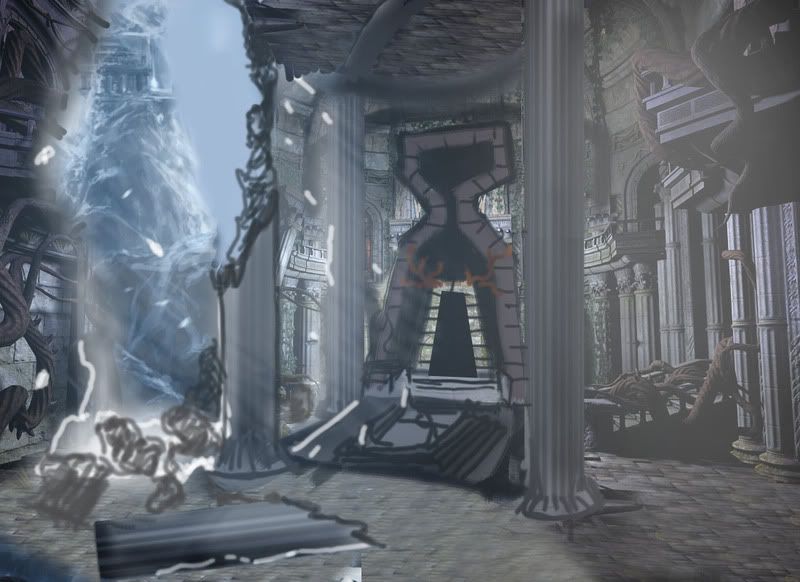
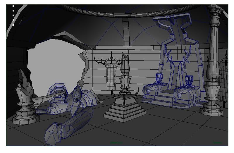
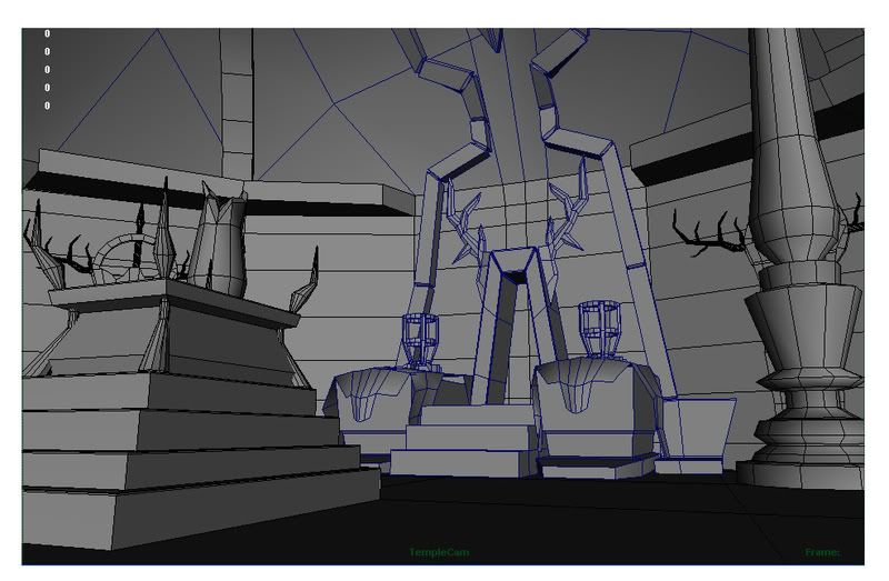
Hey guys, Im working on the Unearthly Challenge for a class at AI-SD, and I chose to do a paint over of one of the original concepts. I chose to make the Zeus Sanctuary into the Temple of Crom, the Hyborian God. Here are the two camera shots im using in wireframe mode. Total tri count so far is 13,218. Any and all crits welcome. Thanks for looking, Jim.
Also, we had to have a bit of backstory, here is what I came up with:
[FONT="] High in mountain ranges of the frozen north of Hyboria sits the Temple of Crom. This unseen yet malicious god must be paid tribute if the populous living below wishes to go about their lives without his grim and unforgiving intervention. The shadow drenched opening in the front of the temple is said to hold the spirit of Crom himself. There is a sacrificial altar in the center of his temple, where only the most barbarous warriors, and beautiful Hyborian women are to be offered. When a sacrifice was deemed unworthy, the dark god broke free from his imprisonment to reign terror and death upon those who chose to ignore his existence. [/FONT]
Replies
Nice work btw. I'm a fan of Conan. Will be nice to see how this progresses.
I'm getting more of a hedonistic Greek god with antlers feeling from this piece rather than a dour warlike half Celt god such as Crom. Theres a lot written about Crom, he teaches his people to deal with adversity and take strength from constant testing.
He's a simple god, preaching strength, battle and toil and those that follow him expect their life to be hard. The Cimmerian's who worship him are generally NOT like Conan, they have no heart for travel and adventure and tend more to give themselves up to the daily grind and are pretty solemn until the druid's aren't looking and they have a drink and share stories about past battles.
They're not a lavish or decorative people, just like Crom ain't fancy.
Bearing all that in mind, I'd have thought crom's environment might be more Obelisk formed, a dark rocky terrain of hard forms with scored markings and a solemn or grim stylized face motif embedded into the natural terrain or carved out of a massive obelisk thats hewn from some rock cliff face.
In a setting like that, then your antlers and animal hides might be just the thing, along with rank fat worn candles and crudely formed steps leading up beneath a monolithic carving.
Just an idea as I'm a pretty big Conan fan.
Your work is awesome, btw.
I chose the antler motif from a painting of Crom I found. I later repainted it w/ a cool color scheeme. This is the re-color:
Then I started thinking that having the stark mighty stone circle set at the top of a cliff face draped in animal hides on hooks. Then those that worshipped him would have to brave the wind and rain in their face while the sea rages below
Incase it's helpful: The Hyborian Age
Also
Crom
your texel density is all over the map. the pillar takes up more texture space than the entire floor. also its larger than the walls too. if it were to be in a game it would appear so much more crisper than the walls and floor.....which usually take up 80% of the screen space and should get the most love texturewise in most cases.
for walls and floor I would highly recommend using a tiling texture probably 512x1024 for the walls, and then maybe a 1024 or 512 for the floor. each prop should have its own seperate texture sheet, maybe combine some smaller ones into one if they will always be near each other. the way it is right now everything looks suuuuper low res and wouldnt hold up in a game.
your textures are really noticable hand painted and then some are straight up photos, I would recommend either going entireley photoshourced or hand painted, a mix as it is right now is really noticeable as some objects have lots of detail while others are lacking it and look bland.
hope this doesnt sound super harsh but no one gets better with ass pats right?
personally for me textures are what always make or break a piece and in this cause they are really holding it back. strictly from a technical standpoint it is wrong and I would suggest fixing it in order to get into the right habits as wearly as possible if you want to get a job right after graduating.
cheers dude, hope this doesnt discourage you at all and lights a fire to giv'er on it!
Basically, tweak with those layers through blend modes or filters. Motion Blur and Gaussian Blurs are filters I frequent a lot when hand-painting some grime, dirt or anything that's natural or organic.
all on one sheet like this is bad bad bad :P
if your assignment is within the specs of the unearthly challenge i believe you have 4096x4096 worth of texture space. this doenst mean it has to all be on one texture. 4096 can be broken up into 8 2048x2048's, 16 1024x1024's, or 64 512x512's and on and on.
having it all on one texture is really wasteful as there is a lot of wasted space and you cant maximize your usage via tiling textures which is the environment artists bread and butter.
I think almost everyone starting out gets confused by kinda general statement of overall texture space that so dont sweat it, cant wait to see some updates after rockin' the new textures.
Anyways, about the textures themselves, there is way too much grey. It almost looks like a black and white render except for the little bit of brown in there.
Do you have any idea what broke down the wall and the pillars?
The surfaces are boring, looks like you picked the first 4 gray rock/stone/marble maerials you found and slapped them on the UVs without much thinking.
The scene is somewhat lacking, like someone didn't do any research. It really doesn't scream nordern barbarian god to me.
It's composed of very basic shapes with very basic objects laying around, and a lot of empty floor which really doesn't do it. There's so far nothing impressing to it, nothing that would instill some respect on visitors.
The original cocepts had some mighty _strong_ pillars, what happened to those ? ...there's those puny ones now instead, I don't think Crom would appreciate the nice rounded beveling in the delicate pillars.
The floor hardly deserves a throne or anything else on it. Was it Crom's summer retreat ?
It sure doesn't look like he ever settled there and spend much money on it. I'd fill up the floor with some larger geometry (platforms) or painted stuff. You don't want it to be too empty (debris doesn't count) but don't want too many random obstacles either.
Also think of maybe painted pics, simple basic colors, depicting related stuff... he loves steel = anvil shapes, weapons etc come to mind.
http://www.strangefate.com//webby/bycrom.jpg
Any temple to him wouldn't be very elaborate.
Thanks for the continuing interest in my limping project here. For the previous shots, yes everything was basically a photo layed into photoshop to just get a general feel for the materials comprising the temple itself. Kevin Johnstone said the cut, rough rocks would work for Crom, so I went with that. As of right now, the geometry is final, due to time constraints. (Must be 100% done and pretty in 2 weeks). Ive been working on this basically nonstop for about 2 weeks now, most of that work being re-laying out the UV's to get a more even pixel density.
StrangeFate, From what ive found on Crom, or discussed with other Conan fans, he wouldn't want anything too lavish or fancy, thats why I chose to keep it simple and function based.
Right now, how im thinking of doing the textures, is have a cold grey and white pallette. The cold grey almost with a tint of blue will be the ground and ceiling area stone. I may go with a white stone for the pillars and support stucture, just for contrast on the darker stone behind it. Around the "throne" area, have dark stone furnashings, with white "polar bear esqe" pelts atop them.
Any helpfull texturing tips would be greatly appreciated, Im somewhat working myself into a rut on this one.
The world of conan is never devoit of rough shaped stone, usually simple and larger shapes and statues that make you wonder (like with pyramids) how it was build.
I wouldn't go fancy at all, but i would expect big rough shapes no man could carve. I would expect that even if its just for the purpose of being able to have a remotely interesting set and shadow casting.
Right now it looks like he found his stuff in the ikea god catalog
Sardonix, you linked me to the current thread, was this your intention?
I like the way it looks much more than before. Texture resolution looks better, the altar looks immensely better and the differences in value help separate everything much better.
That said, I want to touch on the cohesiveness of the textures here. I see that the wall are made of rock, as if this was once a cave that is now supported with beams like the inside of a mine - nice touch. However the floor texture seems to clash with the walls, but only because I would think that in this temple, after reinforcing the wall structures, bringing in altars and building doorways, that they wouldn't simply leave the floor as a rubbly mess. I would experiment with a different texture, something more suiting to a "temple"
The textures on the segmented portion of the doorway looks a little flat right now and could use some more character, add in maybe a photo overlay to break up the flat grey tone of it, and go in and hand paint in some burns, highlights and grunge, and consider showing some aging and damage in the texture there too. same with the stairs as Daaark suggested.
massive improvement from the first pass of textures. These are looking good and on the right track, now just remember to tell some story in these textures as well to bring everything to life.
I like the floor alot better in the newer update than the last.
the only problem i have at the moment ar ethe antlers....don't be afriad to push that polycount abit more to get a better looking randomness to them. i forget if this is supposed to be good or bad. If it's supposed to look bad...you can twist and curl the antlers more. The sillouette on those bad boys is kinda boring at the moment.
lovin it though.
looks better and further along than mine haha.
im lazy
Nope, sorry. Here's the pic I wanted to show you. The look is more imposing if a bit familiar. http://www.tuckborough.net/images/moria-lee.jpg
antlers are looking very MMO low poly right now. I could probably count the triangles on it without even seeing the wireframe.
I think the tri limit was 200,000 for this challenge so just go crazy with it
ENOUGH TALK!!! - Conan The Destroyer
On the other hand I think that your sculpt looks a little blobby. The texture you've sculpted in is fine, but the shapes now look very "zbrushed" if you will. go back in and be a bit more subtle with the extrusions. reference images will help get a more realistic feel to it. But right now, the overall bumpiness of the sculpt looks very similar to the topology of this mean dinosaur's Zbrush sculpt: http://boards.polycount.net/showthread.php?t=53625
AK
Good luck
Hm, the last time I had a normal bake come out like that was when I was using mirror'd UV's. If you're using more than one set it could be an issue with the polyGroups, otherwise I would check to make sure you have everything laid out uniquely and in 0-1 space.
-Mark
-Mark
why is snow caked to the ceiling?
if snow made it in this far and in such abundance, why isn't it building up on the altar, furs, staircase as well?
is the fur green or is my monitor jacked up?
looking better though
ever get the normals to work on the antlers?
I have one week left for this, so the majority of the coming week will be spent between this and the scripting final.
I may scrap the pillars as well.
3 things!
Runes - soften the hard blue outline on them, have them gradiate a bit more instead... it'll make it look less CG Oh! They should be glowing THRU the blood too :P cooool
Blood - I'd blacken it more. Even fresh blood on white floor still has a blackness to it, and is less saturated i believe.. check out this picture:
Green Flames - Yes, much more unearthly, but I think blue flames might look cooler! If you wanna stick with green though, I think you could add more interest to them by adding some yellow to them... Think "infernals" from WoW (giant rock demons held together by glowy green yellow flames)
Lighting is much improved, like it a lot. Textures are much more dynamic now as well!! rock on brosef
I'd reduce the amount of glow on the flames by a bit too, as it is right now it just looks as is it's painted over with an air brush rather than looking like a light source. Try to get the colored lighting to interact more with your scene, blend it in a bit better.
Fast reply man, I appreciate that.
I agree with you on the flames. I went with green for the previous render set when I was playing around with different color choices. I have, however gone back to blue. It makes sence cause the runes are blue and there is 0 green in the scene.
Ive also turned on final gather/caustics to illuminate the scene a bit better. Still working with it though so it doesnt get all washed out
The paintover is what im going to to with the entanceway. By making the inside walls part of the emmissive, it should glow nicely, then i'll add a light so silhouette the bottoms of the archway and antlers for a bit of depth and contrast.