1st post. Environment
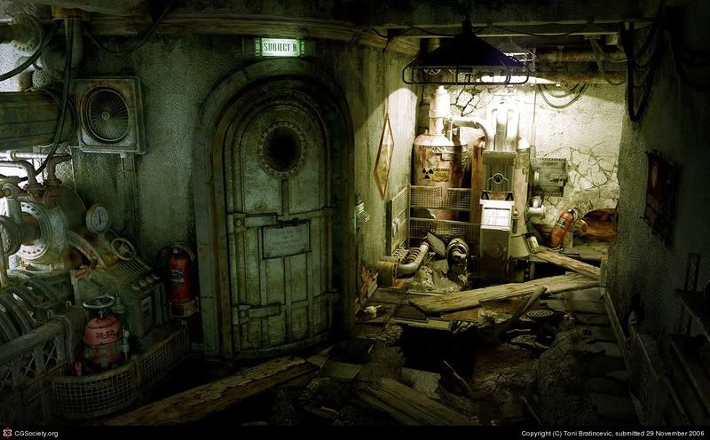
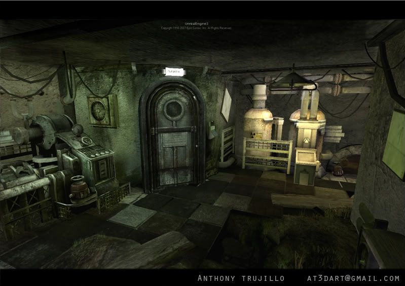
Heres a environment im working on. Comments would be much appreciated. Screenshot is in UT3. Ill post some screens of the assets by themselves soon. " im sorry for not posting concept earlier." I found this concept from my schools server and decided to replicate it in unreal.
conept-


conept-


Replies
I really like the stuff over on the left, and that door is nice too. I seem to recognise this scene, is it based off someone else's concept art, or a screenshot from a game?
The main thing I'd change right now is the lighting - you have a really bright light in the background on the right, illuminating some fairly boring boilers and pipes. I think the scene would be more interesting if these weren't so bright, and instead the lighting brought focus to the more interesting machinery on the left in the foreground.
http://www.interstation3d.com/maya/gallery/experiment.html
i think you could learn a lot from studying his environments colour pallette and lighting more.
Agreed. I consider it stealing not to mention such an obvious attempt at a copy. And then to put your name on it. Dude, not cool for a first post.
We do tend to assume all newcomers know the rules we only learned through experience.
We ALL make the same mistakes at first, so why don't we try to point out the mistake in a more gracious manner. This forum is a place where we all mentor each other through example, why not try to remember that when we point out we know the source of someone's inspiration.
Haha, I thought I was good at sensing sarcasm, but this made me unsure. :P
I agree with Kevin though. Inspiration is something very important, and you shouldn't be ashamed of being inspired. Like Picasso said; "Good artists copy, great artists steal."
I'm not saying you should go about stealing people's hard work, but I hope you get my point. Now I'm actually not even sure if I have a point. Anyways.. Just felt like bargin in.
Good job btw!
*Dummyyou put just a link or a name of Toni at your work.
*Disting
"Good artists copy, great artists steal." - lol , I like it and I'll remember this .
I confess that I don't hear it or I don't remember,... and that comes from Picasso. Shame to diZzy !
Life is wonderful , every day we learn something.
He took a render of a high poly scene and converted it to UE3, pretty faithfully. Nicely done
This looks to be inspired, not stolen...
If this thread doesn't descend into a feeding frenzy I'll be back later to post some pointers on how to push it closer to the ref.
Im pretty sure your reply was aimed at me Kevin. I think i pointed it out in quite a forgiving manner because i appreciate we all started somewhere, most likely in the same way by being inspired by others, theres nothing wrong with that. However, as i said, it is curteous to credit others where credit is due and this is what i pointed out.
It would have been easy to jump on the band wagon but i appreciated the fact it was his first post and credited the originator for him. I also gave what i think to be constructive criticism interms of lighting and pallette.
Im certain, from my own perspective, my post was nothing but credit where credit is due and constructive crit regarding this gents rendition. If you interpreted it in another way then well, apologies. It goes without saying that this is a place for mentoring as im sure we have all developed through critique and guidance from others.
A bit over the top really, especially considering he hasn't even posted a response to any of the comments yet. They guy has 1 post, settle down.
Back on topic though...
Seems like you have some pixel density issues...mainly the left and right wall having a low res/muddy normal. I'd also lay down a few more cuts on the hanging wires, to lose the jagged silhouettes.
One thing I would try to incorporate into the scene is the same cluttered jam packed look of the original, right now everything feels kinda uniformly spaced out while in the ref its all jammed together.
Also, what everyone else said about the lighting and the texture density and the spacing and the gliven. o.o
Kevin said it best. Leave it at that. We learn and move on.
dummyyou, if you're still working on this, I would dim the lighting in the foreground like the original artist did.. leaving more light in the background. Also, try bringing the right side wall closer to the door. Shrink the room a bit so you get that more "confined" feel you get when looking at the original concept. You could also scale down the size of those tanks in the back, and bring them closer together. Good luck.
Cheers!
Let's not start screaming witch and burning people on the cross ey?
Can't wait to see more updates on this.
On its own this environment is pretty good, nothing spectacular but it stands up on its own. Because its soooo close to the inspiration, when you see both of them compared it becomes really easy to pick out the things that were done better in the orig. This is stuff that normally wouldn't be noticed(or at least not viewed so critically).
So i think its definately worth thinking about when you're thinking of recreating a peice, if you do anything less than the orig, you're just showcasing what the other person has done better than you. I think in these cases its better to take a different approach, and do something similar, but take some time out to make it unique, make it your own so you dont draw those direct comparisons.
Wow, you don't mince your words, do you! That's like saying that the model produced from a photo reference that someone else took a picture of is stealing because you didn't take that picture.
Anyway I like the scene but think the lighting could do with an overhaul and that the right hand wall is a bit bare. Keep going and keep posting
On a side note, I wish the shadows and ambient colors are worked on a bit more. Ditto on the texture density.
Very well said! You're absolutely right.
edit: also, I would suggest adding just a few extra loops in those hanging wires so they are not so obvious as low poly geometry
Keep it coming
Vj