Poly Gangster
Hello
This is a model I started last year. Something I'm trying to get finished.
I wanted to create a low poly version of a Mudbox sculpt that I had previously done; fully textured using colour/normal/specular maps.
This is work in progress at the moment, and still needs a lot of work; but i'm posting it here to get some crits and comments before I go any further.
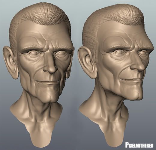
MUDBOX SCULPT
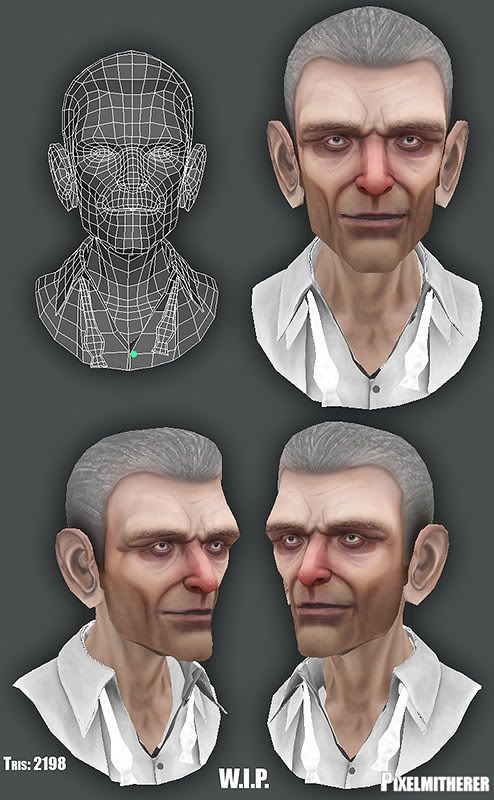
TEXTURE - FIRST PASS
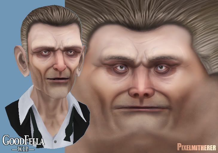
TEXTURE MAP
This is a model I started last year. Something I'm trying to get finished.
I wanted to create a low poly version of a Mudbox sculpt that I had previously done; fully textured using colour/normal/specular maps.
This is work in progress at the moment, and still needs a lot of work; but i'm posting it here to get some crits and comments before I go any further.
MUDBOX SCULPT

TEXTURE - FIRST PASS

TEXTURE MAP

Replies
The skin has a really nice soft feel that I like though and I could totally see this as a character in a pixar film. Keep going man!
Only crit I could give is in the geometry. I would move those triangles that are above his eyebrow area closer to this hair line. It seems like he would have a lot of exaggerated eye expressions. Those triangles might cause slightly odd deformation if he were to be animated.
However it seems like you're rendering the textures "fullbright" at the moment, which seems a bit weird if it's a normal-mapped asset? Basically I much preferred the detailed, "deep" look of the sculpt, where all the features were nicely exaggerated - I can't see that at all in the textured version, it looks like it might as well just be a flat diffuse texture with no normal/spec... but I suspect it's the way you're presenting it that's giving that effect.
Would be interesting to see how he looks with just the specular/normalmap (no diffuse) and a single point light in the scene (no ambient). I think it would look really cool, because the sculpt has all that nice detail, the normalmap should hold that really well.
Just a small update, been very busy recently so not got as much done as I would of liked to on this. But never mind.:\
Working into the colour map a little.
Next steps: finish off colour map and test out in a game engine.
BradMyers82, Em: Hey thanks. Following both of your suggestions and trying to get the ears to blend into the rest of the face, not quite there yet but improving a little I think.
zerafian: Thanks for that, point noted.
MoP: Thanks, I should of explained it better I'm using a temp spec map that I quickly created at the moment. These shots have only have the colour map on at the moment. Hopefully sort the spec and normal map properly soon. Cheers for comment always helpful.:)
MoP, just for you here's the a screenshot of the low poly mesh with spec/normal maps in the Maya.
i am second, who waits normal mapped+textured version.
Low poly version with colour / normal / specular maps.
Screen captured from Maya.
have u done the mouth interior, teeth and tongue?
ultra: Hey Thanks. No, I didn't do the mouth interior, teeth or tongue. I'll probably attempt those on the next model I do.
Here's the different development stages of the colour map for those who might like to see it...