Electric Demise
hey guys. started another environment with a couple of friends.
heres the concept by John Wallin, hes a great concept artist. http://www.johnwallin.net/site/main.html

heres some progress we've made so far. only worked a few days on it.
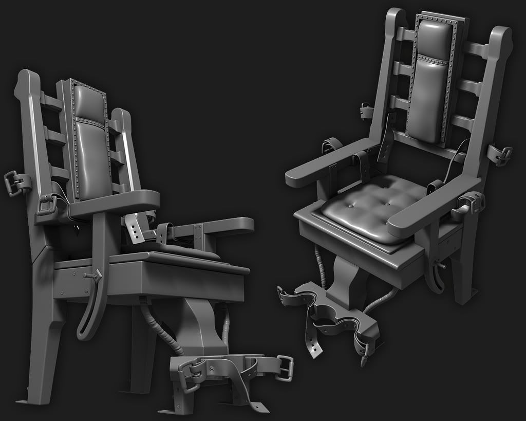
this is the highpoly of the electric chair thats going to be in the scene. I used X-Convicts material tutorial, its pretty cool. gonna get the camera to move in closer to it to appreciate the details.

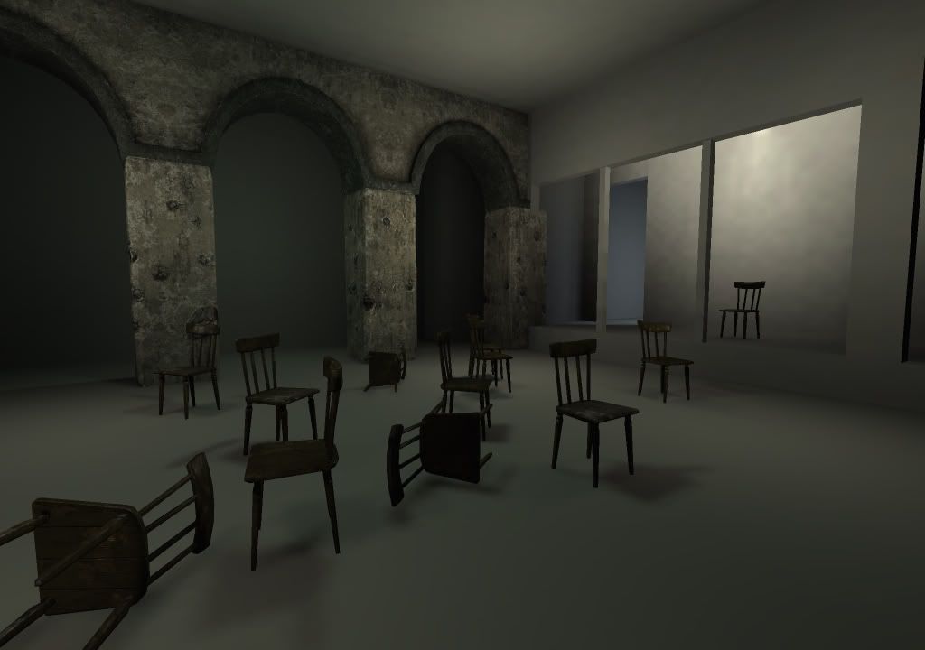
my friend already made a wooden chair, the pillar and arch.
heres a shot of the scene in UE3 so far. very early stages.

heres the concept by John Wallin, hes a great concept artist. http://www.johnwallin.net/site/main.html

heres some progress we've made so far. only worked a few days on it.
this is the highpoly of the electric chair thats going to be in the scene. I used X-Convicts material tutorial, its pretty cool. gonna get the camera to move in closer to it to appreciate the details.

my friend already made a wooden chair, the pillar and arch.
heres a shot of the scene in UE3 so far. very early stages.

Replies
maybe tweak the doorframe in the background (the one next to the electric chair) and position it in a way so it is "framed" by the extends of that window in front of it, that'll make the composition more interesting.
but the electric chair itself is really good. Only thing I would add is a bit of wear and tear to it, like scratches in the wood etc.
Vj
Tri count is at....2884
jk the projection came out nice. Texture it up!
I wants to see moar!
Excellent chair. I have a problem with smoothing errors too. You just have to make the best of it. Besides once you texture it you barely notice those errors in a still shot, but in game you might have some problems.
on the lowpolygon model **slightly** harden your normals, if your using maya go to normals>set normal angle and try to get a number where the hard edges are just starting to disappear. then generate your normal map.
i had this issue with my last model and found this cleared it all up nicely.
then again i think a texture would cover it nicely enough
That made me think, why would they even put a pad on a electric chair? To make it more comfortable? Guy is about to be fried with electricity, but at least his but is comfortable before hand... It's like swabbing the area with alcohol before inserting a needle used for lethal injection.
Love the hp model.
what do you guys think?
i used this as reference.
As for the leather on the seat, well you could add some poop and piss stains, I mean those guys get diapers on because they tend to let everything go once the eletricity hits. But maybe after many, many uses some stuff leaks trough. Sooo...maybe some slight stains like that.
(yeah, maybe weird, but its about history and authenticity peeps!
so heres an update on our scene. the only asset i made for this scene was the electric chair, the tiles, and the little rubble pieces. partner made the rest. but i put them all into unreal and did all the lighting and materials and stuff.
anyway. i think i can push it a lot more.
I like your lighting so far but don't leave the area past the arch black, the concept has a door there and it would be cool to stick to it as much as you can as it all works really well. You can definately push the brightness a bit too, start to get some bloom (not too much though!) from those bulbs.
If the chair is the focal point of the scene, you might want to change your composition slightly. As it stands it's in the middle of the image slightly to the right, maybe bring it up so it sits on a third and draws more attention. Lighting it a bit brighter could give it more focus too.
It's coming along well, keep it up
And yeah, it probably needs to have a little more brightness. That back area is pitch black and in the concept, there's some stuff going on there so I'd work with that area and also add the bookcase. Also, it looks like you've got those cables running along the wall above the windows, but it's hard to notice them.
I don't think this involves the lighting, but the broken glass on the windows should be more noticeable as well. It's hard to tell that there's any of it in the first shot. You could probably make the broken pieces bigger and that would help the glass pop out more.
It's coming through though...just push it more like you said!
Where you've taken this shot from seems like the room is a lot bigger than in the original concept.
Can't wait to see it finished!