Space Marine Powerfist and axe
hey guys
first time poster. did these for a class project and wanted to get some critiques and some techiniques to improve my modeling and textures.
i had some trouble with the color of the crest, mainly in the creases.
any thoughts?
thanks
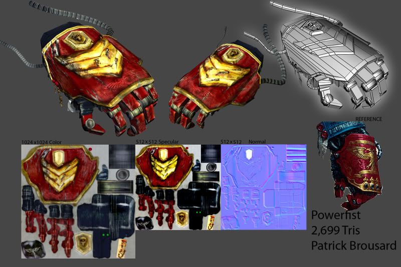
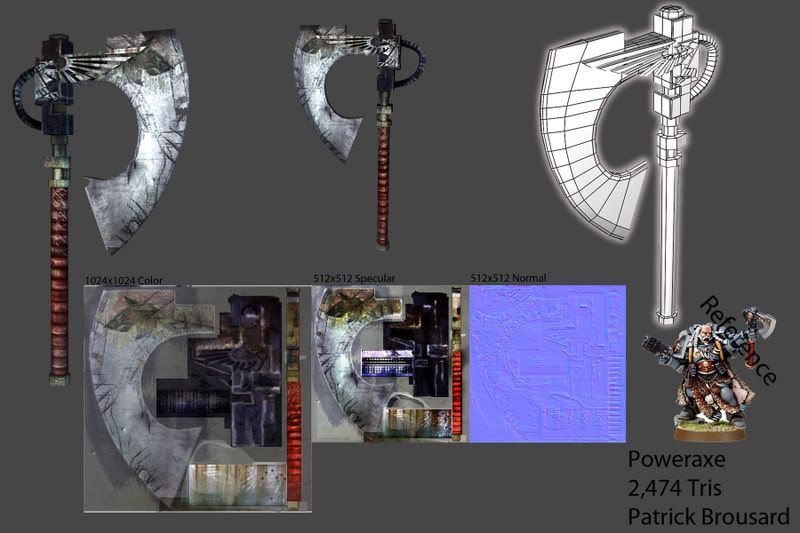
first time poster. did these for a class project and wanted to get some critiques and some techiniques to improve my modeling and textures.
i had some trouble with the color of the crest, mainly in the creases.
any thoughts?
thanks
Replies
The damage on the Axe blade looks nice. I can't see much of what else is going on.
One thing I still don't understand is this infatuation with texture resolution sizes and specifying them as such. It's not just you, a lot of people do this. It takes no skill in turning a 2048 into 512...it's just a quick Bicubic sharpen. I want to see the texture work huge and in my face. I don't care when people state the size of them. When working for a company the LOD's can always be made later.
But you get bonus points for an awesome user name.
EDIT: Upon further inspection, it looks like you just crazybumped/photoshop filtered your normals? Looks like you didn't go that route on the specular. The axe specular looks cool from here.
The normal map is a mix of z brush and a photoshop filter overlay. i dont have a strong understanding of creating clean and good normal maps. does anyone have any techniques you could share with me?
Thanks