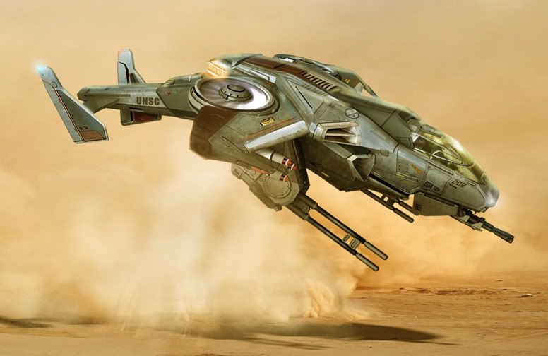
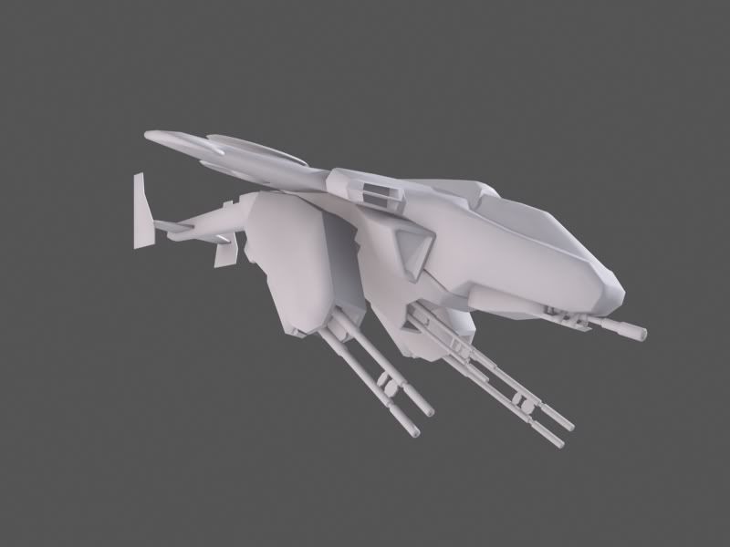
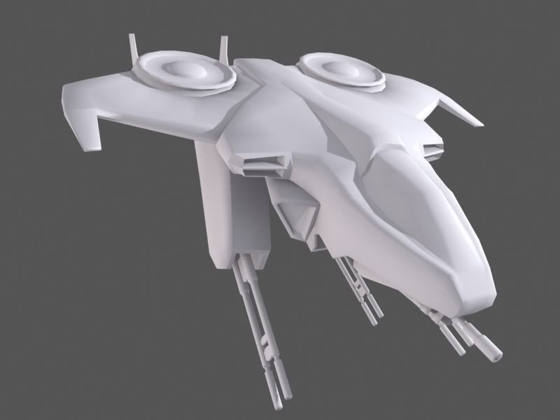
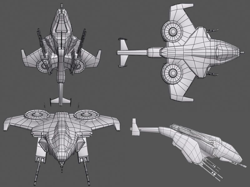
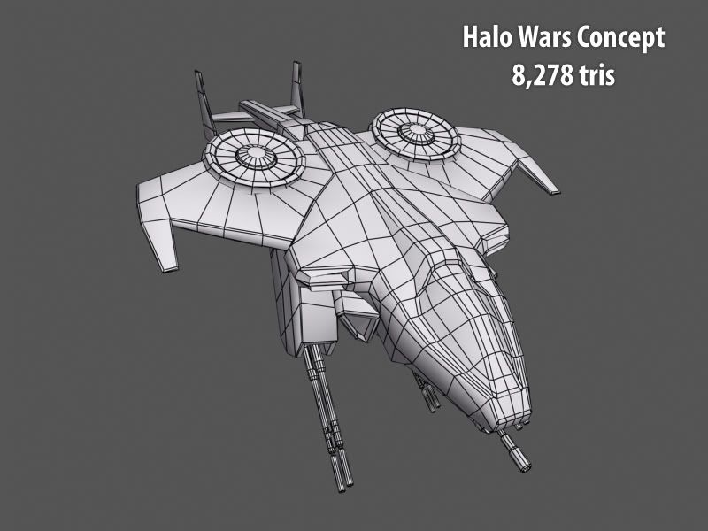
Working on a new model. Grabed the concept from the Halo Wars website. Almost done creating the mesh before I start unwraping so any crits are welcome. Also planning on creating a highpoly mesh and then projecting mapping it onto the lower poly for the normal.
Ya he obviously needs a lot of such details,which Nvidia filter or crazy bump should be able to give easily. Any way Good works so far on the high poly.I wager to see the bake on the LOW poly and the textures!!
Keep it coming
Vj
maybe its just the angle of the concept art, but it looks like the rear stabilizing wings are angled out a bit more. Like they are pointing at 10 and 2 o'clock instead of perfectally vertical. Other than that its pretty awesome man, keep up the good work!
Thanks for the responses guys, I tried to address most of the concerns. Haven't had a chance to work on this for a while and been working on the textures abit. Planning on adding the missiles and left some texture space for it, as well as making those crucial changes to the geometry. Let me know what u guys think so far.
Good base, but at this stage the diffuse is at a point where it looks like you are not confident/Not sure of what you are doing. Advice: on certain edges widen the scratches/ tears on it. Also on the scratches have a dimmed Grey color for the scratches THEN depending on your light (remember keep the light source consistent) use white with a brush that has a settings of 'Shape Dynamics' checked, 'Other Dynamics' checked, click inside Other dynamics, put both tabs to "pen pressure" and where the light hits make an oval shape and then gradually thin it out across the edges.
Ok so I'm trying to finish this before dw. I add more grunge to the diffuse and made the scratches bigger and more apparent. I also added my spec and normal map.
Replies
now keep going to the hi poly
Here are a couple renders of how the highpoly turned out will have low poly with normals soon. Please let me know what you think.
I don't know if you decided not to put it in but I thought I would mention it just in case. Looking good overall though. Keep it up!
Keep it coming
Vj
get crackin sucka
engine inhale is facing straight forward, should face more sideways.
keep is up
cheers!
More highlights on the edges! Good Luck