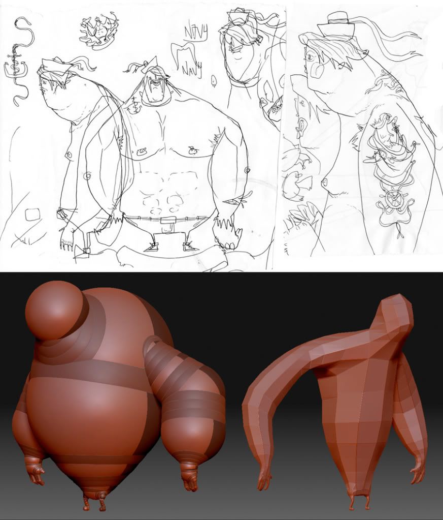
Sailor Terry(WIP)
This is my first post and first attempt at anything 3D, I was motivated to give it a try after a recent collaboration between myself and Tyler Wilson.
I watched a bunch of zbrush tutorials by Jason Welsh and some others I found online, then got stuck in.
Didn't really plan this character too much other than a very rough idea, its intended as more of a learning curve.

Any feedback would be great, as this is a start out.
Thanks...
Gauky
I watched a bunch of zbrush tutorials by Jason Welsh and some others I found online, then got stuck in.
Didn't really plan this character too much other than a very rough idea, its intended as more of a learning curve.

Any feedback would be great, as this is a start out.
Thanks...
Gauky
Replies
You should post some of your 2d art here like the reference for this guy. It's a bit out there so your originals will help
Having a more in depth understanding of anatomy will probably help when you want to break the rules and do some funky stuff like this. Like the way the shoulder connects to the torso. Move down a couple divisions to 3 or 4 and work on the silhouette and muscle definition.
Backing up and doing a regular human naked guy might help since there is loads of real world reference to study.
The anatomy is a little off, but that is forgiven by the fact that its a unique style of character. However, the stuff is way too off in some parts such as the arms, shouders and fingers.
I would suggest to try to texture this and call it done. Then move into a different character. This time around, plan ahead.
Cool illustrations on your website!
I've reposted the concept doodle and zspheres above.
@Tyler - Hello sir its been a while, hope your well... I shall have a gander at some anatomy reference in future.
Oh... do you think I could get the farmer and swine when you next get chance. Thanks in advance.
As Raul suggested I've added some texture to the character, although when I clicked the polypaint to txt button, I lost the colors and it was replaced with a blank fill. Need to repaint it and work out how to save it out, as I'd eventually like the character to be covered in nautical tattoos.
Tis frustrating every time I hit one of those lack of knowledge walls.