Low Poly Hand Painted models
I'm working on a couple pieces with low poly counts and purely hand painted textures.
Also I didn't need to but wanted to practice conserving texture space and using lower rez maps but more of them, rather then just a giant 2048 like I have done in the past.
Anyway here is some progress so far on one of the buildings. Will have more updates soon, let me know what you guys think.
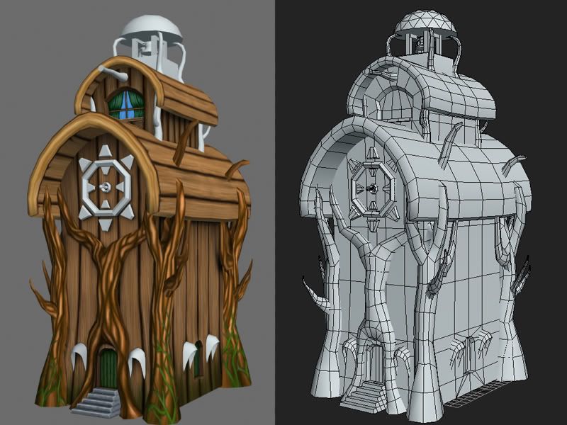
Also I didn't need to but wanted to practice conserving texture space and using lower rez maps but more of them, rather then just a giant 2048 like I have done in the past.
Anyway here is some progress so far on one of the buildings. Will have more updates soon, let me know what you guys think.


Replies
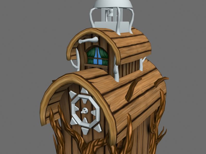
Also, from a technical standpoint, I think that model could use a LOT of optimization. I'm seeing wasted polys all over the place. I'm also not sure about the clipping of the branches through the roof. Those seams are a bit jarring once they are painted. And the nature of your painting makes it difficut to compensate for that in the texture.
Naturally, the polycount is going to be contingent on what this model is going to be used for. If this is going to be a centerpiece in a town environment, then the polycount you are using is probably fine.
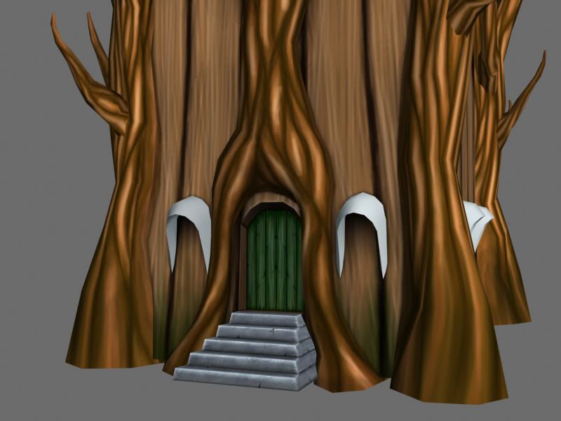
Any how here is an update on my textures thus far.
Looks nice so far, though the roots through the roof is odd, if you can't fix that in the texture due to reused UVs, maybe some really low geometry could be placed at the intersection, textured to look like breaches in the wood.
I also put a few of the texture maps i used on here as well as the concept. I have a lot of unused texture space, but I mainly wanted practice hand painting my textures and not so much for optimization in this model.
One specific problem I encountered was trying to get the detail in my textures to look as detailed on my model. So if anyone has any advice for this problem, I would appreciate it.
You'd do your paint-skills far more justice if you were to put some more thought into your colours. Since I'm being quick and lazy here, I'm counting on my fellow polycounters to make this post more useful by adding examples of colour-choices done right
Essentially, think about light and shadow, and which colours they'd pick up along the way. Is there a strong ambient colour in your scene? If so, why are your shadows black, etc...
edit; for a quick way to see what it'd look like, you can put a layer on overlay, fill it with a random colour, double-click the layer and set the blending (drag the absolute bottom white slider to the left untill the overlay only effects the shadows). Then ctrl-u (hue/saturation) on the overlay layer, and play around with different colours and stuff untill you get something you like. Do the same for mids and highlights. This is no substitute for having actually painted them this way, but it's fun to play around with, and it'll give you an adequate idea of what works and what doesn't.
Alt-clicking the black and white sliders in your blending options allows you to break them into two handles, by the way. This allows you to smooth the transition.
Here's a good tutorial on how to use it (in more clear terms than I've explained it, haha) http://www.cgtextures.com/content.php?action=tutorial&name=blendif
Also when you say I shade with black and white, which part specifically do you mean, because most of the time I do try to shade with color. However I do use black and with to get the details and highlights, like the cracks on the wood. Just wondering which part of the painting you were referring to.
You said you did this mainly for the fun of doing hand painted textures and you weren't worried with optimization and I can appreciate that.
Your pixel density is really inconsistant, your front door has almost as much UV space as the whole front of the house. It's good practice to keep your pixel density consistent on environment work.
you can devote less uv space to stuff that the player will never get close too, like the stuff on top of your building but don't go too extreme because you never know if it's going to be placed in a way that a character can get up there or a cinematic camera will put the low rez area front and center.
I also think you could reduce this to:
wall wood plank tiling texture
roof wood plank tiling texture
tree bark tiling texture
1 or 2 unique items/trim texture
then you can make multiple different houses with the same textures