The BRAWL² Tournament Challenge has been announced!
It starts May 12, and ends Oct 17. Let's see what you got!
https://polycount.com/discussion/237047/the-brawl²-tournament
It starts May 12, and ends Oct 17. Let's see what you got!
https://polycount.com/discussion/237047/the-brawl²-tournament
Claymore Mine critique
Hey, I started this mid-way last week and just got done with it. I need some feedback on it before I can put it up on my portfolio. I spent the last month or so) going through every tutorial on this site and linked from it. I hope I'm going in the right direction.
Texture size is 1024x1024. My friend says I should make it smaller, but I want it to be held by a character in first-person view. Do you think the size is fine?
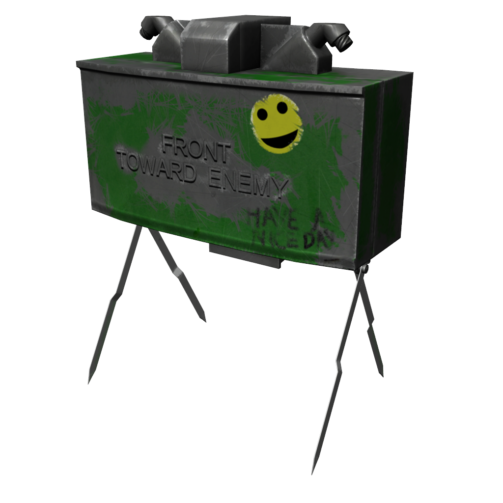
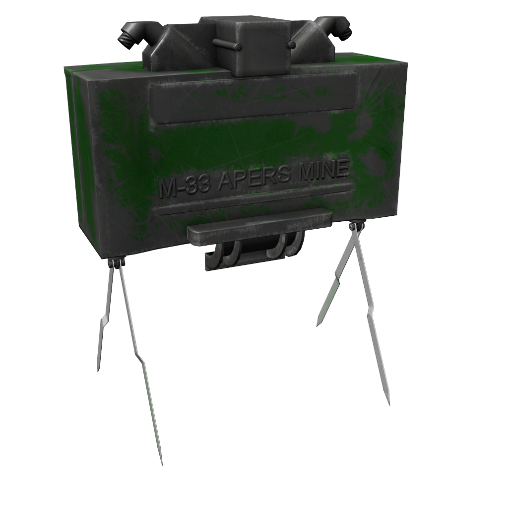
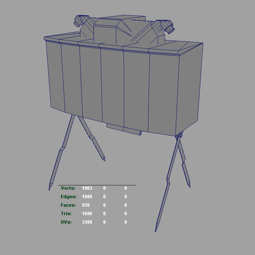
Texture size is 1024x1024. My friend says I should make it smaller, but I want it to be held by a character in first-person view. Do you think the size is fine?


Replies
Also you poly distribution could use some work, it's very dense in some of the cylinders compared to the bulk of the model, but that is debatable and more of a personal preference.
It's also a bit thinner (front to back) than yours. You've got a good start, but gather some reference and keep going.
Also, never ever hold the blasting cap with your teeth.
first of all, as tumerboy said already, theyre plastic.
but even if they were metal, id ditch the neon green you have there. thats like a giant red flag (errr green flag) for the enemy saying "hey look at me!". and your scratches are really random.
youre heading in the right direction by having scratches at corners and edges and stuff but i think you overdid it. dont do it at EVERY edge... it seems very mechanical now.
which brings me to the model. its very flat, even though its 3d. its pretty much a box with minor details on it. a real claymore is not a box, it has subtle curves that define it. it doesnt have sharp edges like yours. (unless its a sword