The BRAWL² Tournament Challenge has been announced!
It starts May 12, and ends Oct 17. Let's see what you got!
https://polycount.com/discussion/237047/the-brawl²-tournament
It starts May 12, and ends Oct 17. Let's see what you got!
https://polycount.com/discussion/237047/the-brawl²-tournament
Quarantine Final
Download link: http://www.moddb.com/mods/extinction-map-pack/downloads/quarantine-map
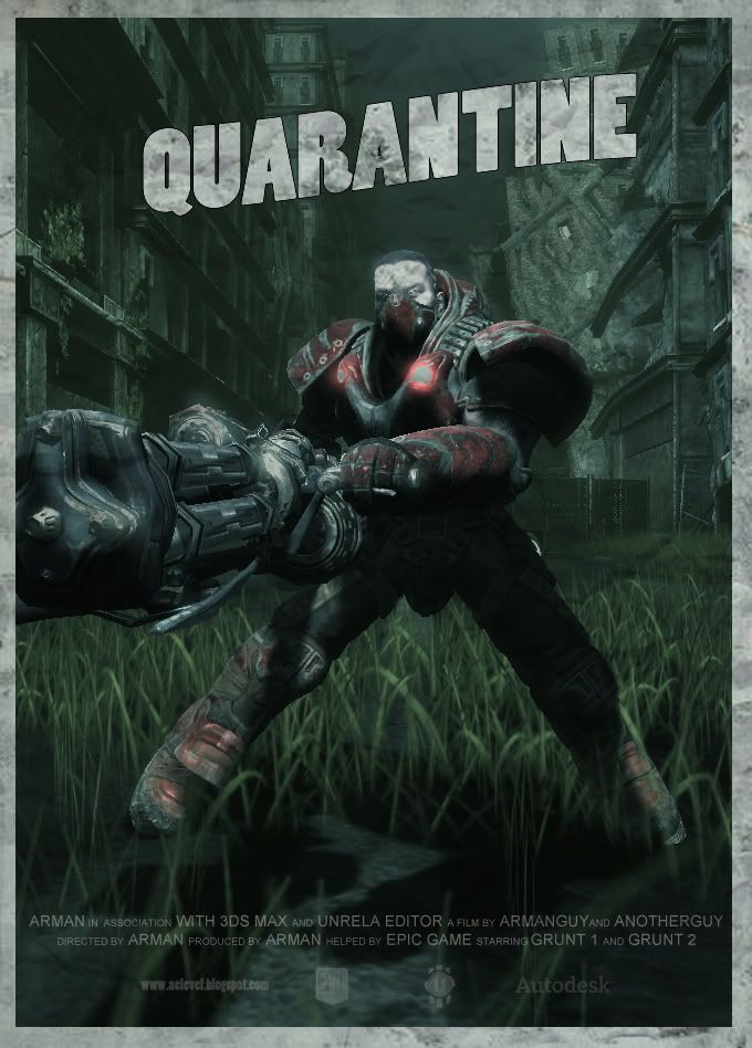
The first in the series of releases, quarantine is a "small" dual map made to be visually appealling. look for more info on my moddb page.
http://www.moddb.com/mods/extinction-map-pack
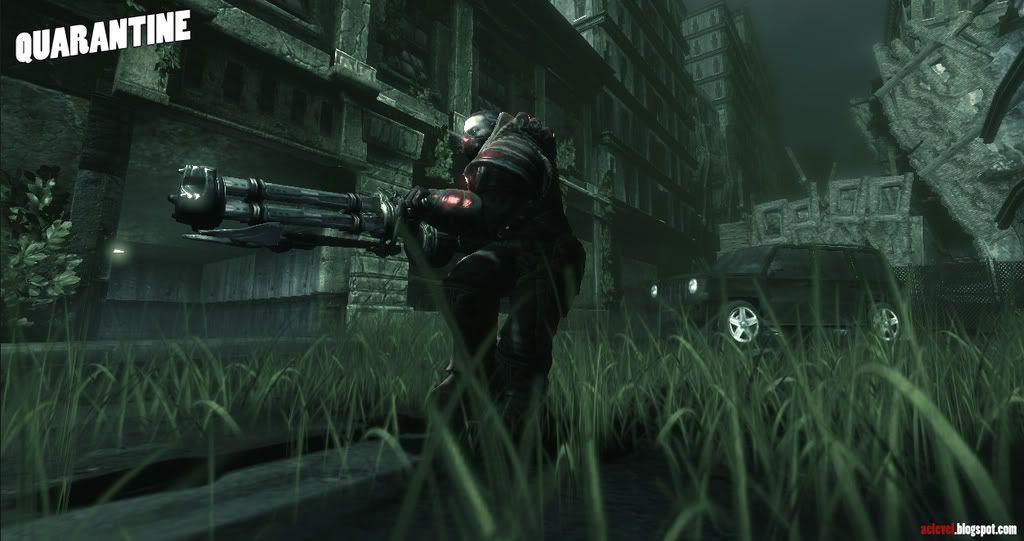
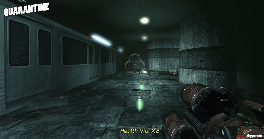
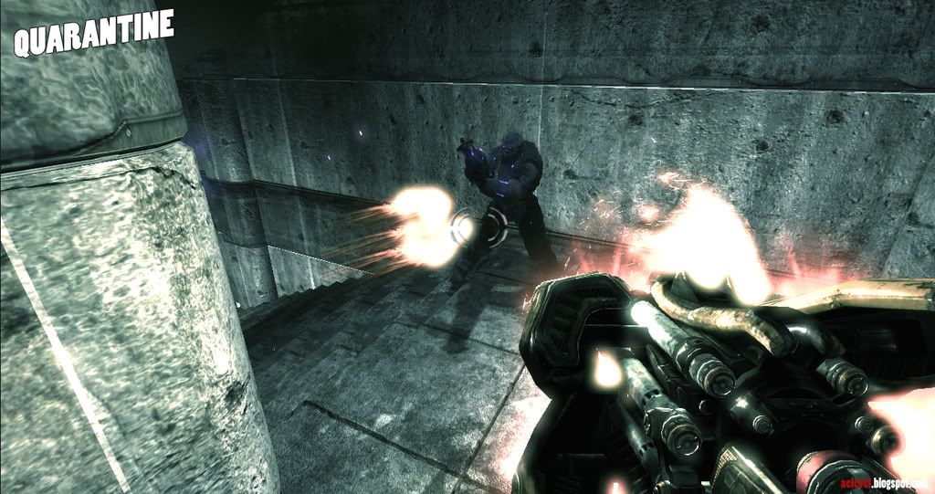
More screens coming!

The first in the series of releases, quarantine is a "small" dual map made to be visually appealling. look for more info on my moddb page.
http://www.moddb.com/mods/extinction-map-pack


More screens coming!
Replies
it looks amazing man
great stuff
id like to thank everyone for there help and doylle over at game-artists who helped me cook the map properly.
i am looking for a junior artist position at the moment so if your studio is hiring any juniors please send me a PM
btw, you spelled duel wrong. unless...theres another spelling that i dont know about hehe.
@00Zero: hey zero alot of it is stock Epic artwork but theres also alot of custom textures and props i made also. now that i have a set of existing props at my disposel my next map will have less stock assets.
i think everyone here can say that building a map from 100% custom assets is a ton of work :P
There could also be a little more interesting points. It looks all quite the same.
Ya, so much for now. Hope i did not forget something in the last 5 minutes -.,-
First off, the collisions need some tuning. I know it was said above... but I had never got stuck. I just thought that you should be able to jump over the jeep. And also in the beginning, while you are in spectator mode, you can fly anywhere. I don't know how exactly you change that but it might be something you want to look into.
Second thing is that I was experiencing some texture loading problems. For example the grass would go low res too noticeably. Maybe change it somehow that everything goes low res when you are further away from it. This may be due to my settings... but considering I had to reinstall and the only setting that I changed was the resolution... you might want to take a look at it.
Other than that I really don't have anymore comments that are more focused on the art side of things. The art was very nice and I like how everything came together. I do suggest that you work on the gameplay a little bit more on your next map (I'm here to help test if you want).
Oh and I liked the Fallout 3 poster!