The BRAWL² Tournament Challenge has been announced!
It starts May 12, and ends Oct 17. Let's see what you got!
https://polycount.com/discussion/237047/the-brawl²-tournament
It starts May 12, and ends Oct 17. Let's see what you got!
https://polycount.com/discussion/237047/the-brawl²-tournament


Replies
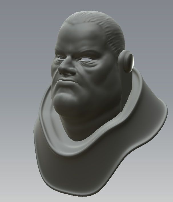
Edit : He looks stylised too, not generic, that is a face I could remember!
If you wanna go cartoony, really go cartoony I say. Style it up more. Use broader, simpler shapes. Minimize your detail, but maximize your content, if you know what i mean.
shitty 5 minute paintover:
that just cracked me up hard.
nice work btw, I do agree that it's stylized but it's a compelling character; keep at it!