Half-Life Project
yo everybody. breaks over, back to school. my first project. its another 2 man project. this time we're trying to remake some stuff from half life 2 (but more current gen looking). i took a few screenshots of the game and bashed them together to create a frankenconcept. the perspectives dont even match up of the different pieces, but its just a general guide for the idea.
have 2 weeks to finish this one.
*****this is a mockup of screenshots from half life 2******
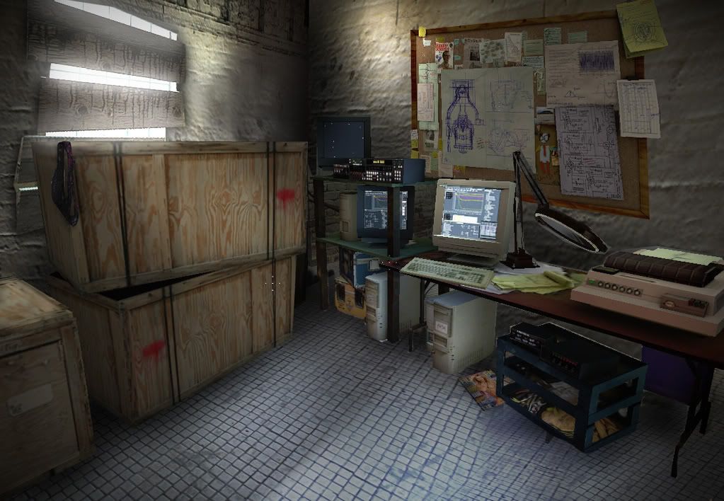
i started off with an old CRT monitor. i just finished the highpoly, will do low and bake and textures tomorrow. im gonna try to stay really tight with the textures and use nice spec and gloss maps.
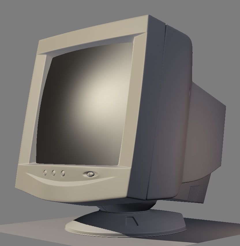
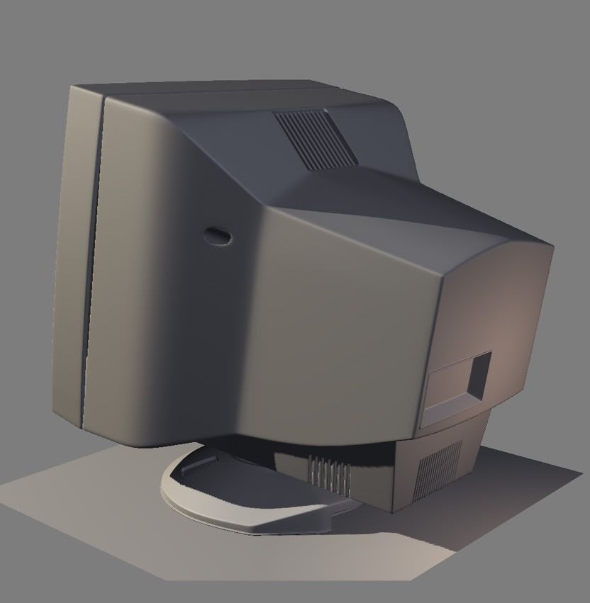
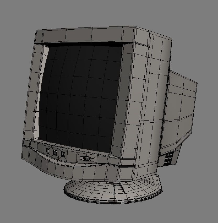
have 2 weeks to finish this one.
*****this is a mockup of screenshots from half life 2******

i started off with an old CRT monitor. i just finished the highpoly, will do low and bake and textures tomorrow. im gonna try to stay really tight with the textures and use nice spec and gloss maps.


Replies
not sure if i'm a big fan of that desk-in-the-corner composition..
do you think its a waste of polys to add an extra division at sharp angles to get a better normal map bake? i read the wiki and everything. ill post some before and after shots i guess.
theres a nasty seam on the front of the base. im trying to clean it up , but its a bit tricky since that edge on the UV layout is 45 degree diagonal.
gonna start the diff/spec etc.
it seems like some edges are "raised". like if you pinch them in zbrush or something.
the high poly looks excellent dude. i'd redo the bake using this tutorial, you'll probably get much cleaner results.
http://www.poopinmymouth.com/tutorial/normal_workflow.htm
im using xnormal to get the normals. and the only quality adjustments i can see for normals in there is the antialiasing (which i usually leave at 1x, id turn it off if i could since it blurs a lot) ill try to find out how to use supersampling.
oh and i fixed the seam. i exported the 'normals' off with that gw obj exporter in max 2009 to get rid of the seam... anybody have an ideas about that? leave it on or off? somtimes it looks better which it checked, sometimes off.
EDIT: ok, i tried a max bake instead. i used hammersley supersampling and yea, there is a big difference. i wish max bake wasnt so clunky.
complete with ass-kissery
i call it ....DONE
http://images1.wikia.nocookie.net/half-life/en/images/9/99/D1_trainstation_050002.jpg
HL2 is about humans being pushed to the edge of extenction. They can't just walk into PC World and buy a brand new monitor.
What, this one?
Are you smoking crack?
odium: my normal map has almost no noise at all. although i did add some noise to the diffuse to give it that beige plastic look. i think the buttons looks weird because they dont get enough res on the texture. ill try a higher res. (oh, the buttons dont have a cage..its just flat on the front there on the lowpoly)
MoP: thanks man, i put in too much time on this stupid monitor, nobody will even notice it. haha
oobersli: sadly that is the case. a few good folks though.
kaskad: i was going for the greasy fingerprints, but when you have greasy fingerprints and leave the monitor uncleaned for a few years, all the dirt and dust will stick to those parts much more and cause discoloration. i was just using reference pics of old monitors.
lord ned: its going into unreal. and thats waaaay too high. im sure it would handle it perfectly, but id be shooting myself in the foot anyway.
im going to start the computer case today. ill post updates soon. thanks for the crits everybody, will take into consideration on the tower, especially the normal mapping issues.
But, if zero thinks it makes sense, it's his call
lol-
nice model and textures man!
haha. unless....theyre monkeys. hmm...genius...i might go with it. a monkey laboratory.
A major problem I see with "env artists" these days is that they spend too much time working on small props and neglect the big picture. A good env artist should always spend more time on composition/atmosphere than on small details. That's why peris won the unearthly challenge - check his thread for some inspiration.
Don't get me wrong, the monitor looks good but it should be one of the last props you model really.
Uhh from the wire it looks low* poly, unless I'm missing something? *Probably high for something that size, but you get what I mean.
Great job zero. :thumbup:
good work, the dirt makes sense, time to get crackin on the rest. Don't forget Lamar...
its been a bit slow lately. i got this floor tile texture done. 256 tiling
and i got this table done. its one of those cheap folding tables with the fake wood veneer on top.
512 map on the table.
PS. do you know what a ****ing pain it is when your internet is crippled to 12kbps for 2 hours? it took me like 10 minutes to load the reference image. and i couldnt even play left 4 dead~!!!!! meh.
HAHAHA!
I think the floor and table looks pretty good, and your hipolys look clean too. Just the baking that's a bit iffy, I'd expect to see better hilites on the edges of those folding arms underneath the table for example. Keep at it though, it's a nice project.
eq: lol
vrav: i know what you mean
thanks rasmus, your tunnel environment is very enjoyable to look at. i can really learn a lot from it.
yea ill work on the spec for the table, seems very "first pass" i think. i just couldnt get that excited about a table to really go all out on it. will do.
anyway, heres the finished keyboard. 256 texture. the geo on top is flat, i just let the normal map simulate the keys as best it could, i dont think its worth having multiple extrusions or even one big chunk for all the keys.
its 92 tris because i put in a couple of divisons near the side edges so it would smooth correctly.
i will admit, i havent done anything to the bottom yet, ill do some stickers and stuff as soon as i find an old keyboard laying around somehwere to see what it looks like underneath.
oh yes, this is waht i used for reference.
One thing that i would REALLY encourage you to do is start modeling your props in sets. So instead of doing a highpoly for a keyboard, and then lowpoly, and then uvs, and then bakes, and then texture. Then get to a different model and repeat all of those steps you do this:
Model Highres monitor, computer, mouse, keyboard, chair, etc. Plan to put these all on the same texture map. And you can get it all done in passes, one pass to do the lowpoly, one pass to do the UVS, one pass to do the bake(bake all at once in the same scene! this will save countless time setting up and doing multiple bakes). And finally texture everything at once, in one PSD. The time saved setting up each little PSD file, and doing each bake per object is worth its weight in gold alone, along with some other efficient benefits you will notice once you get used to working like this(detailing objects out to a consistent level, having that sort of bar set, so you do not spend way too much time on a very small detail, you can look at it the amount of time being spent compared to the level of detail on similar props).
The less you treat each prop as an individual model, and more of simply a part of a common set, the faster you can whip this stuff out.
I also find that when i have a whole bunch of stuff all on one texture sheet, its very easy to keep consistent, unified materials, and it helps to stop me from spending 3 days detailing a small prop, and ignoring something else, because i have it all here, visible on this single sheet in PS.
I like to seperate my "sets" into material types, so say you have a bunch of metal props, put them all in one set, a bunch of plastic props, put them in another, and a bunch of wood props, again in another. Now of course you'll have props that have multiple materials, so i try and use some judgement here, and just organize based on the dominant materials. This will allow you some freedom when setting up your material files in game/max/etc, because not all materials will have the same specular properties, reflection properties, etc.
Another good part about grouping things into common textures, is that when it comes time to render all of this stuff in game, if you can group multiple objects into one, it will render a lot faster than if you have a bunch of different props, each with its own material.
Now, as far as spending too much time adding details that may or may not be seen, i encourage everyone to do this is much as they can, for a pretty simple reason. The more you take on challenges like this, the less of an issue it will become. It will turn from "Do i have time to model this?" to "It would be a waste not to model this, its so easy!".
But seriously, during the course of a game how many people are going to stop, look under the table and be amazed at the normal mapping on the hinges? How long did it take, is it really worth it? Could the same effect hold up at many more angles and be done in less time with a few more polys?
Some times its easy to get caught up in what we see zoomed in on every vert and forget what the players will see and for how long they will see it. Why go nuts on details if you're the only person that will ever see them? Especially when it could be at the expense of other things that are much more important to players?
A big part of what I do and I'm sure others do also, is manage their time effectively...
Err I mean... ur doring it rong fuckwadz!!1
actually, we tried to do the same thing as an experiment at this place i interned at so we put a whole city on one 4096 texture page to see if it would improve fps because it only had to call on 1 texture. i dont think it helped out that much, but thats probably because the ENTIRE level was on one page.
but for a few similar objects it would be very helpful. thanks.
vig: yea, i need to start working smarter/faster
I think you can too quickly get stuck in a rut where you are consistently under-estimating the value of adding quick little details like that, and not letting yourself go to that level of detailing is only hurting your own skill in the long term. If you really have to question the idea of spending, oh what, a few minutes to make the highpoly model, a few more minutes to make the low, a few for the uvs, then i don't know what to tell you. If this sort of work is taking hours, to model a hinge like he has, i think you need to worry a lot more about your general efficiency than what the player may or may not see. In which case i think its pretty easy to make a point of the importance to practice doing these sorts of excersizes, instead of ignoring them.
but i was wondering i could handle all those highres objects in the same scene. anyway, ill hold off on the lowpoly for this like you suggested and model another object highpoly next.
anyway, this is a CB radio.
this is the reference
EQ, That's pretty much that's my point... with an important caveat: Add details like that where they count. Don't bother wasting your time to detail the under side of a rock if its never going to be turned over.
Just because you can pack the details in there, doesn't mean you should always do it to every little thing.
If you want to make master works of art that only pay off after you die, take up painting.
If you want to make quick fun shit that people ignore but pays the rent, then take up game env art.
Keep things in perspective and yes work quickly, but also work with resources in mind, the extra time on inane details added up over the course of a project might mean more objects could have been created? Multiply that across an entire team and what could be done?
Also if this was for Source (or any other engine) you can easily handle that level of detail with a LOD and it would look better when you get close enough to appreciate it.
I'm not saying to ignore these types of exercises or never do them, practice is always great, but pack them in where they make sense. Don't waste time in areas players aren't going to see, and make sure that if you make a great set of hinges that everything gets that level of attention and that you have the time and resources to do that level to everything.
I agree with your suggestion to do things in passes. That can be a smart move. But it might make the scene hard to handle with all those objects in the same file? Any suggestions on handling that? I can only think of a handful and they're kind of messy.
If using 3ds, use the LOD modifier or Xref with proxy mesh.
Turn on bounding boxes.
Build an monster machine?
I disagree about your suggestion to gang up the textures into one sheet to start. That isn't a hard fast rule. That can work if you never plan to separate the objects. It can quickly backfire if the tiny objects share a large texture sheet get recycled by themselves. That works well in some cases like with modular buildings. But for props as individual as a monitor, keyboard and table, they all could be placed independently at any time.
Often props get created as you go, things get recycled and you never really know what all the purposes are going to be when you create it.
At any point we're just talking about rearranging UV's and its as simple to compress them to one sheet. Keep in mind though, it is better if pieces start out big and go smaller, so in general it might be smart to break things up to separate sheets and then if it makes sense at the end of the project, gang them up when you know exactly how the props will be used.
Its easier and quicker to gang things at then end of a project if there is an issue. Then it is to rearrange all effected props when you need to break something off, not to mention you either downsize the texture, or up-res the pieces, or just let the wasted space sit...
great work! keep it coming!