Home 3D Art Showcase & Critiques

Rustic Door

polycounter lvl 9
Offline / Send Message
timwiese polycounter lvl 9
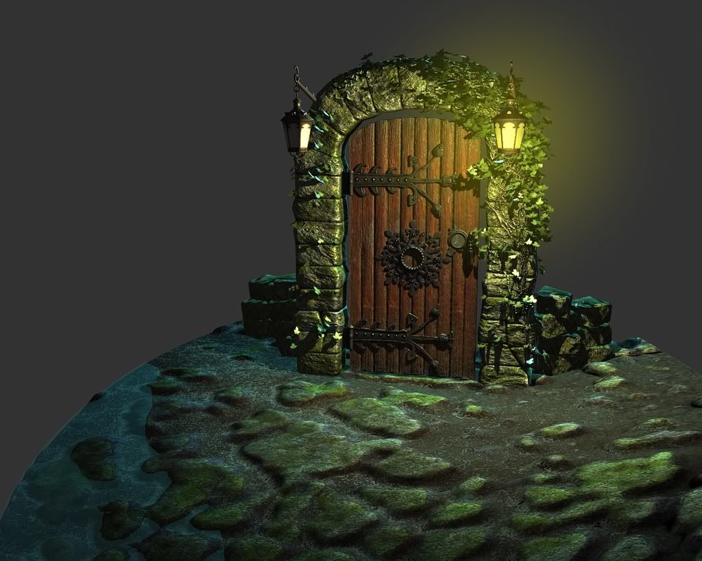
A door I've been working on for the last few days. I think the only thing I have left to add is plants growing out in front of the archway.

I've been looking at it so long that it's hard for me to tell if anything looks off at the moment.

So here it is.
gardendoorRender10.jpg


I will post wires and textures if people want to see it.

Feedback is greatly appreciated.

Replies

  • kite212
    Offline / Send Message
    kite212 polycounter lvl 16
    i really like door, i like the cast iron pieces, idk if its just me, but compared to the door and arch, the ground seems kinda off
  • dejawolf
    Offline / Send Message
    dejawolf polycounter lvl 18
    yeah, this is a great piece, but the ground just ruins it.
  • SnarG
    I'm in agreeance with the others above me. Awesome job on the door, but it's just not clear what the floor is meant to be.

    If those stones in the ground are supposed to be natural then they're very flat and soft looking, and if they're supposed to be man made then their shape is far too irregular. Personally I'd really like to see a nice cobbled floor there. But I do really like that door.
  • odium
    Offline / Send Message
    odium polycounter lvl 18
    The floor is clear to me; Moss covered rock, blended into the ground with some water next to it.

    However the water is very poor, classic "Blue" water. make it more fancy, edge fading, reflections, sparkle that kind of thing. The ground is poor in contrast to the door because it lacks defination and all seems to blend into one object.
  • pestibug
    Offline / Send Message
    pestibug polycounter lvl 18
    Yeah, I had no problem seeing it was this eroded moss covered rock. The only problem is that it doesn't really fit the way it is executed now I suppose, because it does look 'off'.

    Also, like odium says water also doesn't help very much.

    Add some harder rock bits to the ground, perhaps have some vines and leaves on it too. just to pull it a bit together as a whole.
  • timwiese
    Offline / Send Message
    timwiese polycounter lvl 9
    Thank you guys, I will work on the ground a lot more. It doesn't look right to me either because I rushed it just to have some kind of ground instead of just putting the door/archway prop by itself.
  • vj_box
    is this piece a part of ur env?or is this standalone?
    good work on the door,as other said,u just need to take care of that ground part which will turn this into a good piece of work.
    Vj
  • timwiese
    Offline / Send Message
    timwiese polycounter lvl 9
    vj_box: it was meant to be of a stand alone piece (the door and archway) but For presentation's sake I thought I would add a bit of the environment around it.
  • John Warner
    Offline / Send Message
    John Warner polycounter lvl 18
    looks great. the render has too much contrast equally distributed... that's a problem with most 3d art, i think. darkest darks are all over the place.. generally speaking, you should put the most contrast into the focal point. i would personally tone down the cast shaddows from that light.. right now the way all of those planks are separated is kind of.. hmmmm.. 3dish, like i say.
  • Talbot
    I think it looks great. :)

    The only thing I would comment on is the gap between the door and the arch. It just seems like it is too much space.

    Anyway, it is very nice.
Sign In or Register to comment.