The BRAWL² Tournament Challenge has been announced!
It starts May 12, and ends Oct 17. Let's see what you got!
https://polycount.com/discussion/237047/the-brawl²-tournament
It starts May 12, and ends Oct 17. Let's see what you got!
https://polycount.com/discussion/237047/the-brawl²-tournament
Lighthouse scene (WIP)
Im working on a new scene based off of http://flickr.com/photos/bobindrums/852622369/sizes/l/ in maya.
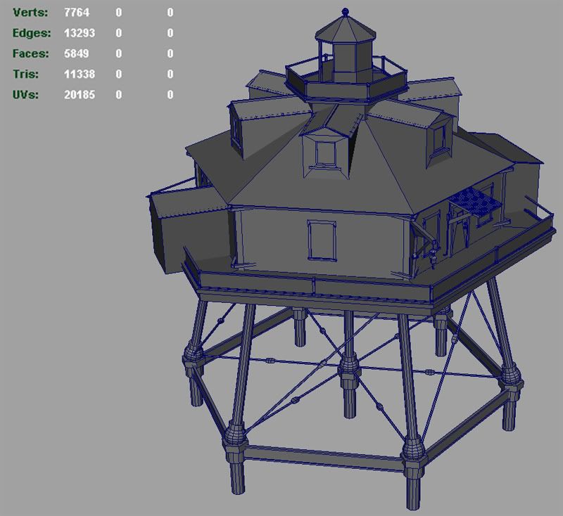
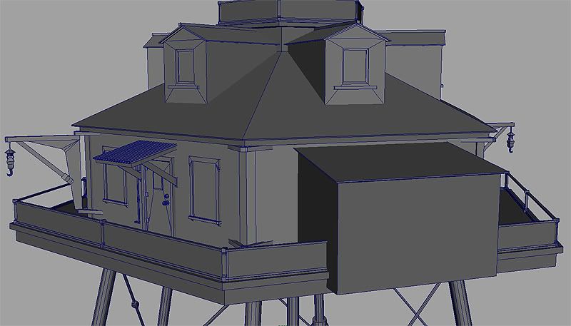
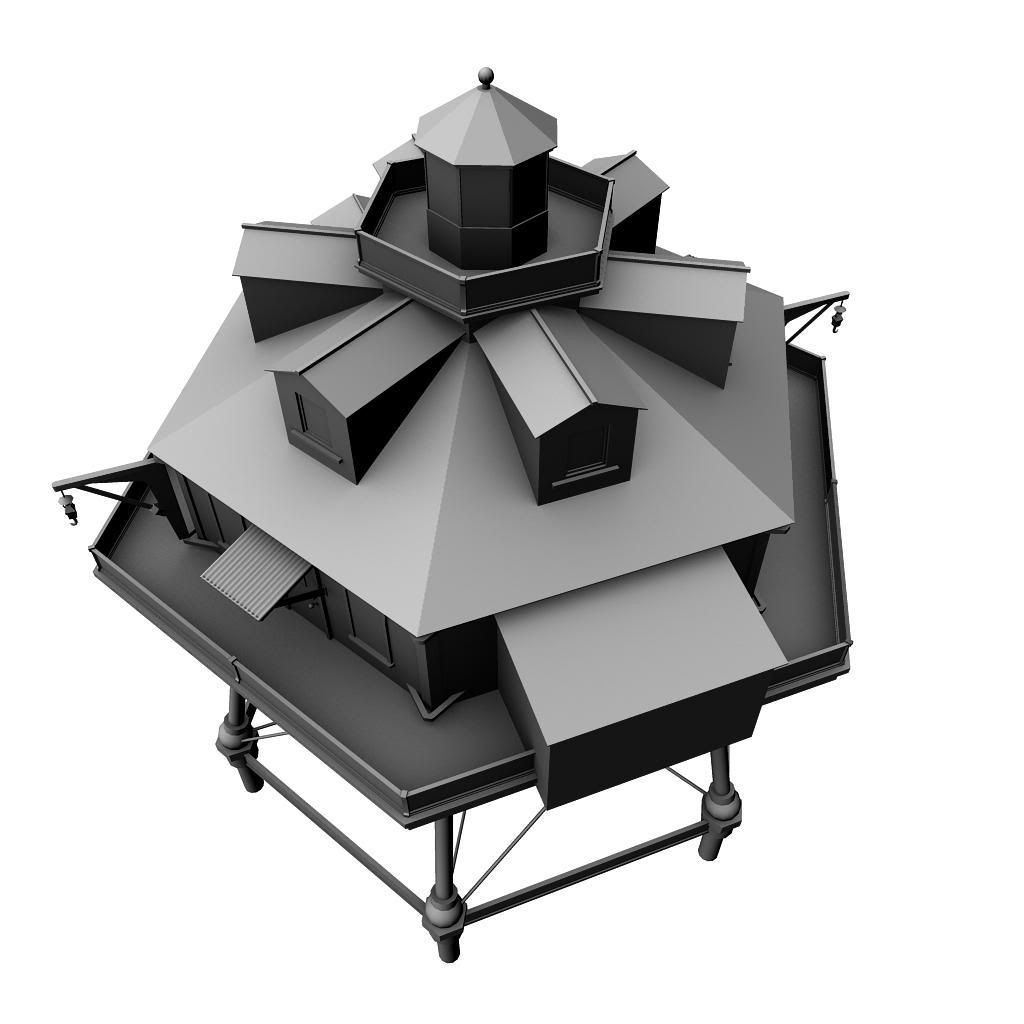
It's not a lot of polygons right now, and I plan on adding the dock and a boat later on. Besides critiques, I need some help on how I plan to set up my shaders for it. I'm thinking that for the lighthouse, I should have the bottom frame holding it be a 1024x1024 texture and the upper half 2048x2048 separate. Do you think this is wise? I'm thinking it makes sense since these two parts are different materials.
Also, can I get away with having this much floating things in the model? I've been told that game engines don't really care how you model anymore, and I want this to be able to go into engines such as Unreal3.0.
Replies
I can see there's alot of modular peices in this, so you may even be able to fit it all in one 2048 but don't take my word on that
your floating geo is fine, it should import fine into UE3
Anyways, I added most of the suggestions to the scene, and also started adding a new major asset to:
I'm basing it off this reference: http://picasaweb.google.com/royalblossoms/CTTripUdated#5072074549026174082
looking forward for this