Scorpion Queen
Please press F5 to refresh... If the pics don't show...
Please press F5 to refresh... If the pics don't show...
Please press F5 to refresh... If the pics don't show...
... if the pictures dont show up I am very sorry. My host (Network solutions, to mention some names, grrrrr) have not managed to fix it despite many reports and explanations. Looks like I need a new host too.


Hi guys, long time no see. Nice to see there are so many of the old crowd still here. BTW Is anyone still playing Q3?!?! .
.
My daughter came up with a concept, the company I worked for went belly up and I am out of work so finally have to think about making a portfolio again after having been involved more with lead and tech positions instad of real work. It is amazing, as soon as you stop doing pure art how far you get behind. Even though I have helped out every team member with every bit of work hey have done I have nothing to call my own.
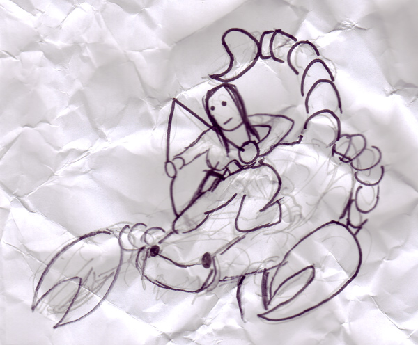
So the first pic is the concept, go easy on my co-author, she is only 8, and she screwed the paper up because she was so dissatisfied with it (even though daddy helped), so saved from the bin our combined effort at her first bit of concept art
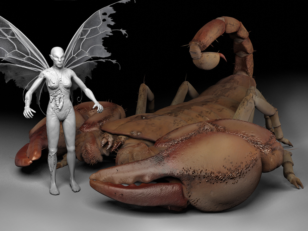
And the second pic is how far it has got to date...
It is going to have some kind of zombie queen riding it with whip/bow in hand and be a low poly model with normal map. So far most of the low poly is done and some of the high for normal mapping, but please rip it to peices as I need all the help putting a new portfolio together I can get. BTW if anyone has any hints about how to make a nice render of the high poly in Max then it would be really helpful as I am used to LW and max rendering is something I have never really tried (for example do you need a dome for GI? and what is the best way to set up textures for some kind of radiosity as my spec didnt show up last time, what sort of lights to use and and and ...
Any help at all making it look cool concept wise toooooooooooooo......
Thanks for any help
BTW the boards are looking excelent now days
tim
Please press F5 to refresh... If the pics don't show...
Please press F5 to refresh... If the pics don't show...
... if the pictures dont show up I am very sorry. My host (Network solutions, to mention some names, grrrrr) have not managed to fix it despite many reports and explanations. Looks like I need a new host too.


Hi guys, long time no see. Nice to see there are so many of the old crowd still here. BTW Is anyone still playing Q3?!?!
My daughter came up with a concept, the company I worked for went belly up and I am out of work so finally have to think about making a portfolio again after having been involved more with lead and tech positions instad of real work. It is amazing, as soon as you stop doing pure art how far you get behind. Even though I have helped out every team member with every bit of work hey have done I have nothing to call my own.
So the first pic is the concept, go easy on my co-author, she is only 8, and she screwed the paper up because she was so dissatisfied with it (even though daddy helped), so saved from the bin our combined effort at her first bit of concept art
And the second pic is how far it has got to date...
It is going to have some kind of zombie queen riding it with whip/bow in hand and be a low poly model with normal map. So far most of the low poly is done and some of the high for normal mapping, but please rip it to peices as I need all the help putting a new portfolio together I can get. BTW if anyone has any hints about how to make a nice render of the high poly in Max then it would be really helpful as I am used to LW and max rendering is something I have never really tried (for example do you need a dome for GI? and what is the best way to set up textures for some kind of radiosity as my spec didnt show up last time, what sort of lights to use and and and ...
Any help at all making it look cool concept wise toooooooooooooo......
Thanks for any help
BTW the boards are looking excelent now days
tim
Replies
keep goin!
Thanks Slum, I have a little problem getting the two to knit but fingers crossed.
Thanks vj_box, will d, half way there, phew...
Fixed a a bunch of small mistakes and made a go at the diffuse texture, so far the spec is just the diffuse inverted but after some more fixes it should be next. Not sure if it is better to go onto rendering the normal or the high poly of the rider and weapons next though.
Here is a quick update, really must learn how to render in Max though.
Edited because of an experiment with GCMPs translucency sugestion. The map still needs working on
Please refresh if it does not show.
tim
tim
tim
Glad to see u post art dude! Cant see the pic nomore tho!
Keep it up!
ben
tim
Cool to see you back again man
Alright, the concept, it's cute hehe. Just wondering, will she have a saddle of some kind? Or ride bare back?
Digging the highpoly, but the pinchers (specially the inside) seem a bit soft and blobby, define those ridges a bit more.
The armorplates could use a bit more, shape to them, have a slight indent run along the outline, and maybe add a bit of detail to them.
The only thing that kinda nags me as far as a potfolio piece, it's not really exciting. The scorpion is pretty much a scorpion, with a zombiequeen riding on it.
I'd think the scorpion she'd ride would be one badass motherfucker. Have a look at some lobsters and mix in some bits of them. Specially look at the armor on their arms (pincher thingies), which have spikes and such. I think that would add some more 'pop' to this piece.
No comments on the texture as that is my own weakest part
Keep up the good stuff!
(and oh yah, get ur ass on msn! :P )
Some nice falloff effects could be rendered to texture in max, blended with your ambient occlusion and diffuse colours in pshop, this should help when building the specular and gloss maps
Depending on your poly limit/uv layout you could put small tubes inside the segments so that you can add opacity to the outer on certain places, shouldn't be too costly really.
Back to the point....
Definatly not there yet GCMP, really good comments and i tried getting the same sort of translucency, but not much luck I am afraid, my poor home computer just took so long to render as soon as it is turned on that I spent a day or so experimenting but not with any good results. The translucency map includes everything you have sugested but it is not doing what I had expected, totally to do with my novice approach to max rendering. It is probably best to finish blocking out the rider and accessories now or it may never get finished. I really like the idea of the internal tubes and hope so much that I will be able to get something like that working in the low poly when it all comes together.
Pesti, I was thinking of you while making this for some reason, and then decided to post here again, it has been so long and it is really good to see so many of the crew again. Yes with out doubta a saddle, reigns, lots of thigh squashing straps, a bit of neudity but with more than a little repulsion value from a nasty zombie skin job and a warhammer chaos style sward/whip as accessories probably.
You are also dead right it is not very exciting as a portfolio peice, perhaps some armor on the scorpion, i dont really want to change the beast its self too much as at the moment it looks very much like my pet that stowed away in our tent on the way back from italy.
I am not sure how to make it look big either, the translucency helps make it small as does any realisem it has, hopefully a bit of camera work can help but the spikes will have to go in there some place.
Then again what do you think of the idea of making it really small with toadstalls in the background as a zombie fairy possibly with wings a little in the vein of pans labyrinth?
Here was the last render...
Really have to get the rider set up now or it will never happen, back as soon as it gets anywhere.
Thanks for the comments again guys
P.S. any one else want to take it to peices I really apreciate hard criticism etc...
tim
Good work, both you and your daughter
Bad luck about the job.
Hi frankie, thanks, long time and hows life? I was thinking of ledahosen and ss insignea for the fairy? Or perhaps some kind of fairy tutu clothing, any sugestions?
Many thanks tinokun
Hej Pixelgoat, mange tak og jeg skal nok sige det til datteren
rdramsy1121, will do, it is still too high res, so the breakages didnt show enough but I will be sure to increase it, thanks.
t4pan, thanks, now got to sort out the fairy, really not sure about her so far, and mushrooms in the background
Hey brad thanks, actually we had one as a stoaway in our tent from a recent camping holiday so the references are only a magnifying glass away, very small though.
tim
Cool stuff here, I like the new renders ... the texture here and there on the scorpion is nice, like the raised black speckles, looks very natural.
However I think there are a lot of areas which could have more sculpted/geometric detail - like the front of the claws, they're currently feeling very flat and smooth and don't really look as natural as some other parts.
The hairs are a nice touch, and the colours are great.
The wings on the rider are very well done too. However I think the arms are looking a bit odd, maybe the upper arm could be a touch shorter and the forearm longer, also the shoulders are looking very "pinched" too, they could do with more definition and bulk to make the connection more solid I think.
The rider looks like prime material for making a really interesting costume - currently the silhouette is quite boring in my opinion, you could go to town on some interesting clothing and attachments (maybe made of small plant life, bits of thrown away garbage or something? a shield made out of a clothing button?)
Keep it up, will be great to see this piece all finished and posed
tim