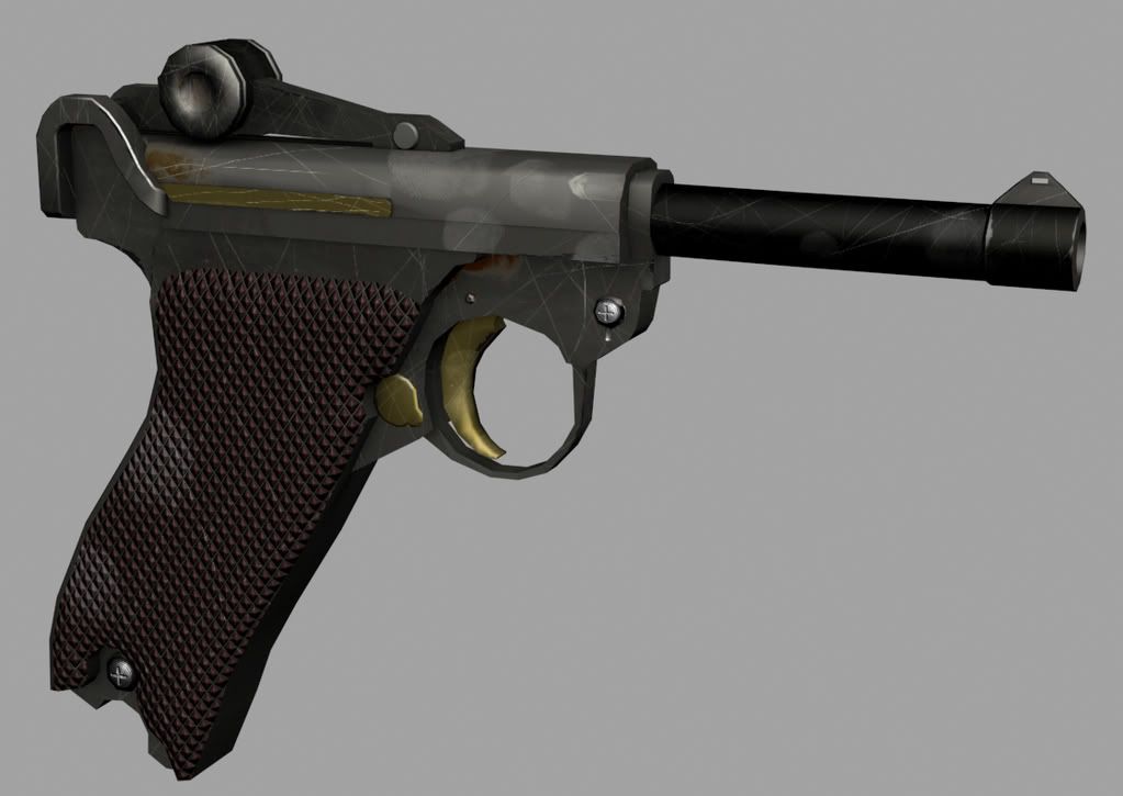
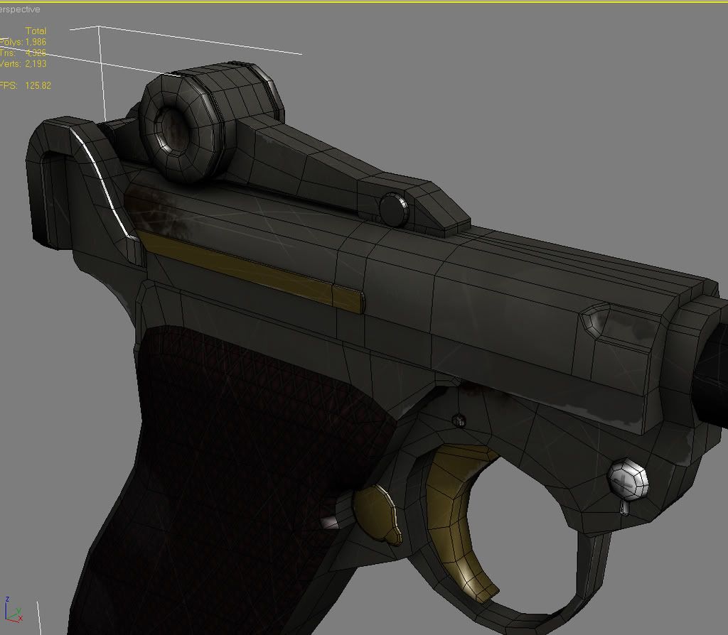
Been working on this one for a little while, looking for ways to push it a bit more, since it doesnt quite have the feel yet, throw me some suggestions! thanks!
The scratches look really random and forced, i would consider redoing those. also, work on your material definition, the current specular is not giving it that distinct gun metal sheen.
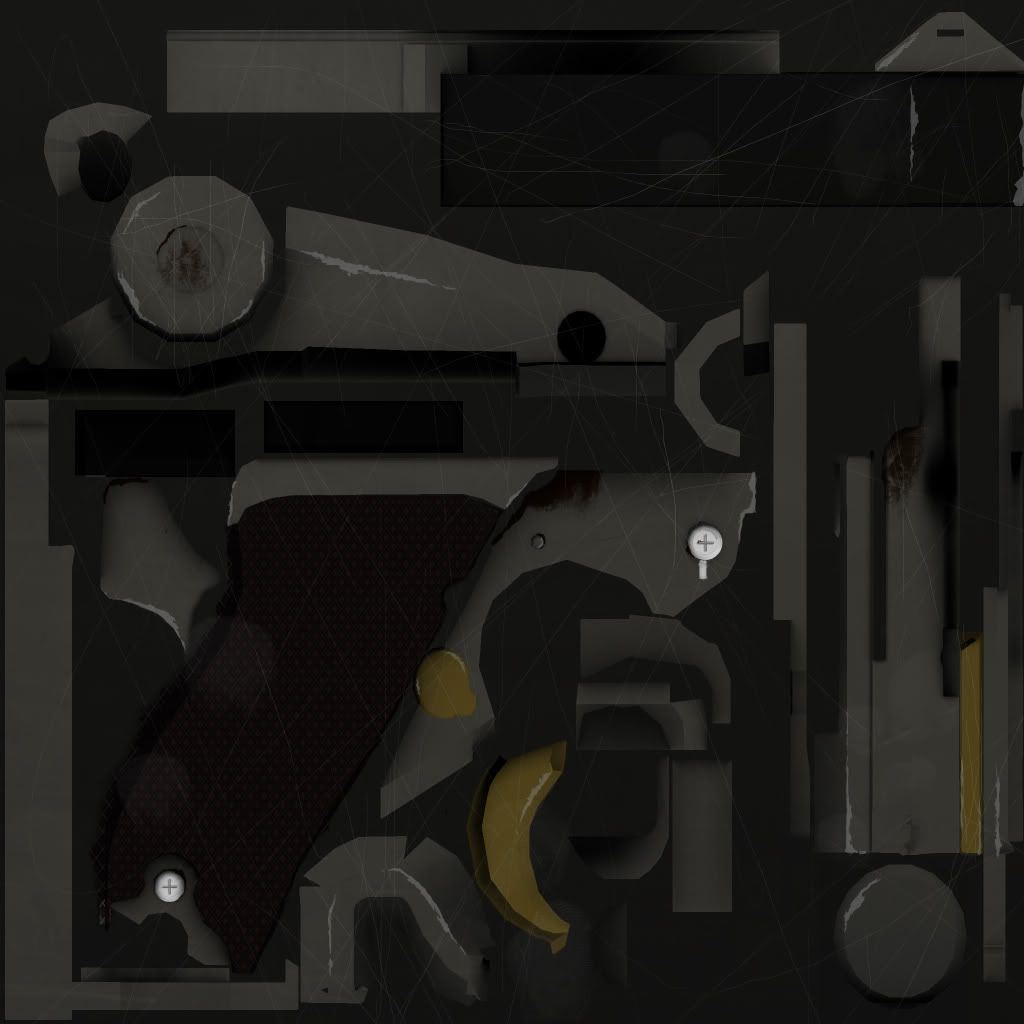
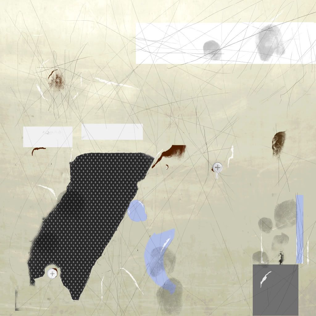
right now it looks as if you inverted the diffuse to create the spec, I wouldn't recommend doing this on on object like this (dark scratches on the spec?) , instead start with what you have in the diffuse and change it to get the desired effect, while adding new details that show up as the light rolls off it.
yeah and some edge treatment. anything that that has a hard angle should get some harsh wear, softer angles less hard wear and more of a burnished look. you can see how that bevel towards the back of the gun REALLY catches the light, thats basically what I`m talking about with edge treatment. if you dont have the tris to spare, then try and simulate that effect in the diff, and spec.
conversly, crevices should receive gunk. jammed in there.
I can tell you did this to an extent, but you need to push it further.
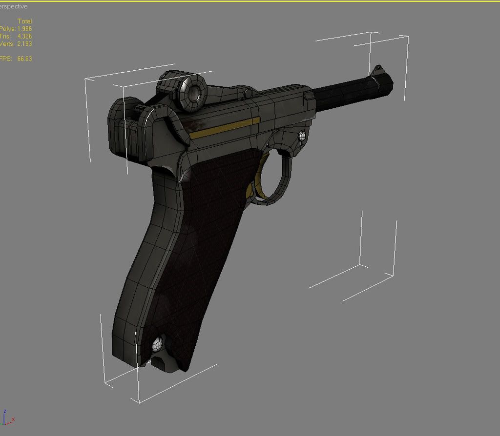
as for the model, theres some reeeeally small polygons that you probably wont even be able to tell if there gone.
the texture is bad in its execution - one can see that you used a mouse + did not knew what to do with the surface. All you did was just blocking with some 1 pix brush lines on it. Try to search texture so that metal really looks like metal.
e.g look here http://www.cgtextures.com/textures.php?t=search&q=metal&cat=582
colour wise its all grey- look more at reference pictures - analyze the metal where and how are scratches (if any) visible. What about color variations, color gradients ect. all in all put more effort in the texture.
model looks decent and alot better compared to the texture- though like mentioned before some polygound are rather smal and will be hardly noticed
Hmm I was running off Stefan Morrell's hard surface tutorial as a reference as... well texturing obviously isn't my strong suite. I appreciate all the feedback! I'll post an update later on today. Question though: I can't seem to get a good gun metal texture going without dipping into fancier subsurface scattering textures, otherwise it looks either like plastic or metallic chrome. suggestions or links on how to achieve that shiny half-matte look with just basic texture maps? thanks guys!
afterthought- the grip would have some soft of border around it I think. It look sort of slapped on. See? vvv
now copy that exactly. don't be afraid to take colors and even textures directly from your reference image. They will need tweaking and adding to, however. Take a close look at how the texture looks on the gun, then find a way to make your diffuse look just like that, but without the strong highlights. Then take a looks see at EQ's textures, and keep in mind some of the crits from above to create your spec. You can do it man. GO! GO! GO!
well, in addition to your spec map you would also need a gloss map to tell it how wide/narrow reflections are. eg. finger prints would be darker on the gloss map so that it would catch the reflection at a wider angle than the clean metal, that way it would be whiter...ehhh im making no sense. i need food in my belly.
i hope you understand what i mean.
also, be careful with the grip, your diamond bump design thing just ends abruptly. it should have a border.
you're definitely going down the right track, but to be honest, the texturing really does feel forced, like the smudges and scratches, why are they in those particular places ya know? Just keep plugging away though, you seem to be on the right path
Worked out an update with these suggestions in mind with well.. mixed results. Obviously still not quite there, but feeling good about the direction. Further input greatly appreciated, and thanks a lot for all the feedback so far!
Render w/ AO:
Normal, gloss, spec and diffuse:
Screen Grabs w/ wires:
cleaned up some of the lesser needed polys, still some optimization I'm going to run through.
the normals look like they are empty except for the patterns you added in photo shop. So are we looking at the low poly mesh? Did you bake from a high poly mesh? If so can we see that?
I think the scratches look a lot better. Keep working on it.
the normal map is fake,- better ditch it then if you dont know how to use it- looks so forced. Some of the scratches look like cracks- very odd- again check reference pictures - are there even that visible scratches.
I still dont understand the yellow parts in the gun (trigger)- why is it yellow- is it painted, gold ? it looks out of place.
No. Didnt do a highpoly for this one, felt pretty comfortable doing most of the normal work in crazy bump. I'm going to run through with the scratch and dirt layers when I'm finished with them for my final renders. Some very light toning, right now the additional bump map I have on there is doing some of the work.
edit re: Renderhjs: the reference I was working off of earlier for dimensions had those parts gold or yellowish. but since I'm generally working my texture more off of cody's ref. I guess I'll go in and change it. Why would I delete the current normal map? it's doing what I need it to do right now.
delete the current normal map? it's doing what I need it to do right now.
yes but using like 2% of its power - so almost not worthy of calling it a normal map. A normal map has 3 channels each 8 bit usually thats a hell lot data just for 2 screws and almost not noticeable grip texture.
on the reference picture the metal is clearly brushed and thus scratched only in 1 direction if you insist on it.. There is this old school PS tutorial how to make brushed metal: http://photoshoptutorials.ws/photoshop-tutorials/textures/metal-texture.html
try to incorporate some of its techniques to get your metal texture and scratches perhaps more streamed.
Looking at the photo you did matched very well the model (I did not liked it at first,- but its just like the photo). Guess that explains the yellowish then as well- personally I would play with that- maybe dark brown?
I'd model the whole thing out in Sub D and then build a lowpoly mesh to bake the normals into.
Or, make the mesh much cleaner and low poly, and then paint everything in with the color map.
Or, just get rid of the normal altogether. It's not really doing much.
The base of the handle seems very sloppy. That's the big trouble area. It almost seems like you are trying to use the easiest methods from "next" gen and skin gen to acheive your results. I'd pick one direction or the other and learn how to do it properly.
Replies
right now it looks as if you inverted the diffuse to create the spec, I wouldn't recommend doing this on on object like this (dark scratches on the spec?) , instead start with what you have in the diffuse and change it to get the desired effect, while adding new details that show up as the light rolls off it.
conversly, crevices should receive gunk. jammed in there.
I can tell you did this to an extent, but you need to push it further.
as for the model, theres some reeeeally small polygons that you probably wont even be able to tell if there gone.
There really isn't any kind of material property to this. It looks like its all plastic of different colors.
Keep at it man!
e.g look here
http://www.cgtextures.com/textures.php?t=search&q=metal&cat=582
colour wise its all grey- look more at reference pictures - analyze the metal where and how are scratches (if any) visible. What about color variations, color gradients ect. all in all put more effort in the texture.
model looks decent and alot better compared to the texture- though like mentioned before some polygound are rather smal and will be hardly noticed
afterthought- the grip would have some soft of border around it I think. It look sort of slapped on. See? vvv
now copy that exactly. don't be afraid to take colors and even textures directly from your reference image. They will need tweaking and adding to, however. Take a close look at how the texture looks on the gun, then find a way to make your diffuse look just like that, but without the strong highlights. Then take a looks see at EQ's textures, and keep in mind some of the crits from above to create your spec. You can do it man. GO! GO! GO!
i hope you understand what i mean.
also, be careful with the grip, your diamond bump design thing just ends abruptly. it should have a border.
Render w/ AO:
Normal, gloss, spec and diffuse:
Screen Grabs w/ wires:
cleaned up some of the lesser needed polys, still some optimization I'm going to run through.
I think the scratches look a lot better. Keep working on it.
I still dont understand the yellow parts in the gun (trigger)- why is it yellow- is it painted, gold ? it looks out of place.
edit re: Renderhjs: the reference I was working off of earlier for dimensions had those parts gold or yellowish. but since I'm generally working my texture more off of cody's ref. I guess I'll go in and change it. Why would I delete the current normal map? it's doing what I need it to do right now.
on the reference picture the metal is clearly brushed and thus scratched only in 1 direction if you insist on it.. There is this old school PS tutorial how to make brushed metal:
http://photoshoptutorials.ws/photoshop-tutorials/textures/metal-texture.html
try to incorporate some of its techniques to get your metal texture and scratches perhaps more streamed.
Looking at the photo you did matched very well the model (I did not liked it at first,- but its just like the photo). Guess that explains the yellowish then as well- personally I would play with that- maybe dark brown?
Or, make the mesh much cleaner and low poly, and then paint everything in with the color map.
Or, just get rid of the normal altogether. It's not really doing much.
The base of the handle seems very sloppy. That's the big trouble area. It almost seems like you are trying to use the easiest methods from "next" gen and skin gen to acheive your results. I'd pick one direction or the other and learn how to do it properly.
Keep at it man.