Crush! Kill! Destroy!
Hello,
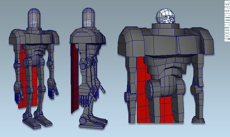
Here's a robot character w.i.p. that I started back in 2008..
I'm posting it here to get some comments and crits in perhaps a vain effort that I might actually complete a piece of work this year instead of starting new stuff.:\
It started out as an exercise to 'sketch out' a quick low-poly mesh character for myself so I could get in a bit of texture practice (Colour, normal and Spec etc).
I started it straight in Maya (its gone a little 'Mars Attacks'! design-wise).
He's a sort of tounge-in-cheek 50's-esque sci-fi creature.

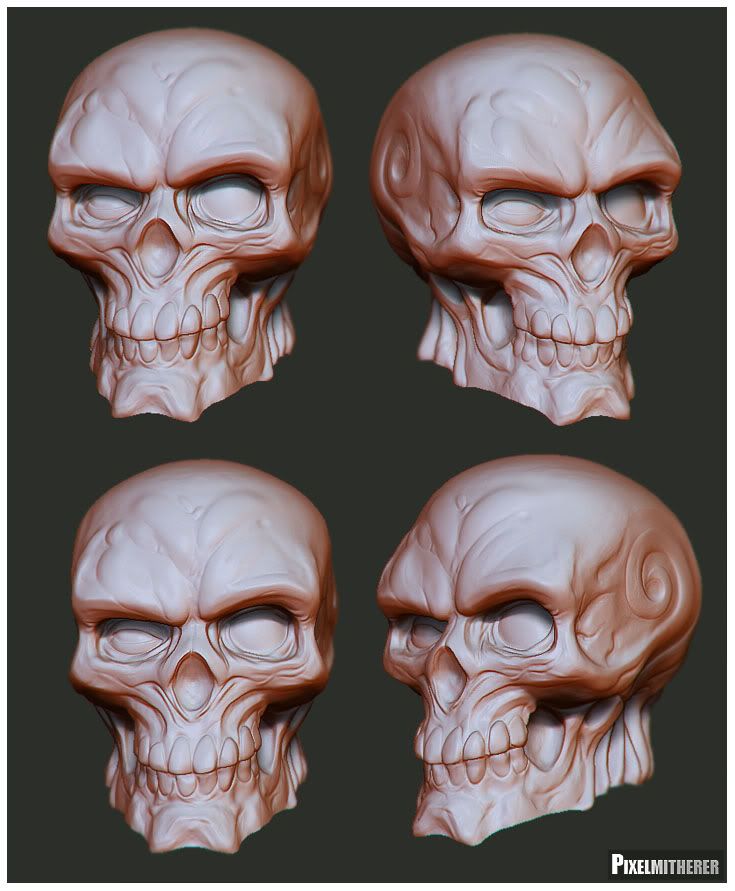
First pass on the skull...

And the second pass...

High res sculpt in Zbrush, details to be projected on the low res (which might need a little remodelling work.)
Here's a robot character w.i.p. that I started back in 2008..
I'm posting it here to get some comments and crits in perhaps a vain effort that I might actually complete a piece of work this year instead of starting new stuff.:\
It started out as an exercise to 'sketch out' a quick low-poly mesh character for myself so I could get in a bit of texture practice (Colour, normal and Spec etc).
I started it straight in Maya (its gone a little 'Mars Attacks'! design-wise).
He's a sort of tounge-in-cheek 50's-esque sci-fi creature.

First pass on the skull...

And the second pass...

High res sculpt in Zbrush, details to be projected on the low res (which might need a little remodelling work.)
Replies
I'd probably make the teeth a bit more prominent (basically sink in the border between teeth and gum a bit more) to really make those shapes pop out. Currently I think that at longer range you won't really see them at all, especially on a normal map.
Character looks pretty fun
Looking forward to seeing more updates.
Can't wait to see how this turns out man, awesome sculpting (love the style).
Hope you finish the model.
you're a champ
really dig the style, I don't think the swirly on the side of the skull is workin for this guy though
yeah man, i dig the skull! will be interesting to check how you do the rest of the body
I look forward to seeing more!
Cheers, Nick.
MoP : Thanks man. Point noted.
Funky Bunnies: hmmm yeah, not sure, I originally liked the swirl, but now I've put more detail into the skull, I'm not sure now. Hmmmmmmmmmm
rooster, konstruct: HA! yeah Ashley Wood was a bit of an influence on the style here, I love the way he draws robots, and women!:)
Tumerboy: Oh yeah, I didn't think about it before, I love the style of Wolfenstein.
Nick Carver : Thanks Nick. But i'm keeping the skull simple at the moment with no moving parts. I once saw one of the model figures built for the original (before they scrapped it and changed it to CGI) version of 'Mars Attacks', fantastic workmanship, tiny model but you could move the facial features into different expressions.
I have a question as well, i've just started to lay out the uv's, one map for the skull, and the other for the body and cape.
Normally with a colour map I'd lay it all out and mirror elements on the texture like arms and legs etc to save texture space, the usual old technique!
If i'm going to use a normal map I'd make the uv's have their own unique space.
Just wondered if anyone had a different way of working that would still allow mirrored textures.
If not never mind.:)
A few hours into the texturing.
Colour map
This is just a colour map a the moment.
Still a long way to go, wanted to get some C&C on this one.
Thanks.
I agree with Ferg, but... holy balls.
great work, anyways !
Now keep going, the updates with the diffuse look great!