Half naked armored chick
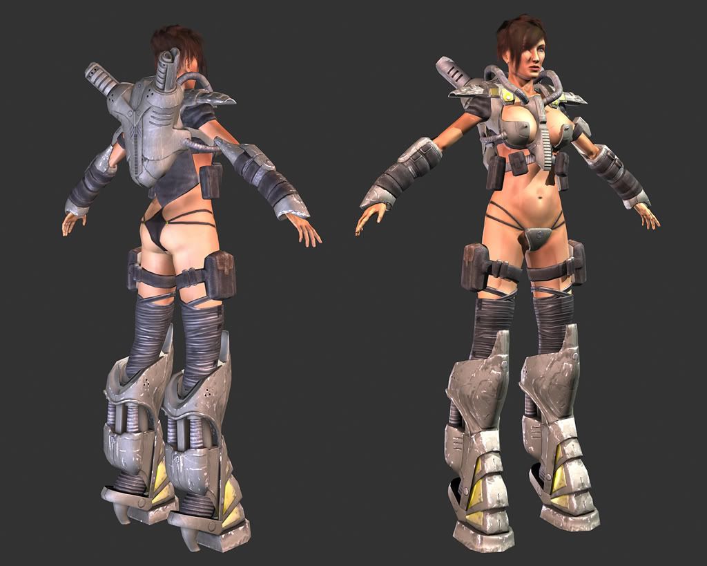
This character is based on a concept by James Hawkins.
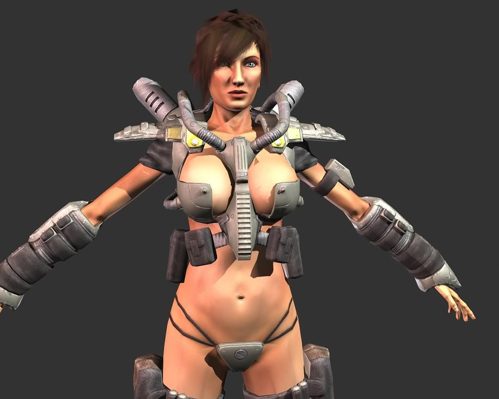
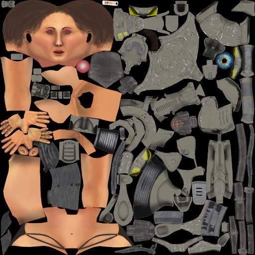
The character comes in at 8094 polys with a 2048x2048 color, spec and normal.
The texturing is still unfinished, I would say I am a little over halfway done with it. It needs a lot of tweaking in the spec and color in areas for it to read more like I would like it to.
Please give me honest feedback on what needs work and changing. Be as brutal as you need I can take it.
Thanks
The character comes in at 8094 polys with a 2048x2048 color, spec and normal.
The texturing is still unfinished, I would say I am a little over halfway done with it. It needs a lot of tweaking in the spec and color in areas for it to read more like I would like it to.


Please give me honest feedback on what needs work and changing. Be as brutal as you need I can take it.
Thanks
Replies
I think the backpack-thingummy could also use a splash of colour, perhaps some of that yellow from the boots and shoulder pads, or perhaps some warning labels, or, maybe use an emissive/glow map to add strips of 'energy' coming from the vents.
These are all personal choices keep in mind, I can't really fault anything here, it's pretty damn good. Just throwing some ideas at ya.
How 'bout some wires? Great stuff!
The face looks very stiff and almost a bit manly esspecially the cheeks and her lips- try to make them more soft/ rounded just more female.
The overal appearance is not very catchy, I did a quick mock up trying to improve things the way I see things:
what I noticed is that you have a lot of bulky decorations and its not supporting not at all the female shape but instead screaming in any direction. There are alot of uninspired repeating elements such as the riffled wires (pre 1995 ? design).
Alot of your main color for the suit (just plain grey) is ued without any smal itneruptions like seams, signs, scratches ect. which makes it look like you gave not much effort to the texture just key color with AO and alike.
So all in all myu suggestions would be:
- less bad porn - style
- less bulky decor
- support more the female body
- take texture work more seriously and add smal but interesting detail
I like the idea of emissive glow coming from vent areas of the backpack. Thanks
DockRock: Thanks. I may add some head gear, it would be something more for decoration rather then a bulky helmet.
haha yeah, the design isn't anywhere near practical.
renderhjs: I do like all of your crits, but I think at this point going back and changing the whole design is kind of tough for me to do. Most of the design, such as the nipple armor and bikini are in there because I was trying to come close to the concept. Although removing the nipples in the armor is a easy fix, and I think I may do that cause it's a bit distracting for me as well.
The texture work though is something that I know needs quite a bit of work, I feel at this point that there are too many different elements with colors and such and some objects don't tie in with other like they should.
Plus there are many areas that need to be "roughed up". I think the only area close to completely done at the moment is the boots.
You had better hope that recruiter is a perv.
Seriously though, in my honest opinion this design does you more harm than good. Chances are the recruiter will be a male and might just frown or laugh this of, if not... Not a risk I'd take anyways.
How many models have you seen like this in actual commercial games? Or even in successful artists portfolios? Of course you can go for a "lighty dressed"/"sexy" design, but there is a thin line here which I think you've crossed.
Another version, changed it up a bit. Since the last thing I want to do with my model is offend people it's not really what I ment to do.
ehh I'm tired. I should stick to environments that's what I can do well. :poly127:
When I viewed your site earlier today, I tried picturing your characters in the environments and the enviros really out do the characters. We all cant do everything. But do what you love. Ive been following that stairwell scene on that other forum site, and you turned it around really well, I was surprized. Good job!
Stick with environments! its better to create another place to be, rather than create another person to be :P
I love the stuff in your 'folio btw!
This character was the last project I had for school, so i wanted to finish her up for the folio since I just graduated.
But yeah I'm thinking I am calling her done and starting a new environment tomorrow.
She was better when the armour was entirely silly and completely useless. I'd be inclined to suggest pushing the riduculousness of the design even further, not by revealing more skin but perhaps making the armour even more bulky and cumbersome to accentuate the complete lack of protection every where else.
Make it a distinct parody rather than just another in a long line and you'll have something genuinely memorable.
Jackablade is right - it works better conceptually as parody rather than trying to cover her up.
I've been good man I just had my interview with High Voltage, they told they might hire me in feb or march. but it's still a "maybe" so I'm looking for any other work I can get.
How you been? I think I may come in to visit one of these days, when do you teach?