The BRAWL² Tournament Challenge has been announced!
It starts May 12, and ends Oct 17. Let's see what you got!
https://polycount.com/discussion/237047/the-brawl²-tournament
It starts May 12, and ends Oct 17. Let's see what you got!
https://polycount.com/discussion/237047/the-brawl²-tournament
VOX - testing laboratorys
damn.. ages since I´ve created a thread here.. but i want to keep the development of this guy a bit together
i plan to do some more "beauty shots" with some scenery and some more tests (bake to verylowpoly), but for now: the current state and the process in reversed order
edit: oh btw.. i dropped the idear with the chestbelt for the moment.. it would make the upper body to busy
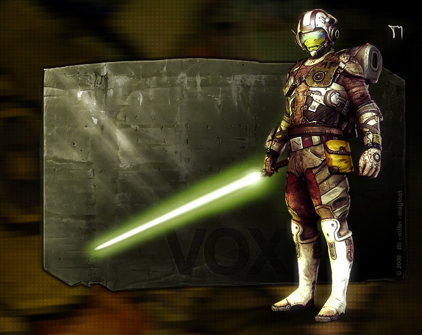
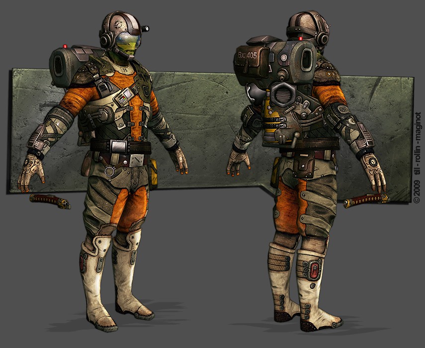
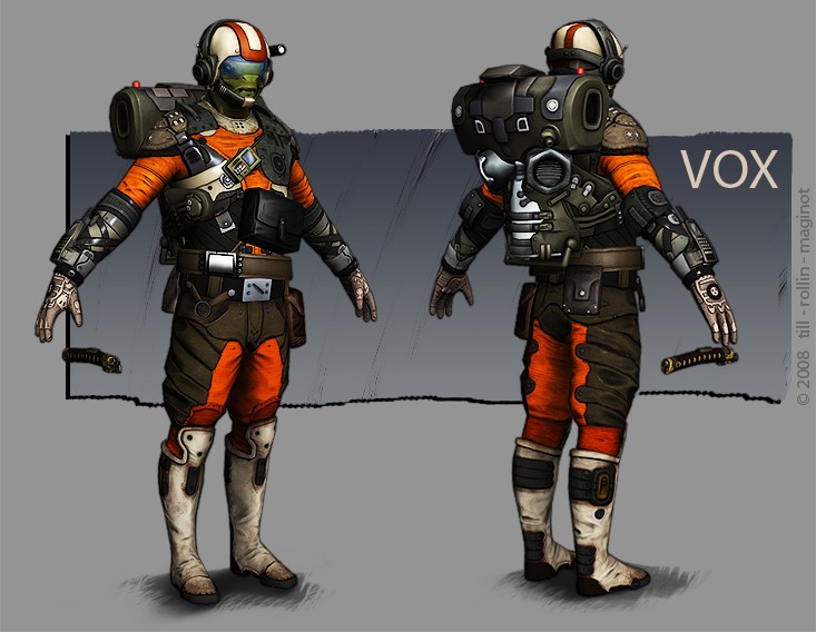
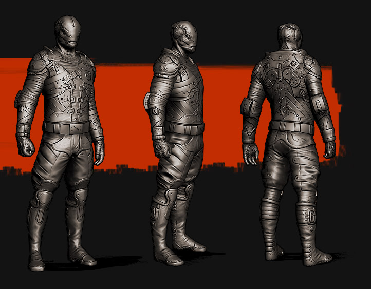
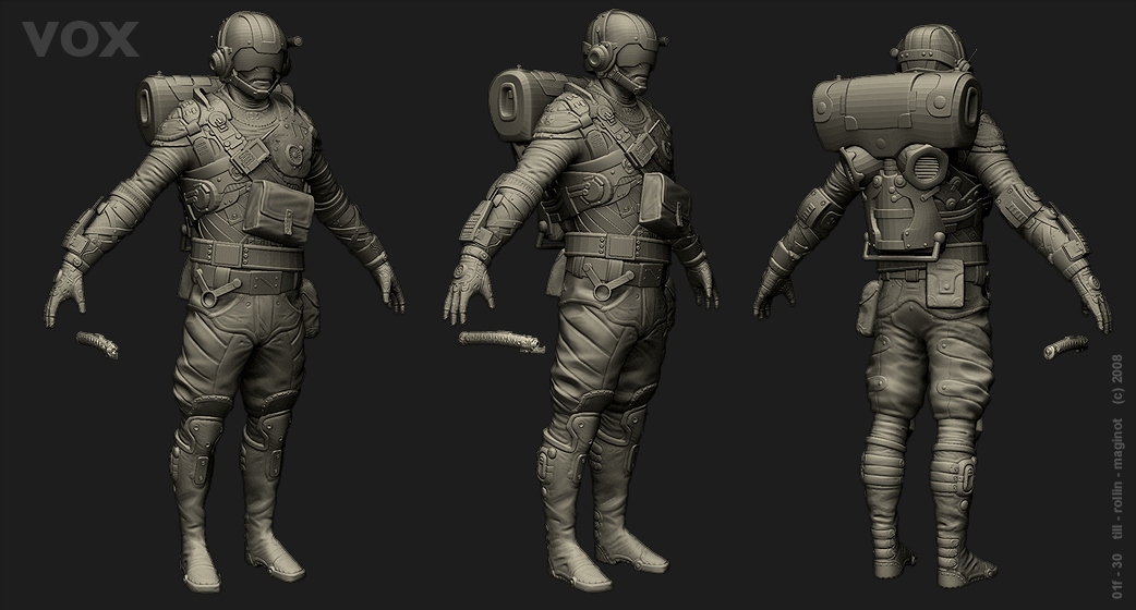
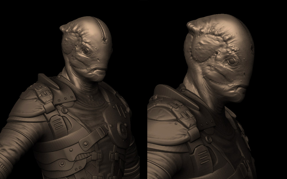
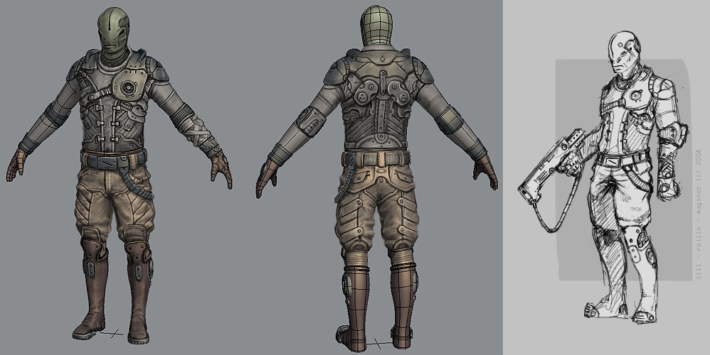
i plan to do some more "beauty shots" with some scenery and some more tests (bake to verylowpoly), but for now: the current state and the process in reversed order
edit: oh btw.. i dropped the idear with the chestbelt for the moment.. it would make the upper body to busy
- lightning and colour theme test + post fx

- 50% selfilluminated

- basic colours and specular

- lowpoly with normalmap and ao

- highpolys


- paintover concept and initial concept


Replies
And yeah, the orange is great, it's a shame it's lost in your first beauty shot cause of the post fx.
I dropped the idear with the strong orange.. somehow strong colours with normalmaps need special shaders or so.. otherwhise it always looks stupid and ugly imo. it looks better with desaturated textures together with strong and good lightsources within the levels..
with some selfilumination and less normalmap influence it´s also working better .. creates some cartoony feeling.. if you want it
i have no idear how to get around this problem and it starts to get on my nerves.. the GoW guys know why they are doing all grey in grey.
oh and it´s getting better with more polys for the lowpoly and a bigger texture resolution it seems
That beautyshoot would probably look better without the brown reddish backround.;)
+50 pts for the lightsaber.
i really like this one better than your final one, right now this one has much more visual "pop" than the post fx one wich just seems desaturated and doesnt have as much contrast in the design as this image
mat - I post the flats as soon as I stop working on the textures. So far: I´ve used 2x 1024^2 textures
palm - they are all complaining about these backgrounds.. pff.. at least they are making ME happy
Johny - hola! I know what you´re saying.. and it´s more or less the root of the problem I´ve described above.
so all in all it was not going into the direction I wanted.. it´s a different theme and style (supermario style
I have to do some more test within an actual 3d environment.. also want to bring it into ue3 or similar and see how the colours and the contrast is behaving
Microneezia - yes it´s 3d without hard lighting and a very basic texture