RAGE level
hey guys. a friend (kelvin tan) and i tried to recreate a shot from id's RAGE trailer. we spent 3-4 weeks on it and pretty much split up the assets in half between us. I mostly worked on it during weekends because that was the only free time i had. A lot of room for improvement.
i want to add more to it during the next couple of weeks. what do you guys think of it so far?
its in unreal 3 btw. haha i guess you can tell by the stupid 'lighting needs to be rebuilt' message.
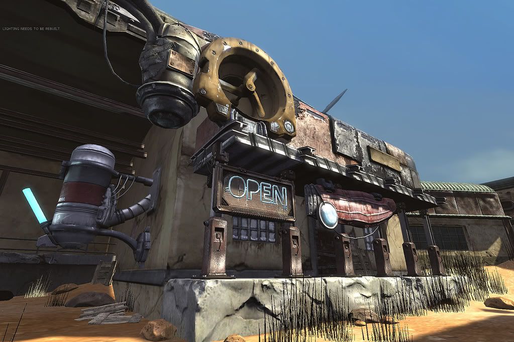
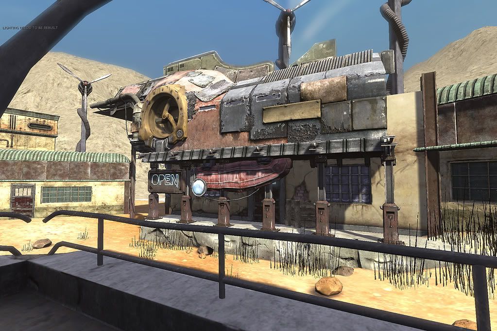
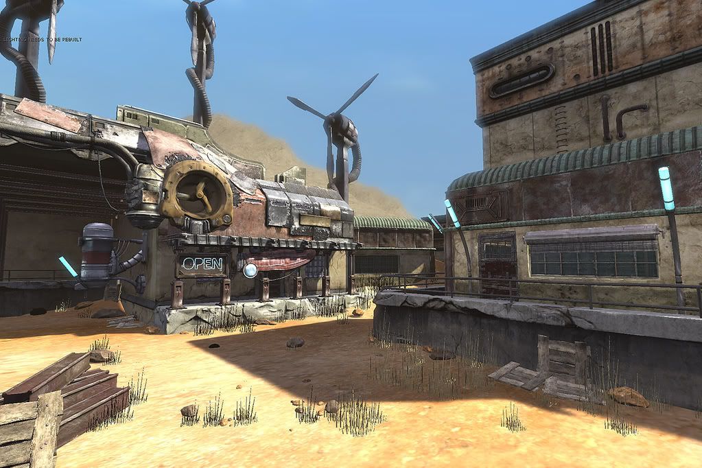
i want to add more to it during the next couple of weeks. what do you guys think of it so far?
its in unreal 3 btw. haha i guess you can tell by the stupid 'lighting needs to be rebuilt' message.


Replies
I'd like to see sand and dust in the air... Also if this was dusk or dawn rather than high-noon, you might get more out of that neon sign? hmm. I like it either way though.
Also,
Tumbleweed! can I have it?
Edit: if you do put sand and dust in the air.... Can you show me how you did it? hahah! thanks!
You should really try do something nice with the lighting, wouldn't take much work to have it looking a lot better. It's screaming for some AO love too of course.
Then do the usual post processing stuff, some colour correction/bloom/depth of field. Will help it look a lot more like RAGE.
Looking great so far.
Other than that... maybe a little more control over lights? But on the whole I think its awesome.
Also the terrain needs a bit of love. Look at the trailer again around 00:45. Get some of those cliffs and hills, along with the crags in the ground would push this along too.
Also I'd love to see a scene breakdown. Keep going, it's looking good.
To add I'd say that the grass also needs to be brighter, smaller and less "spiky" because now it looks not natural.
vj
hey everybody, thanks for the replies and suggestions (and a guy from id! lol). I pretty much agree with all of them and i see how they can be improved. i just dread opening this file again, but one day soon i'll do it i guess.
here are some shots of the models and a few texture pages. A LOT OF PICTURES, just a warning. but i guess its too late, youve already downloaded them and now your bandwidth for the month is half wasted.
But for now, here are some of the wire frames and texture pages. (Just for the record, these aren't the real RAGE presentation pages, just thought I'd reference the objects to the game in my pages).
As a side note (but it's personnal), I'd add a little "fanart" near your big "RAGE" logo
Renaud Galand - You made some good points that I can see now. I'll go through my lowpolys and try to get them lower thanks
I had the same thought.
Fixed