Medieval Street Level
Just working on a level / environment art piece, and wanted to post the WiP up at polycount to get crits and suggestions, as always
its my first project of the year, starting on the first day of the year.
i want to gauge where my skill-set is at the moment, then be able to look back at the end of the year.
well, enough talk, more art:

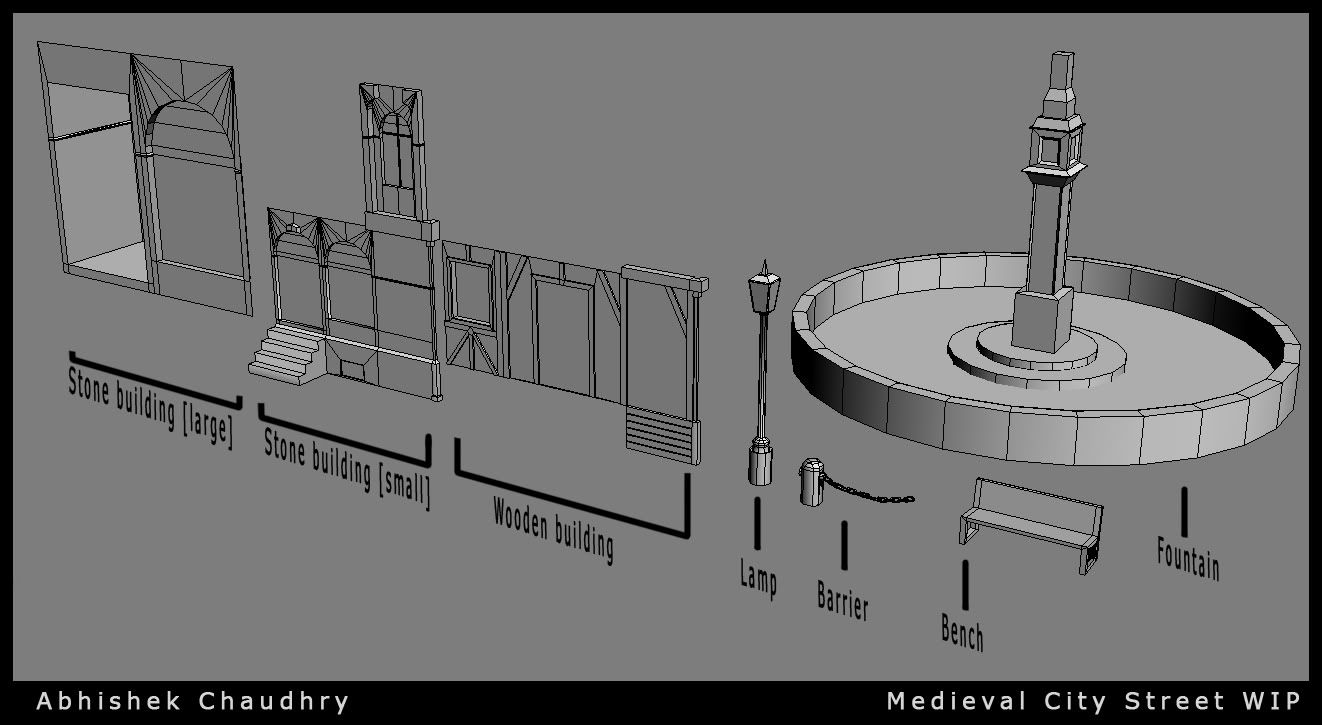
just a couple of modular pieces i made in a few hours' work
medieval Europe is my main reference; especially the walking street and docks at Copenhagen
at the moment not really looking for anything specific, but if you notice anything bad / good thats worth a mention, then please do
cheers!
its my first project of the year, starting on the first day of the year.
i want to gauge where my skill-set is at the moment, then be able to look back at the end of the year.
well, enough talk, more art:

just a couple of modular pieces i made in a few hours' work
medieval Europe is my main reference; especially the walking street and docks at Copenhagen
at the moment not really looking for anything specific, but if you notice anything bad / good thats worth a mention, then please do
cheers!
Replies
Here are some fountains from that time period:
school work and general stress about uni applications had kinda pushed this project 'back' in terms of priority
also a small pet project came in the way etc etc
a bit less stressed now, so a little bit of work got done.
its not much, but i wanted to 'revive' the thread and the project in a way.
other than that
thanks for the crits, suggestions, and references
im headed more for a street level look. so higher res along the streets, yes. I tried taking the criticism about the fountain, and added a bit more to it. i still think it needs something, but im not sure what, just yet.
as for the uneveness, sagging etc, im still trying to look for wires around the internet, trying to find a place where i can see how that was done. Often times, i learn best while looking at wireframes / end products / processes of other artists. Either way, i decided that i would make everything 'perfect' first, and then later make a 'damaged pass' where ill create multiple damaged versions of most pieces.
once again, thanks for the crits and comments.
hopefully, by feb, after exams, this project will pick up the pace.
im also working on an indie game with a few friends, so thats taking some time away too lol
cheers guys!
here's a very small update:
i know that i didn't work on much, but its crunch atm for high school's first semester - final projects and exams comming up this week and next. in the meanwhile, i was experimenting a bit with the fountain, and researching other props etc that the scene could potentially use.
once again, thanks guys
cheers
larger updates should come sometime soon when i gather some energy and time together
3 types of shop stalls are the main addition
from left to right, they are
- wooden top
- canopy top, supported by wooden frame
- canopy top, supported by wooden 'columns'
will probably sit down later today to make things for the shops to contain, and maybe make some crates / bags of grain etc
cheers!