Unreal Jungle environment
HI, I'm creating a jungle environment for Unreal 3 set in the dry season and have hit a few roadbumps. Currently the map is just a small test bed to see if I can get foliage and plants working efficiently before I add more focal points such as statures and ruins.
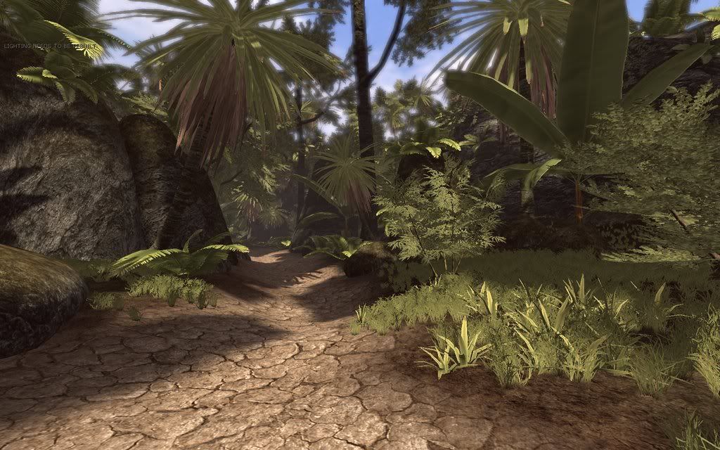
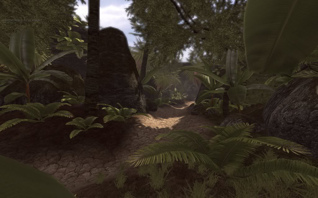
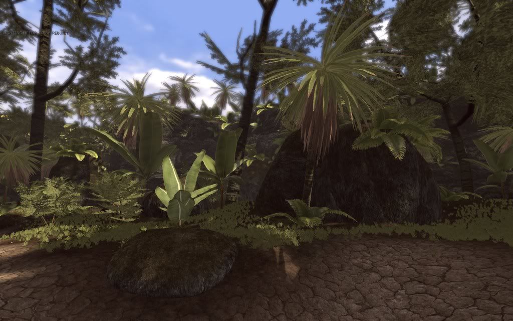
On my list to still create and work on are -
Mountains in the background
Add more ground foliage
Rework the canopies of the trees so they look more voluminous
Work on the bamboo and bush models so they don't look like a collection of planes
Re work Most of the normal maps (most are crazy bump placeholders)
Add focal points such statues based on Angkor (http://en.wikipedia.org/wiki/Angkor)
My main issues are shadows for the plants. Currently most of the trees and yuccas are dynamically casting shadows which looks great but is not viable in a real time map. Is it still possible to use something like projectors as in Unreal 2004 to do cheap dappled shade? Most of my other plants such as the cheese plants currently are using shadow maps which don't take into account the alpha map on planes and so they have very square shadows. I figure I can model around this so that the geometry matches the shape of the alpha mapped leaf more closely. Does that seem like a good idea? Is there a better way?
I am trying to get this map running in Unreals highest world detail settings on quite an old computer (single core 2.8 with an AGP Geforce 7800 and 2 gig of ram). I figure that this is a good way of showing employers that I can optimize well and understand the limits of current gen systems. The problem I'm having is on the long stretches down the map, even after turning off Dynamic shadows my frame rate dips below 15! If I set it to a lower detail setting It copes a lot better so I'm guessing post processing is to blame and not polycount or texture size (I don't get an improved frame rate if I decrease texture size). Polycount wise the cheese plants are 640 faces, the large trees are 990 faces, the rocks between 500 and 700 faces and the ground based palm shrubs are 380 faces. Does that sound too high for current gen games, thinking about it it seems too high to me! Post processing on the map includes depth of field and an overall hue shift to tie the colours together, which I guess are quite expensive.
Any way, let me know what you think. I didn't mean to write this much, sorry if there's too much waffle!
Replies
Great screens sir. Only things I can point out is a lack of definition between your surface blends, mud into grass, grass doesn't quite show up too well/green so your foliage looks like its flowing compared to it. Of course, mountains in the distance too.
Unfortunately I have no idea about the shadows. unrealWiki it? Looking forward to seeing more !!
But I guess if is very hard see anyone in this environment (is good, but is bad yet)
Yeah, lots of red there. That's not good is it........
Hold on a sec, I think if it's a 1-bit alpha it will, blended, it won't.
If you want to add a color variance to the plants, use vert colors and some type of noise added to the spec/diffuse channel. That combined with lighting in the level should break things up quite a bit.
**EDIT** Sorry, and 1-bit alpha is where it's either 0 or 1, no gradients in the alpha channel.
Then on import into UnrealED you tell it to use alpha as opacity mask and to set the blend option to masked as well.
If done correctly, not only will sorting on the mesh me cleaner, but you will have lighting work correctly as well.
Here is an example from a project I am working on.
make a ps3 game easily?? =P
Turns out the preview does do raytraced shadows. So I went back to the UDN and tried to find the bit of text about alpha's and lights I saw a few months back. This is what I found:
Terrain will always be red because the actual terrain system already uses it's own complex shader.
If you're seeing a performance hit, I'd bet it to be something other than shader complexity that'd really be the culprit. Check your light complexity if you're using a few dynamics.
Thanks for sending the actual screens as well, it makes it much easier to figure out/find (on udn) what the problem is related to.
Awesome work so far!
a quick fix maybe is to see if you can have it drop out things or chamber off areas that u dont see down the path. maybe add fog to help do that.
as far as color variations are concerned i would agree that it could use some color break up from just the muted color you have currently. this looks great though man keep it up! send some more screens if you can. you know we all want to help make it perform better
Polycount - when I switch off foliage (each grass model is only 2 faces but there's lots of them!) I get an FPS increase so I think I better do some LOD models! Any one know a quick way of doing this?
Shader complexity - I think double sided faces are slowing me down, not sure what I can do about it though, I don't really want to duplicate all my plant faces to get around this as that would hit polycount! Double sided faces is definitely causing the sea of red in shader complexity view, I suppose it a depth sorting issue?
Shadows - I cant seem to fake dappled shade with out using dynamic lights. Basic light maps don't seem to take into account alpha maps unless you buy Illuminate labs Beast plug-in, which I'm guessing isn't available for the amateur market! Not sure what I'm going to do with this. Modeling the shape of the leaves around the alphas has worked with the Cheese plants and even reduced the poly count a little but I cant use that technique with tree branches and leaves!!
Thanks for all the help everyone, I might have to bite the bullet and buy a better PC but I don't really want to! The Unreal engine seems great for corridor shooters but I don't think it likes jungles at all!
Your kidding right? It recalculates what your doing, so, it's actually a bit more expensive if you have a lot of them'(or, so im told~). It's less expensive if you duplicate your geometry, and flip it. Like, if you have a leave , then duplicate it were it stands, then flip that geometry. You get no z fighting since it's flipped, and you don''t need two sided stuff because you are using the geometry to do it for you.
use BLEND_masked instead
Double sided materials won't matter if you use BLEND_masked.
Never once has it gotten me coffee, a sandwich, walked my dog or driven me home when I've had a few too many. It also stopped working when the power went out, lazy sob... It should at least have the decency to build monuments out of paper clips for a few hours just in case it flips back on, like the rest of us! What a lame excuse "I can't work because I'm dead", really who is going to buy that? Try calling in with that one some day see if you still have a job.
umm so... yea... awesome-stuff-no-crits-keep-up-the-good-work...
I see guys said almost everything here so i will say it once more and maby add sth:
first of all you should avoid using dynamic lights as much as it is possible
then use BLEND_masked materials
you should check if you got only one material mesh
you can try gettin rid of normal maps from materials
if you dont have it add some more geometry to make more acurate shape of masked places (that will limit "rendering transparent" places"
if ou use BSP convert it into mesh, and generate UV
you can also marge meshes that use one material into bigger chunks
thats all i can remember for now.