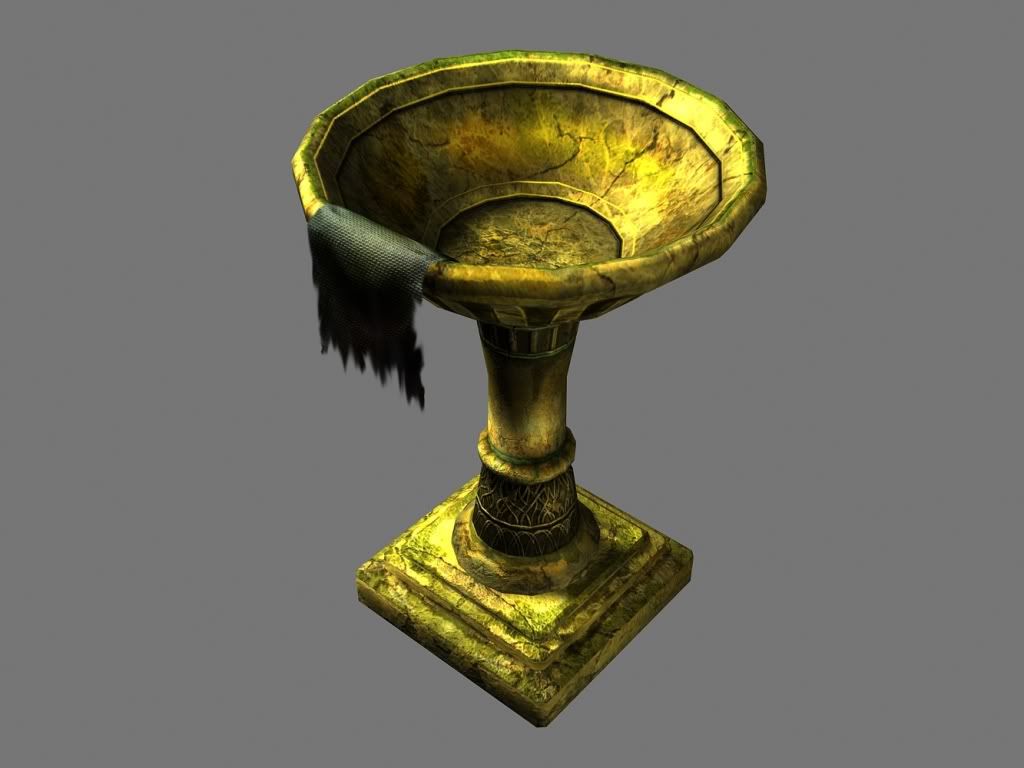
Golden Chalice
Hi guys, I was wondering if you could give some input on my model?

This is the Chalice I was working on and I'm not sure where I want to take it from here. Any tips, advice and critues would help me out alot. thanks you very much in advance.

This is the Chalice I was working on and I'm not sure where I want to take it from here. Any tips, advice and critues would help me out alot. thanks you very much in advance.
Replies
The "bowl" seems a little stretched as well.
But other than that it looks great from a distance.
wireframe?
Leviathan:I tried adding some moss but I guess it didn't work out.
pliang: I'll reUVmap the bowl I've been noticing it too.
Renderhjs: that shouldn't be too hard to fix, thanks.
To get the right feeling of metal, do i use the specs mostly to apply the contrast or is it a combination of both painting the diffuse and the highlights with them?
http://farm1.static.flickr.com/71/186895088_5fd303ae97.jpg?v=0
-Buddikaman
I'll work more on normals and specs for the mold. Thanks for the link and reference. I'll post updated pictures tonight or hopefully.
whats with the cloth? overall it looks to me about the size (and design) of a bird bath