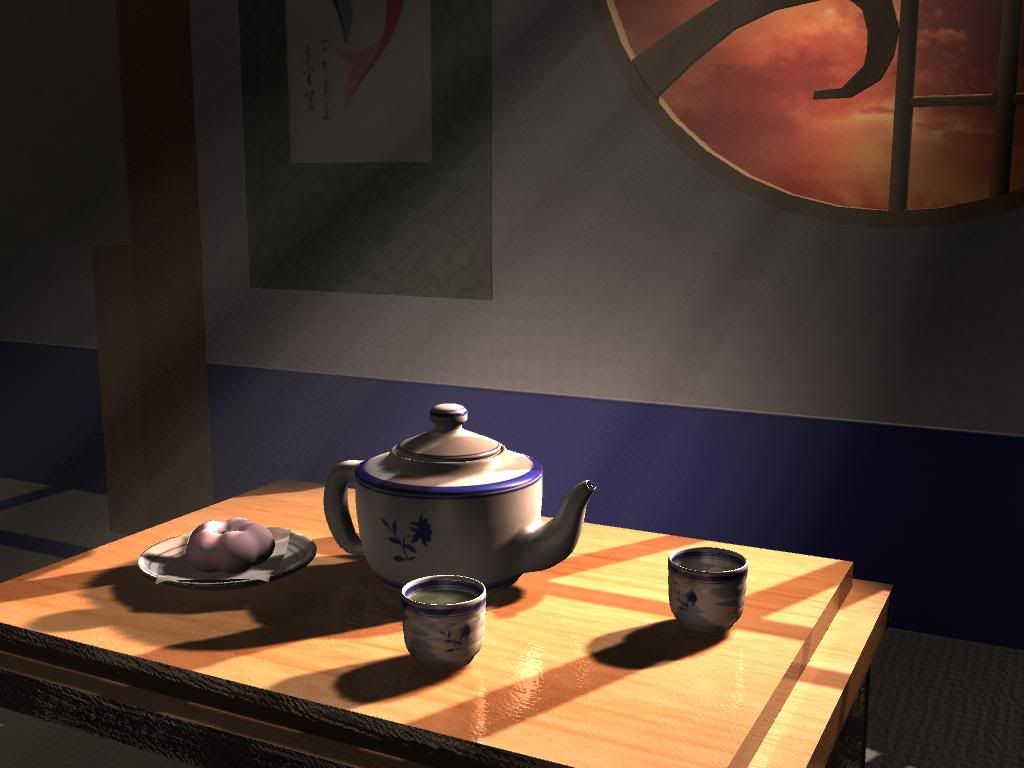
Tea Room Lighting render
Here's my first lighting project in Maya.
For my first attempt, I was happy at how it turned out. But I know there are things that need to be changed. I'm still learning Maya more and more, so I'd like for people to tell me what puts them off about this render so that I can get the best out of it.
(*By the way, I know the sky does not match the light ray color at all.
The sky image will be replaced when I create a new one.)
Feedback & advice are greatly appreciated.

Replies
if you decide to replace the sky image, then adjust the light source accordingly.
i think this will turn out nice for a first project.
Cheers and good luck!
-AA is too low theres jaggies around the teapot and cups
-Wall texture seems low res compared to the teapot, and things. Try to keep everything consistent with texture resolution
-Look into setting up an ambient occlusion pass
I'm not a maya user so I can't give you any help with the settings and what not but keep at it, take on board what everyone says and post up the improved render
Yes, I realize that.
I'm painting a new (blue) sky that will match with the light source, most definitely.
The shadows are something I've been fighting with, especially where they overlap each other and look like two different shadows... >:P!
I honestly don't know if its because I didn't break the shadow connections on each of the objects right, or if there's a setting for overlapping shadows.
(I haven't played with Maya long enough to know if there is.)
It may be something as simple as me having to play with shadow color, or whathaveyou.
I think that would be most helpful