Roman Cistern WIP
I decided to create a tileable environment and I took inspiration from the roman Cisterns under Instanbul. I started working on it yesterday, and so far I have 4 major pieces done. I'm doing this in 3DS Max (relatively new to it).
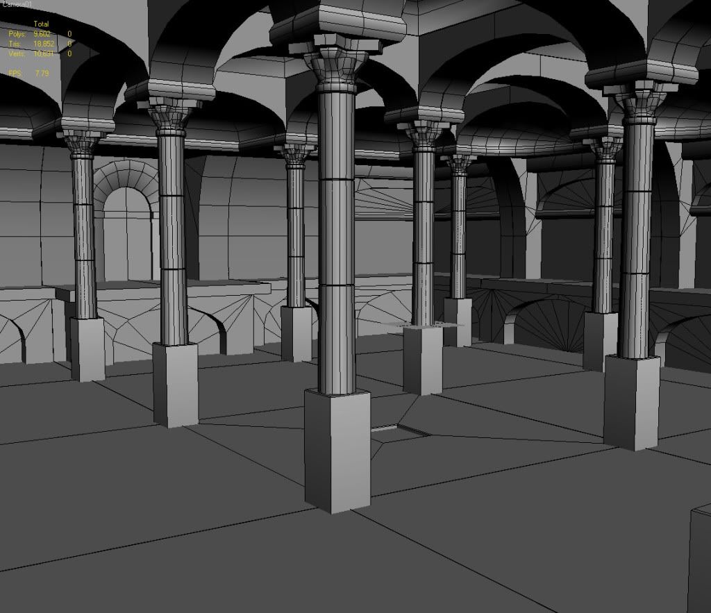
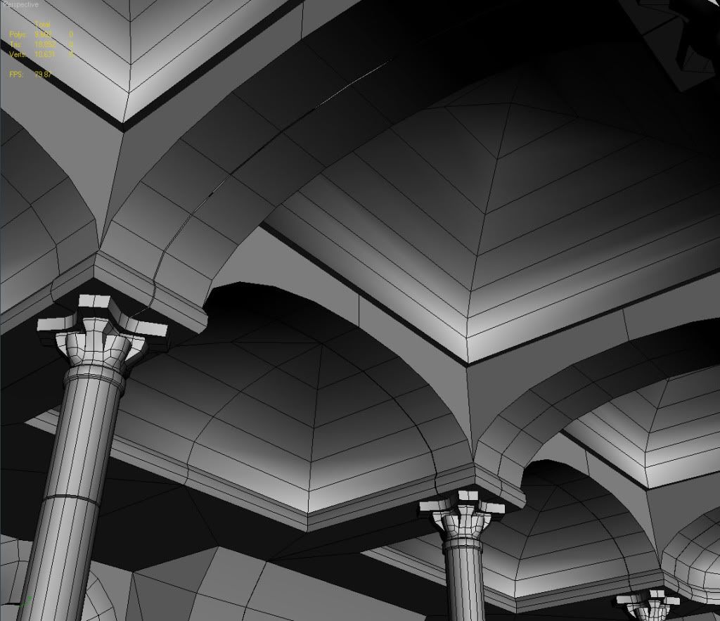
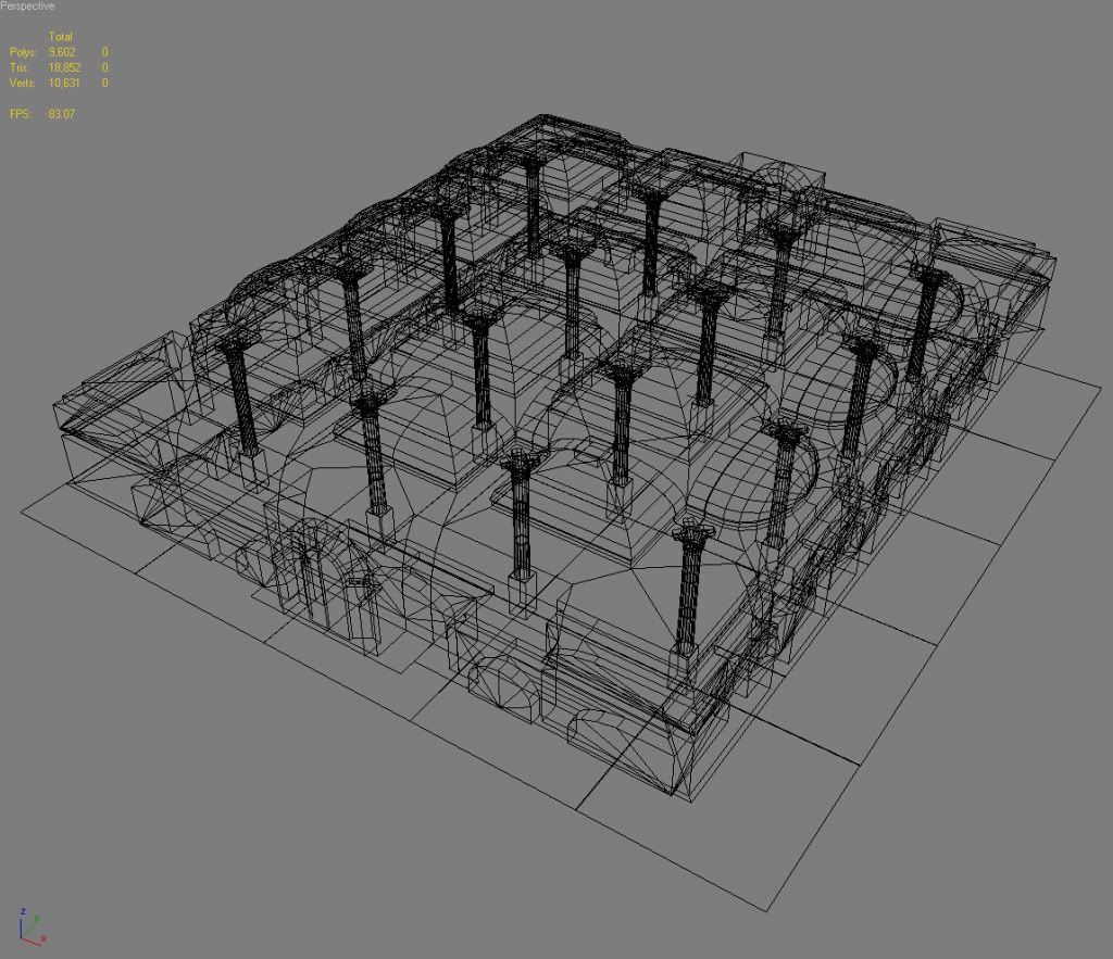
As you've noticed there are gaps between the pieces. Is there a snap vertex tool similar to the one in Maya? Something equivalent of holding V to put one vertex on the exact coordinates of the other. Also, I'm concerned with the amount of detail I'm putting in to each piece. For next-gen games, should I bevel and extrude the stones or simply paint a normal map of them?
I'm also open to any other suggestions on where I can go with this.
Replies
Under the options tab is Use Axis Constraints. This is handy when you want to align something based on an x, y or z coordinate, but not snap to it. You can hit F5, F6, F7 to switch your widget between x,y,z.
The proportions of your scene are off. All your archs look squat. As in, squashed down to the point of ineffectiveness. Also, the columns are thin and weak looking. Overall, thes makes your room appear tiny and improperly supported.
Looking solid though, Chris has some good points about the proportions- have you got any photo refs you can post to show the proportions/architecture?
"The design of most classical columns incorporates entasis (the inclusion of a slight outward curve in the sides) plus a reduction in diameter along the height of the column, so that the top is as little as 83% of the bottom diameter. This reduction mimics the parallax effects which the eye expects to see, and tends to make columns look taller and straighter than they are while entasis adds to that effect."