The BRAWL² Tournament Challenge has been announced!
It starts May 12, and ends Oct 17. Let's see what you got!
https://polycount.com/discussion/237047/the-brawl²-tournament
It starts May 12, and ends Oct 17. Let's see what you got!
https://polycount.com/discussion/237047/the-brawl²-tournament
ctf_aerospace - Map and lots of custom content
Earlier this year I decided that I wanted to learn how to make maps and models for the great Team Fortress 2. I'm still getting te hang of it and I learn as I go, but this is where I got so far:
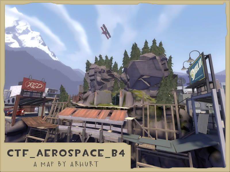
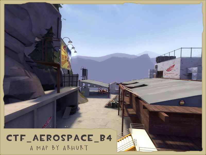
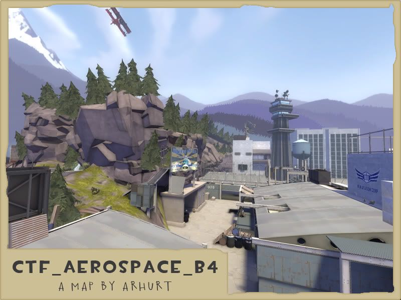
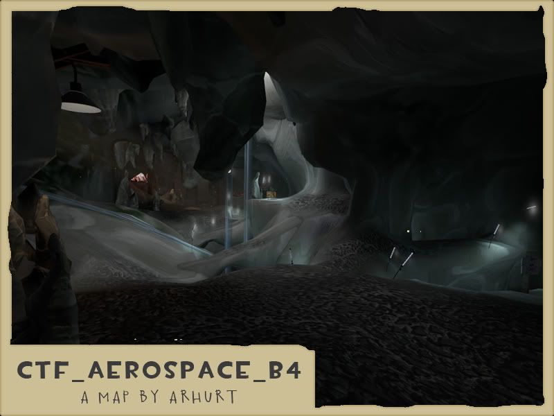
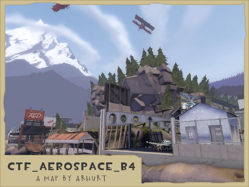
There is quite a bit of custom content on this one. Here are a few images of some of the models used on the map (the trees and mountains where discarded):
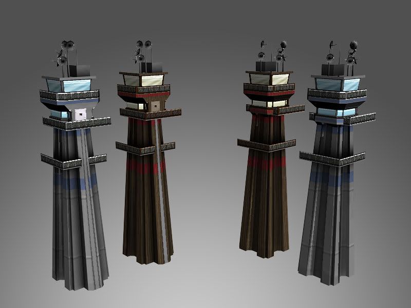
The pair of control towers that go in the 3dSkybox (nevermind the missing faces, players never see them from above)
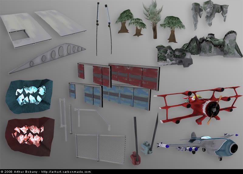
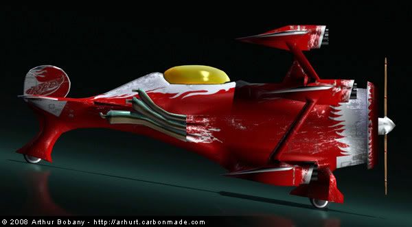
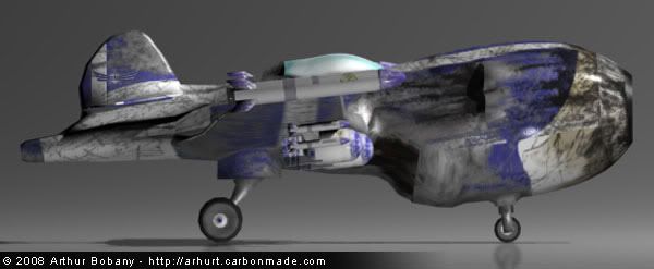
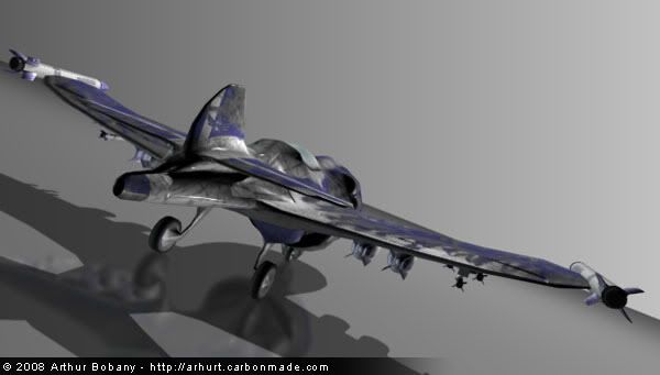
The collection of custom props I created. The central piece of the map is the pair of planes. They are scattered around the map at various locations and there are actually a few of them flying above the map. The hangar roof sections are also big central pieces of gameplay.
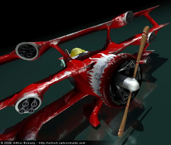
And here are the two plane models before I created their final textures. These ones where just placeholder until I had more knowlege of how the Source engine would handle materials and such.
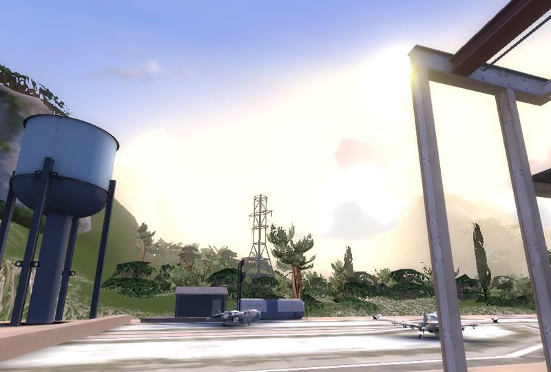
Before Valve released their set of Alpine trees and materials I was doing a lot of custom trees and vegetation, but scrapped it since theirs was much better. Here's a look at the map back then:
There is a whole lot of info and a billion images on the original development thread here, where you can actually see the evolution of a completely n00b mapper/modeler into... well what I am today: http://forums.tf2maps.net/showthread.php?t=2157
Don't belive me? Check out the plane model I created in April this year:
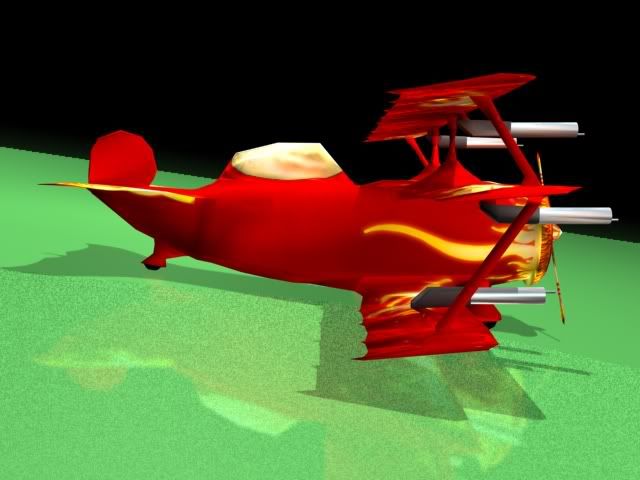
Eyebleeding I know... But I came around and learned my stuff
If you would like to download the map and check it out for yourself here is the link: http://www.fpsbanana.com/maps/73575
Thanks for the read and I much appreciate comments!
Aerospace
"The Government has issued a contract for the creation of the new line of combat planes
that are to be the standard for the near future. Two rivalling companies, Red Aerospace
and Blue Aviation, are now battling for the contract.
After many months of lawsuits, legal actions and speculation, the The Government has
decided to let both companies create a prototype, and has given advanced funding to both.
At the end of the deadline, both prototypes will be analyzed and the best one fully produced,
giving it's parent company will recieve the funding of a gazillion dollars for it.
Unfortunately, the production must be carried out in a secret location, and both companies
have been given one half of the terrain to estabilish their facilities. After many months
of hard work, espionage and peeking over the walls, they each have their own prototype ready
ahead of time. They could use this extra time to make their plane better, but stealing the
opponent's blueprints and sabotaging their planes seems like a better option.
And so their facilities have became a warzone."


There is quite a bit of custom content on this one. Here are a few images of some of the models used on the map (the trees and mountains where discarded):
The pair of control towers that go in the 3dSkybox (nevermind the missing faces, players never see them from above)

The collection of custom props I created. The central piece of the map is the pair of planes. They are scattered around the map at various locations and there are actually a few of them flying above the map. The hangar roof sections are also big central pieces of gameplay.

And here are the two plane models before I created their final textures. These ones where just placeholder until I had more knowlege of how the Source engine would handle materials and such.


Before Valve released their set of Alpine trees and materials I was doing a lot of custom trees and vegetation, but scrapped it since theirs was much better. Here's a look at the map back then:

There is a whole lot of info and a billion images on the original development thread here, where you can actually see the evolution of a completely n00b mapper/modeler into... well what I am today: http://forums.tf2maps.net/showthread.php?t=2157
Don't belive me? Check out the plane model I created in April this year:

Eyebleeding I know... But I came around and learned my stuff
If you would like to download the map and check it out for yourself here is the link: http://www.fpsbanana.com/maps/73575
Thanks for the read and I much appreciate comments!
Replies
That said, I've still played a few rounds and have a few minor issues with the map:
- The cave area and indoor area leading to it are both confusing and a bit difficult to navigate. I realize this may have been your intention, but simplifying it just a tad and making the areas you can fall down into be really obvious would help.
-The light glows you have in the caves are very disorienting; I was chasing after somebody through the caves just this last Friday and I had to stop and get my bearings because the light glow made it hard to see pits I could fall into and people behind the light glow.
-The plane designs are great, but the textures feel slightly out of place next to original TF2 textures. The high-frequency texture detail in the red plane's engine and on the wings seems especially out of place. I'd suggest simplifying things a bit and adding only impressionistic details with large brushes if you want it to fit in a little better.
-It's slightly difficult to find your way to the intel rooms. Adding a few more signs and arrows might alleviate that.