Lil'Chew-Chew
Hi everyone! This is my first post here and I've been playing with game modelling for a year now and have just finished the first part of this little project.
For those unfamiliar with the game, in Team Fortress 2 there is a gamemode called Payload where the Blu team must escort a bomb-cart trhough the enemy base and detonate it at the end of the track.
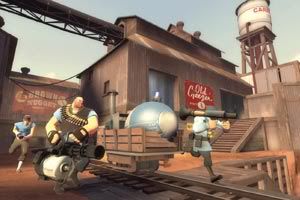
In the classic Payload map called Goldrush the payload is a bombcart that slowly advances trough the tracks as players push it forward.
A fellow mapmaker started to create a map where a few things change from the original concept. First is the size of the payload, instead of being smaller than a player it would be large enough to provide cover and so the defending team would have a harder time killing the players pushing the "cart"
Another change to this would be the speed of the cart, much faster than the original, meaning that standing in front of the "cart" would mean death.
He proposed to me a layout based on a train locomotive that Valve had placed in the game. He wanted the locomotive to be menacing and look evil, with yellow eyes and a mouth of jagged teeth carved from the furnace and spewing fire.
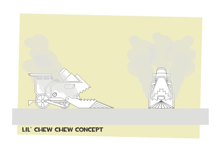
With this idea in mind I pulled together this concept in about an hour, just to place down in paper (.jpeg?) what I had in mind:
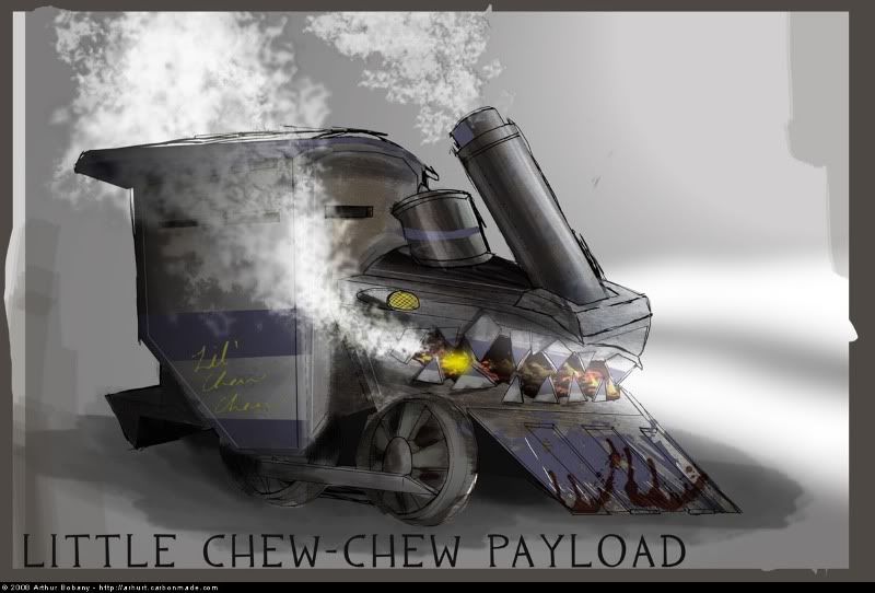
From this I started sketching around ideas until I got to the visual I was looking for:
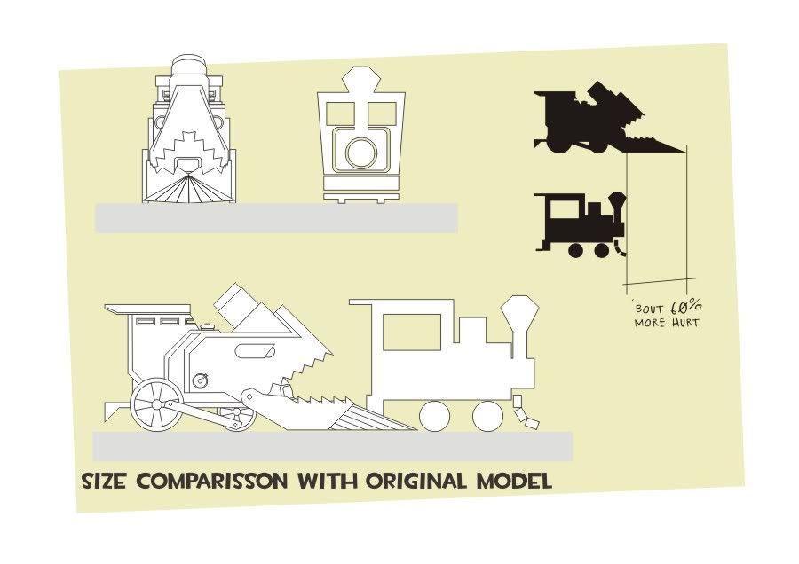
The other locomotive you see on the previous image was the original model he was using to playtest his level. At this point in time changing the lenght of the locomotive by 60% would be too much of a hassle to implement, so he asked me to reduce the model and make a few changes. Here is the new profile I got to:
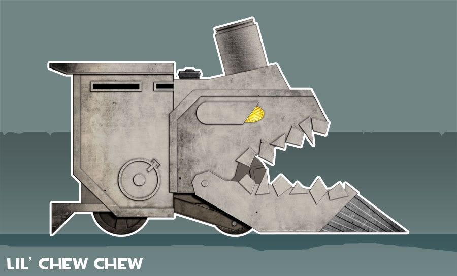
Still a little bit bigger and bulkier than the previous model, but doable. After a few more changes I finally started working on the model itselfl:
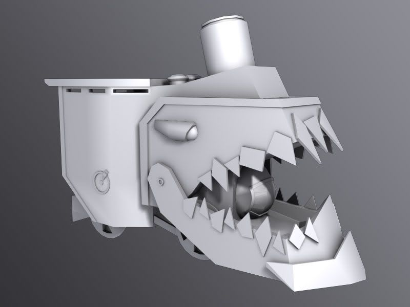
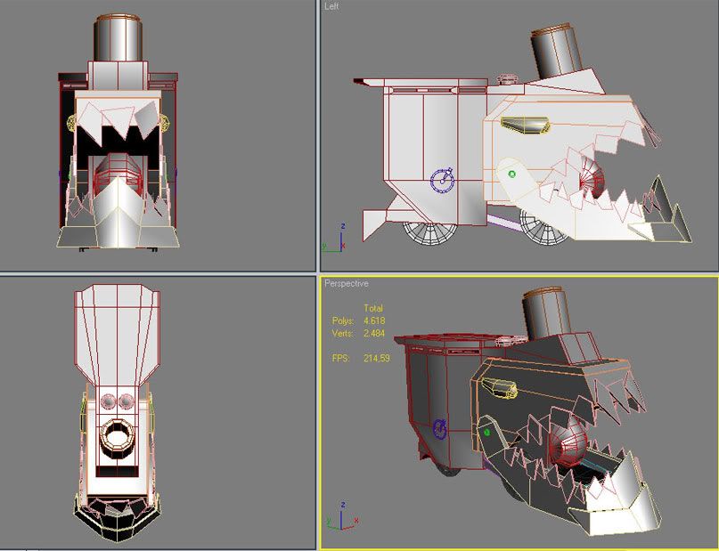
After some fixes the final model sits at 6000 triangles.
With the model done it was time to texture it. I choose to make a paint-over of the model to show what I had in mind:
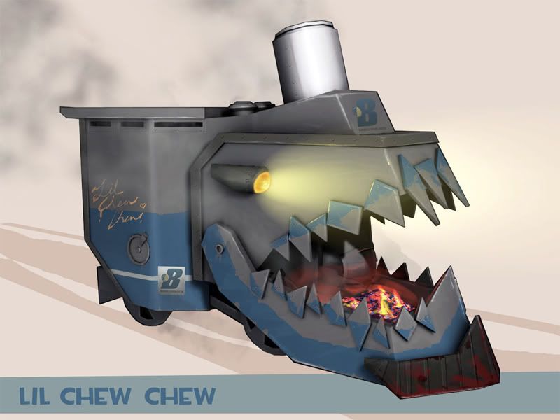
With that paint-over done it was pretty easy to make the texture and finalize the model:
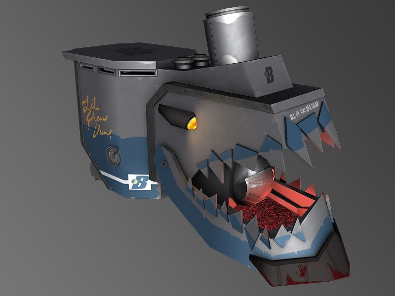
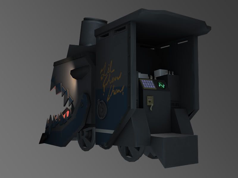
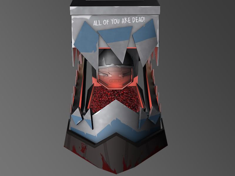
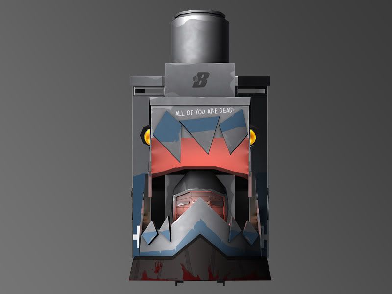
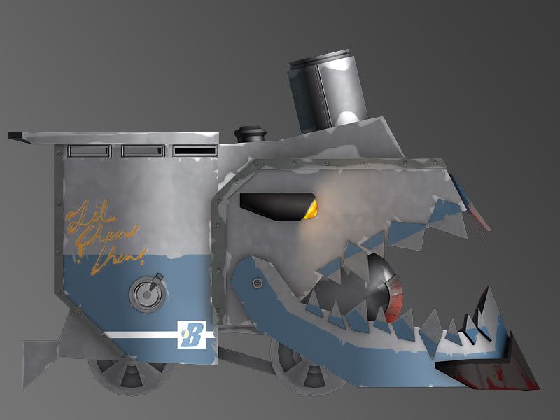
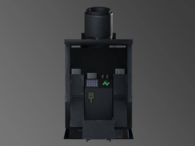
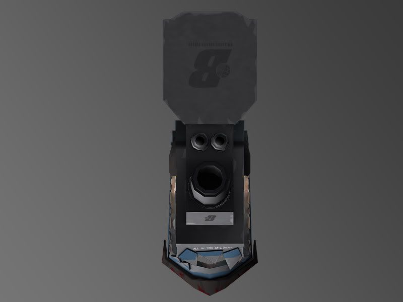
It's all rigged up and working in-game, and as soon as the map is released with the model I'll post a link here for those of you who own the game and want to see it.
Comments and critics are more than welcome!
For those unfamiliar with the game, in Team Fortress 2 there is a gamemode called Payload where the Blu team must escort a bomb-cart trhough the enemy base and detonate it at the end of the track.

In the classic Payload map called Goldrush the payload is a bombcart that slowly advances trough the tracks as players push it forward.
A fellow mapmaker started to create a map where a few things change from the original concept. First is the size of the payload, instead of being smaller than a player it would be large enough to provide cover and so the defending team would have a harder time killing the players pushing the "cart"
Another change to this would be the speed of the cart, much faster than the original, meaning that standing in front of the "cart" would mean death.
He proposed to me a layout based on a train locomotive that Valve had placed in the game. He wanted the locomotive to be menacing and look evil, with yellow eyes and a mouth of jagged teeth carved from the furnace and spewing fire.
With this idea in mind I pulled together this concept in about an hour, just to place down in paper (.jpeg?) what I had in mind:

From this I started sketching around ideas until I got to the visual I was looking for:


The other locomotive you see on the previous image was the original model he was using to playtest his level. At this point in time changing the lenght of the locomotive by 60% would be too much of a hassle to implement, so he asked me to reduce the model and make a few changes. Here is the new profile I got to:

Still a little bit bigger and bulkier than the previous model, but doable. After a few more changes I finally started working on the model itselfl:


After some fixes the final model sits at 6000 triangles.
With the model done it was time to texture it. I choose to make a paint-over of the model to show what I had in mind:

With that paint-over done it was pretty easy to make the texture and finalize the model:


It's all rigged up and working in-game, and as soon as the map is released with the model I'll post a link here for those of you who own the game and want to see it.
Comments and critics are more than welcome!
Replies
At what point did you stop liking it? Do you have any suggestions on how I could make it better? Or even what should I look forward to improve on my next project?
also the texture clashes with the design. a rusted metal lok would suit it much better, and the modern type faces look out of place
It's going to say things like:
During setup time: "Initializing vacuum tube logic; Loading Chew-chew personality"
If BLU has taken several CPs without much resistance: "Error: resistance not encountered. Executing steamroll"
When he runs over someone "Debugging complete" "Maggot removed" etc
Before he goes over the cliff at the end "I've not been programmed for Regret"
Plus it will be pushing a cargo cart loaded with dinamyte crates
in fact.... here's a piece of triforce.
Now that the model is finished (I'l just do some tweaks to the texture and animate the wheels) I look back and see a lot of different things I'd do.
Yes it is a cartoony piece, but not so much as to look unrealistic. It's really hard to explain but it fits TF2 style pretty well. It's for the Blu team, very industrial and clean:
If anyone is interested in knowing more about it, I recommend checking these articles by valve:
The same goes for the wheels. Make them darker. The problem I think was mentioned earlier is that everything blends together. You can still keep the core color theme of cool colors, just get some contrast in there so its not all grey/blue.
lastly.. mayybbee post up your texture flats so we can give more crits.
When it hits a player it should gobble them up and shoot their body part into the air out of it chimney stack
Munch munch munch
If it cart moves very fast you'd probably have to make a zig zagging track (or very winedy map) , to avoid a gigantic level.
The model will be used in a map and the size and shape of it have a huge impact on the gameplay. Like there are places where you can only get to by jumping from the top of the locomotive and thus there's a limited timeframe to get there. In some other areas Lil'ChewChew will completely block passages and such.
But with your comments in mind I have done some tweaks to the model that are actually going in before the first beta version of the map goes live this weekend.
Some changes I made are messing with the teeth so they aren't aligned and are kinda jagged and more menacing. I've changed my textures so there is more distinct difference between the different parts of the model. Added bolts and also made the teeth look sharper with a white trim.
The model in-game looks considerably different because Team-Fortress uses a Half-Labert shading and lights the model with vertex-lightning. Here's a look at it in a simple room:
The model uses 3 separate materials. One of them is for the embers inside the mouth and has a diffuse and self-illumination maps. The others have Diffuse, Self-Illum/Opacity, Specular and Normal maps.
I didn't want to reuse textures so much because the model is already totally symetric and I wanted to add variation on the texture.
Here they are:
Diffuse maps
Specular maps
Self-Illumination (also dubs as opacity map for the Vaccum Tubes Glass)
And the normal maps (that only have smallish details like bolts and creases I am considering using just a bump-map)
Your criticizm is most welcome and I thank you for the time spent looking at these
If so,you might wanna reconsider that,you would need a better and efficient UV layout than the current one.
If you have the original UV layout with textures,can u show us that?
Vj
-I dont think the bloody hand fits the toon-style very well.
-Same goes for the coals inside the mouth, I'd expect these big chucks of coal instead of the noisy texture.
-I agree on the UV space, I can imagine this texture being HUGE if you'd want the 'all of you are dead' text to be readable.
good job
more screens of this awesome map and the download link here: http://www.fpsbanana.com/maps/74124#pid_4707472
Think that those could be placed as particle generators inside the map editor, and attached to the cart.
Mirror some details, and use decals for things like text.
Use more fake Ambient Occlusion on your texture, some shadow. ATM its too bland.
Define edges a lot more, atm everything look fullbright.
Little details like scratches and stuch can still be done. Just because TF2 is cartoony, it doesn't mean its plain.
I also remodelled the eyes to look more angry/evil. Some people thought the old ones looked sleepy and lazy :P
Here are some MAX renders:
And here are the new texture sheets. I use two 1024x1024 material files with Diffuse, Normal, Specular and Self-Illumination maps for the entire model. As you can see there is a definitive improvement on the normalmaps (if not perfect).
Diffuse:
Normalmap:
Glow:
Specular:
Any comments and advices are very welcome!
Oh, and this is what you see with him alone in a tunnel when you are about to be ran over:
And a few shots of it in the dark to show off the Glowmap:
Big fan of the glow map you've used to illuminate it in the tunnel. Loving the teeth!
Good work, keep it going sir :P