Dirty_mechanic!!!!
Here we go!
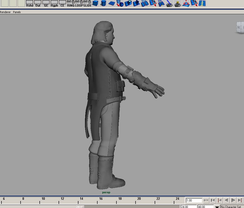
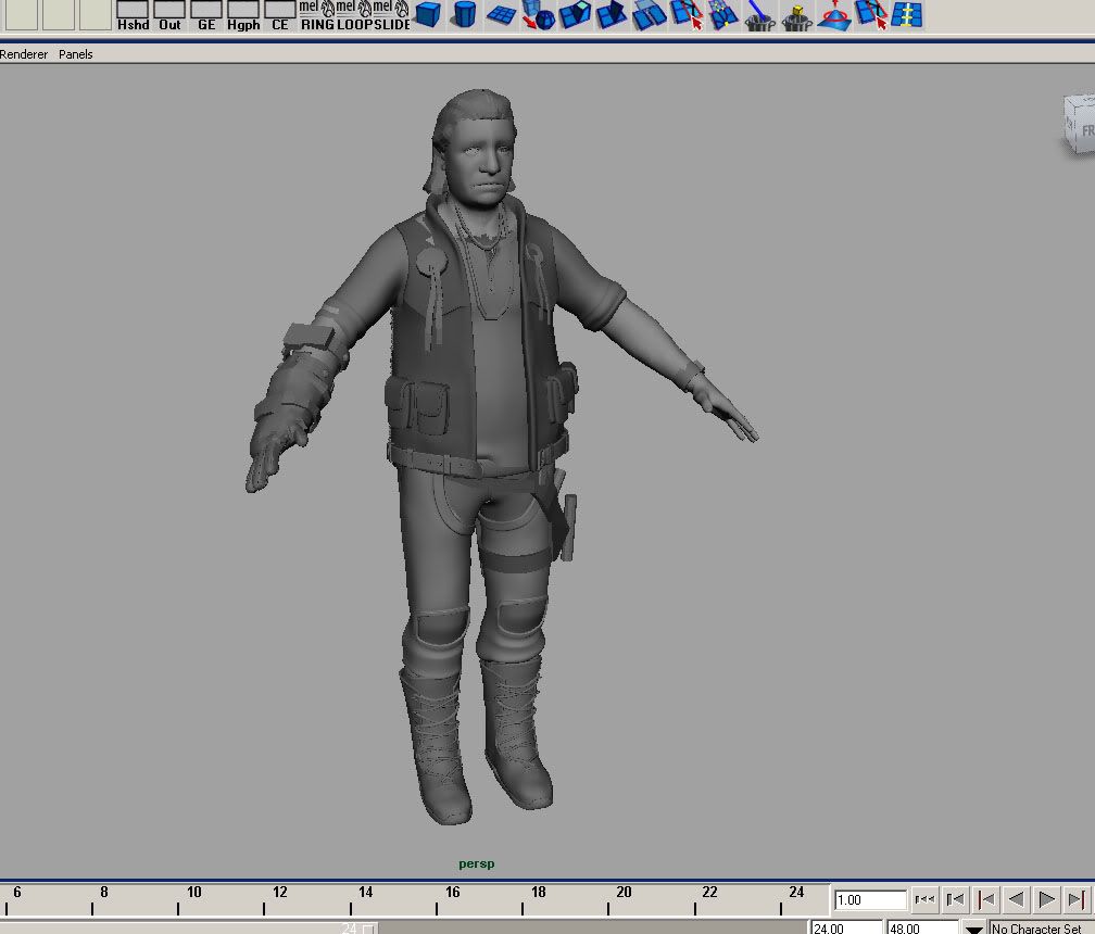
Working on a character, who is a mechanic. But I have so woes.Iam almost done blocking in this character but Iam just not happy about something. And no its not the face; The head is just a place holder until I can sculpt something in zbrush. Right now, I know its very old man like. The head iam going to go off of, will be something like Jeff Bridges, with his crazy dude hair(see below)
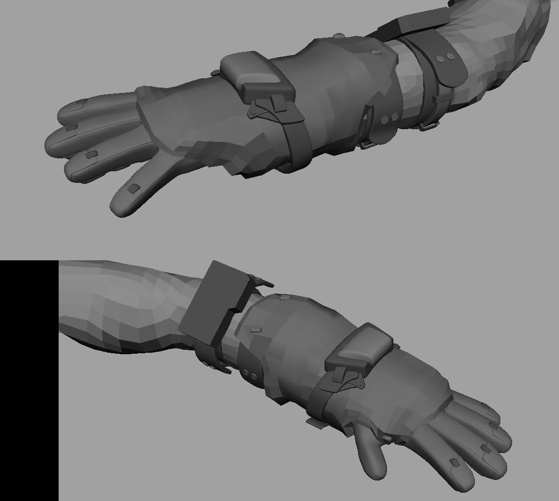
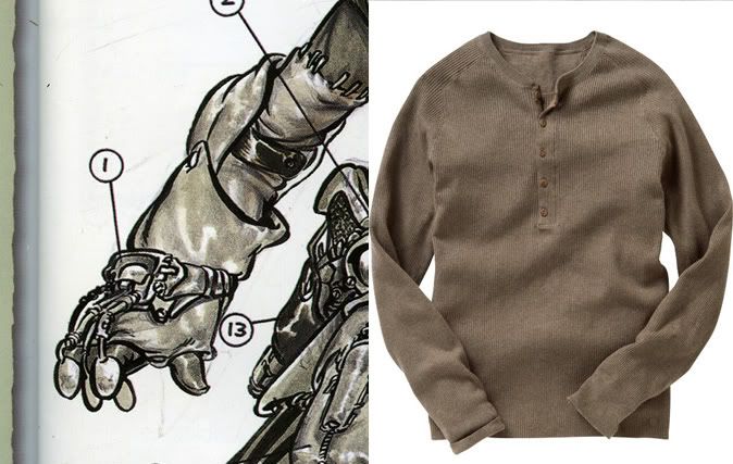
What bothers me is the attire of this character. I dident want him covered in crazy sci-fi like armor or things like that. I want him rooted in reality, but an obscure twist on it, so i threw in some native American influences on the vest and gave him a funky glove. And as a mechanic, gotta give him some sort of overalls.
On his right Leg I started to throw on an tool belt. Something that would have tools of the sorts.
But like I said. Not happy with the overall design of it right now. Trying to figure out whats up. Any Idea/feedback would be like an early Christmas.
thanks!

and a photo-ref of jeff (the dude) bridges for good measure.
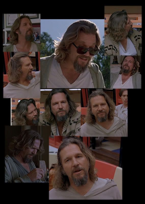
Working on a character, who is a mechanic. But I have so woes.Iam almost done blocking in this character but Iam just not happy about something. And no its not the face; The head is just a place holder until I can sculpt something in zbrush. Right now, I know its very old man like. The head iam going to go off of, will be something like Jeff Bridges, with his crazy dude hair(see below)
What bothers me is the attire of this character. I dident want him covered in crazy sci-fi like armor or things like that. I want him rooted in reality, but an obscure twist on it, so i threw in some native American influences on the vest and gave him a funky glove. And as a mechanic, gotta give him some sort of overalls.
On his right Leg I started to throw on an tool belt. Something that would have tools of the sorts.
But like I said. Not happy with the overall design of it right now. Trying to figure out whats up. Any Idea/feedback would be like an early Christmas.
thanks!


and a photo-ref of jeff (the dude) bridges for good measure.


Replies
Love to see some Wire frame shots,poly budgets if any.
The photoref is good,and if you are planning this for a real time asset,you would need to plane the hair and beard,as these two are very prominent elements of ur reference.
Any way,do update us with ur progress.
Vj
Maybe some reference from the main character in Prey would be a go too. Some decal and emblem on his vest perhaps?
Digging the process so far.
to be able to stand back and "see" what it is thats bothering you.
Usually its just over familiarity, taking a break and working on something else for a while helps me sometimes.
Failing that, how about loosening up the trousers a little? If I remember the Big Lebowski
style correctly his trousers were like really loose, comfy. If he was a mechanic he'd need loose
trouses to be able to manouvre around vehicles etc. Kinda combats, maybe jogging pants.
Just a thought. But keep the kneepads!
Between looking up some more additional references, and taking a break, I made some changes the other night.
I added this design in the back of the vest, took off the Indian design in the fount. Also put in a tool belt/bag on the side of his leg. Its for his goodies.
He also has now a sweet pair of shades that i threw in along with his pcube necklaces. (need to work on those too)
I am feeling more comfortable with his design, but my biggest concern is that he's looking off-balanced with his glove on one hand and nothing on the other. So i might have to add another glove, but I am probably going to mess around with some more ideas before I commit myself to anything yet.
Changed a few things around, and started sculpting Legging and undershirt. Still very much a work in progress and parts are still subject to change.
Vj
"Pbthhh"
After I finished sculpting, I baked out the maps in Xnormal/max and mixed results. I don't know if its the max viewport or what, but I am really not digging the black shading on the edges of the model. On that note I did make sure I used correct shading groups.
My biggest complaint is some nasty seams I cannot for my life of me get rid of. Along the arm, and the back of the jacket. When I baked them out, I made sure the UV's were not stackd on top of each other. I gave (i belive its called) Warbys, or woobys -somthing Normal map seam tutorial but it gave me not so good results.
If anybody were to know of another way to rid myself of these seams i would be so greatfull.
C&C always welcome.
Inverting the green channel totally worked. Much thanks to you sir.
Somehow, i need to improve my textureing skills. And i would love to find a way to finish this dude off, because I know, that there's still much that could be improved.
Any major eyesores please let me know. Because I know it can be improved.
http://www.mosaiko.gr/admin/articles/images_large/metallica.jpg
I'd say the texture looks on its way to being good, I would make some adjustments to your texture along the lines of this guys work.
http://www.fx81.com/
looking good man
I checked out your site and I really like your selection of vehicles. Makes me want to do some hard-surface stuff.
the greyscale jacket/shirt is a bit sterile. give it some coloration. in fact, the whole piece could use some slight discoloration.