Mayan Environment
polycounter lvl 17
Hey Everybody,
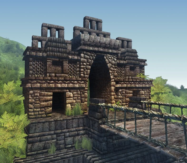
A ways back I posted a WIP of a Mayan/Incan environment that I haven't been able to go back to for quite a while ... Here's an update of what I've been able to do since starting up again. I'm looking for a job and want to throw this in my portfolio/demo reel, so I'd love any critiques anyone might have. Thanks!
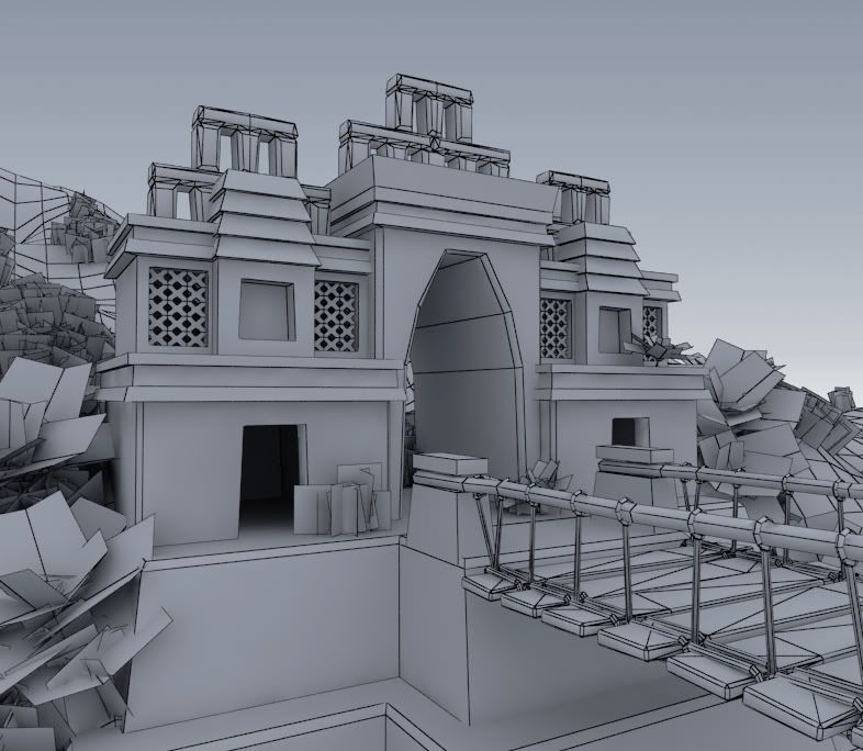
Geometry
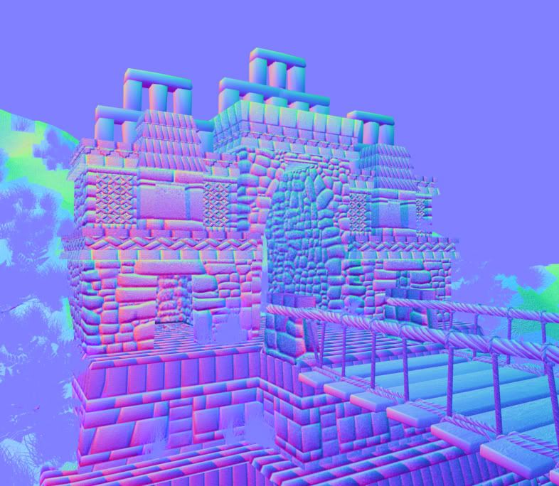
Normal
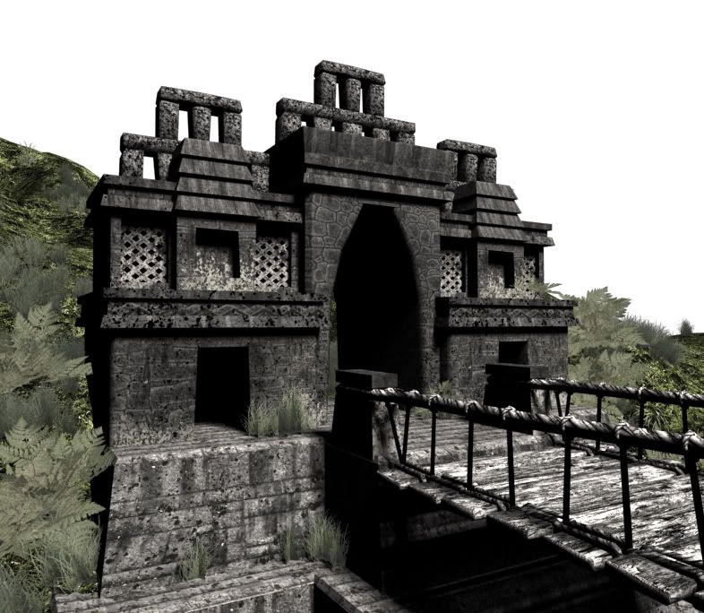
Specular
A ways back I posted a WIP of a Mayan/Incan environment that I haven't been able to go back to for quite a while ... Here's an update of what I've been able to do since starting up again. I'm looking for a job and want to throw this in my portfolio/demo reel, so I'd love any critiques anyone might have. Thanks!
Geometry
Normal
Specular
Replies
Secondly, everything is planar, as in perfectly modeled straight up and down. This is an ancient stone temple. Wear and tear, destruction, weathering, delabodation, time.
Finally, most of your stone normals aren't stones, their simple bevels. A quick sculpt pass in zbrush or mudbox would do you wonders
same as well for your trees. the leaves are very stiff. 2 planes for the leaves just isnt enough to make it a convincing tree
is it me or does that proportion seem off. Bridge to Temple.
The "X windows" are actually geometry - I was afraid this would hog too many polys but apparently I can use more?
Cholden, should I model out just the stones comprising the corners and then er, "crash" that into the model I have now, if you know what I mean? How many tris do you think would be appropriate for something like this? Thanks, I'll go ahead and age it a little bit, toss some rubble around and add more detail to the normal maps.
Menechu, you're right I think it's the planks being oversized that throw off the scale. It's a suspension bridge but it's very large, so I'll shrink down the planks, add more vertical ropes and maybe add some sort of scale reference in there.
With the vegetation, there's grass billboards that are just 2 quads, and then the ferns that are made up of a leaf texture on a quad, then copied and rotated around a small stalk about 10 times. I'll put a screengrab up when I get to my computer - but this seems to be the amount of detail put into these objects in other games. Am I way off?
If by crash you mean intersect or t-junction, this is common. You can usually get better lighting results from a solid mesh, but again this all depends.
Your vegetation isn't that bad, but some of them reveal themselves as planes because of their lighting. The real problem is the variety and usage. You've set everything up that this is in a plain (rolling hills field). This should be in a jungle or at least have some trees and vines around.
Menechu does have a great point, that bridge is HUGE or this temple is tiny.
I think your stones are all too bubbly. While the mayan ruins are very old, they don't get rounded off as they degrade really, and most of the stones were made cut very precisely and flat.
That's the top of Chichen Itza. The stones of the lower wall, while not being in any traditional brick pattern, are all pretty angular, and all have a pretty flat surface to them. They've got gaps between the stones to a degree, but they are not rounded off really.
Do a flicker search for any of the following: Tikal, Palenque, Uxmal, Chichen Itza, Tulum.
Youl'll find some sites that have degraded more, but those tend to just have rougher surfaces, not softer ones.
personally id say the bridge is too orderely, shift around the boards a bit, maybe having hanging down a bit more perhaps. good stuff tho
As recommended by everyone I'll beat the model up, age it a bit.
Thanks Cholden - I'll make those changes (and trees ... eventualy...)
Here's the reference I used for the bridge
And here's a smaller bridge with smaller planks and more verticals
I would tend to be afraid of making something a certain way to "show off the normal map." Like most of the stuff we do, if done right, the normal map shouldn't be noticeable, but should just feel right for the piece. I also think that your normal map needs a little bit of grit to it. Right now each stone looks pretty smooth overall. Even Incan stones are rough outside of the seams.
The bridge is better, but I think you're kind of in a dangerous position right now.
The problem I see, is in the main rope (handrail?) of your bridge. If it is meant to be used as a handrail, it's still too tall. But if it's NOT, then it's too short. If you look at your reference, the guide ropes act more like suspension bridge cables, and are above head height (I believe). It's in a confusing position right now, at about chest level. If it's a handrail, it should be about 3' over the planks. If it's not a handrail, I would raise it to 10' or more, and sag it more in the middle like your ref.
Is this a new/in use Mayan/Incan temple? Or is this a ruins site?
Right now I'm dirtying up the stones, flattening out the curved edges, aging everything a little bit, scuzzing it up and making it more ruin-y. Will post more pics soon.
Weren't these ruins painted at some point when they were in use? I'd almost like to do that but it would be a little counterproductive...
If their ruins, are they undiscovered ruins? or have they been dug out and cleaned up?
The edges of any structures in real life will not look razer sharp,they have their slight bevel.
Do not restrict your self to platform specific art for now,if u have an thing in mind like that.Feel free to spend more polys and u can of course use more texture pages.The normal map wil do the job only upto a certain extent,in some areas u can show details by actually modeling out the stones and slapping them to the plane wall geometry.Tomb raider undeworld is a perfect example for these kind of structures,or any time, games like gears and UT.
Once you have completed the basic blockout modeling,you can move in for the second phase,and so on for the textures.
Then if you really wanna showcase this as a reall time game art,you can go in and create the second channel of UVs for the entire structure,give the scene a good light setup and render out the light maps and blend it with the diffuse layer and show all your constrcution sheets along witht the geomety.Frankly speaking as a Lead Artist,i'm tired of seeing the just the plain occlussion render,which does not convey anything.
Hope you get the point
Vj
I finally got some time to make some changes to this WIP - so I went in with a sledgehammer and messed things up a bit. Fired the gardener too.
I used a lot more polys (that was a relief, I thought I had a lot less to work with...), modeled out anything that would be seen in silhouette, remodeled some plant life (There's ferns and such that are fully modeled, and then grass/weeds that are just flat quads), and adjusted the bridge, hopefully it fits a little better now.
Tumerboy, I'm thinking of this kind of like an "in-use" ruins site (pre-columbian time period) - it's not overgrown but has been worn down by nature/violence, if that makes any sense!
Anyways thanks everyone for the critiques - texturing is next but let me know what you think so far!
One thing that struck me was the tree roots. They look very snake like. I'd put some more branching on them where they turn. So instead of just turning the other way, they split at that point, and each one goes in a different direction.
Two things; the vegetation looks great on the left, but is bare on the right. Balancing this with a lot of vegetation would be the direction I'd take this. You've got canopy level foliage on that tree; surround your temple with it! Secondly, overall, the green is low saturation. It just seems a bit too monotone for the scene overall, but it could work with your final scene depending on how you take it.
With those more chaotic ruins and richer vegetation it gets really nice.
Good job
Vj
i think it would make a nice compostion to have the canopy from the tree on the left arc out over the top of the temple and leave the hill on the right as background, infact maybe even push it back a bit, with a little fog that could make a real nice depth to it and lead the eye around in a wirlpool fashion to or from the centre.
edit- and yeah great update
Let me know what you think or what I can do to make it better!
Not sure I'm a fan of how you handled your UVing though. maybe some can give you tips on that - I haven't done too much of that rez so I don't want to give out misinformation, but it looks like you have a lot of wasted space, and there might be a better way to go about it (once again not my thing right currently)
one tip I can give however to clean up the UVs if you want to approach it this way is to get Chuggnut's UV Tools 1.5 and use the align tools to make the UV's straighter and pack them in more.
all and all though dude looks way better, good work
I'll have ti agree with bounch on how you handled the uv layout. On one hand I understand that you wanted to get everything on one map, and hopefully keep the resolution consistent between the pieces, but then if you did that... why is there still so much unused space? Another way to handle this (maybe) is to use a tileable texture method... but I don't know how well that would work out in the end.
Anyways man, this is super nice, the lighting is pretty good too, but I can't help but think you could push it more. It seems like its around noon in this shot, but what if you made it morning, or dusk? You can get some really great colours in the sky, like some nice warm oranges or pinks / purples etc. which should really liven up the scene some more. You could also work with maybe some candle / torch lights. I see some orange in the main entrance (I like) maybe you can work with that a bit more.
And that Terradactyl rocks! DINOSAURS RULE!!
but it is looking much better
Overal style is now better but there are still some downfalls imo:
- stiff bridge,- make it hang more. Loose some panels
- big and undetailed leafes with razor sharp edges and metal hard surfaces
- gras looks like a complete different texture item- it pops out because it does not blend with the rest
keep it up you are making great progress here
The tree roots still feel like they're floating too much. I'd try blending them in better with their surroundings. Roots that have been there long enough to get that big, have lots of crap pile up around them/under them. Even on the stone areas, those roots would have caught dead leaves and blowing dirt, and would have build up some dirt under and around them. Especially at the base of the tree, grass is not likely to grow right up to the trunk, there is usually a bare patch of dirt, or at least piles of dead leaves around the base of a tree trunk and it's roots.
The texture on the tree trunk/roots looks pretty good, but feels like it's tiling a TON for some reason. It feels like you accidentally typed 100, in the tiling box instead of 1, or something.
Is the fog something you did in game? or in Photoshop?
Overall, there's something off about the lighting too. I'm not totally sure what it is? Maybe it just feels too crisp with the hazy/cloudy sky you've got?
Because its industry standard and good practice. Don't do a 'bump' map. (re: b/w height map)
now you need some men in feathered masks and lots of blood.:)
With the trim texture map - I was under the impression that each separate object needed it's own map (don't ask me why) but it sounds like you can cram nearly entire scenes of this size onto one map (correcto?). Tell me if this is right here: I'll straighten out those UV's (even though it will distort the textures a little?), include all the other objects in the scene, fill in the gaps and pack everything in more densely.
Shepiro I'll make sure there's more unique detail in the trim pieces - the stones need more variation like what you see on the inside of the arch and the trim pieces don't have that yet.
You're right the tall grass color is off from the actual ground texture - should I also blur the bottom edge of the grass alpha map so you don't see that line so sharply? And the same for the edges of the "Big Leaf" texture? Right now there's no normal bump or specular on the big leaf, maybe that's why it doesn't seem to have any detail (page one of this thread has got a closeup of it).
Tumerboy, the ground texture is just a single tiling texture so I'll use vertex color to get some dirt and scuzz closer to the tree roots. Should I use some geometry of dead leaves for this also or is that too much? Part of the low level detail on the tree isn't actually tiling too much but I know what you mean... I'll try making it larger. I actually did the distance fog in photoshop with a z-depth mask, but tried to make it look like something a game engine could do. Ya totally caught me there. And you're right the lighting needs to be more diffuse. But by Jason's recommendation I think I'm going to change the lighting to be a little more dramatic, or maybe even nighttime w/ some torches?
One more question I have is what engine can I put this into? This is all in 3ds at the moment and my computer is too sloooowww for UT3. Curious if there was a particular format an employer might prefer to see this in.
Thanks again,
John
If you're talking about unwrapping each block to separate uv space in one giant map, that's not quite what I meant (not sure about others.)
I'd use a tiling material (diffuse, normal, specular) for the stones, all of em. Just unwrap each one and relax a bunch. You could vary the coloration/tone across the tiling texture (if it's big enough) and then just move each stone's island to a different spot, to get a little more variation in the overall appearance.
Then Set up a second UV channel to bake your AO to a separate map.
UT3 would be your best bet if you can find a computer to do it on.
As for the "scuzz" some extra geo for dead leaves might be useful, but I would just make a "dead leaf & dirt" decal, that is alphaed around all of the edges. Then you can make some little mounds under the roots over the blocks, and map the texture to that so they blend out with the stones a little better. (hope that makes sense)
On the grass, most jungles don't have much grass. Grass does well in big open areas where there is a lot of light, and not a lot of tree cover. In jungles you get a pretty thick layer of hummus and leaf litter, and then lots of small plants and trees in the understory. If you're set on grass (no skin off my nose) I would make a few planes like you have, but off different heights. Put the shorter ones in front of the taller ones, and it should help to blend it into the ground a little more. Also make the blades in your texture fall over to the sides too. Right now they ALL stick straight up, and then start to bend. Real clumps of grass act like pin cushions. Each blade kind of points toward a common center. So the ones in the center of the clump stick straight up, while the ones on the edges can be pointing almost horizontally. Break it up enough that it doesn't look stupid though, otherwise you just end up with green, fuzzy balls. . . .
. . . yes, that's where I'm leaving my critique. . .
A few crits, not sure if they've been covered already...
- The bricks are stacked funny. Normally the center of an upper block lays across the gap of the bottom two blocks, like bricks. What you have now, they stack on top of each other, kind of weird and not as stable.
- Your colors could mingle a bit more. Your tree is all brown, your stone is all grey and the dirt/grass is all green. Good color choices but they need to blend together to make all the separate objects in the scene come together.
- When you zero in on an object and start painting its diffuse, don't forget its one object in a forest of other objects that are all going to interact with each other and be needed to sell the scene as a whole piece.
- Jungles have aggressive plant life that works to reclaim lost structures. You want to show this by not making your brick and man made structures stick out, but blend in. You want hints at the inorganic structures mixed into all the organic plant life. What you have, seriously underestimates mother natures power to reclaim what we leave unattended.
- you also need to think about the generations of plant life that are attacking this structure. Moss and dirt creep in, as generations come and go their dead carcass are left on the battle field to feed the next wave of incoming troops. As the body count stacks up and collects in areas bigger stronger plants can take root. You have to think about where the dirt and debris would collect, how the wind and rain effect these things and place your grunge, dirt and plant life accordingly.
In other words, put green on just about everything...
@renderhjs "why using a normalmap !?! when your goal is a rendering- its like everyone feels the urge or need to do the same everyone else does even though it makes no sense at all. Just stick with the good old bumpmap its easier and less a pain in the ass to do right."
I'd much rather work with normal maps than bump maps any day. It makes perfect sense to me but to each his own.
I agree great work!
Vj