New ISS Work, Buildings
Hey all, hopefully a massive improvement at quality of work, again this work is for a modteam and might acutally be used in game, merely because one of the members lost alot of work due to Harddrive failure
Word of warning to all modellers then, back your work up right now.
Anyways, previously i modelled a infantry and it turned out really really bad the first time, way over the Tri limit and everything... the next attempts got me closer to my goal but eventually i gave up,
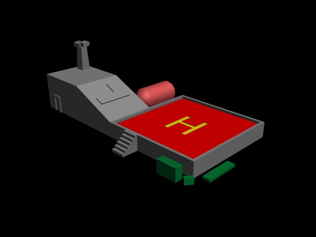
My new task was to model a new building using one of the previous renders uploaded onto the modteam website... i hope you folk love it
Statistics of Helipad on its own... (inc Stairs)
Polygons : 156
Tris : 364
Edges : 338
Verts : 184
Statistics of Scene shown below
Polygons : 229
Tris : 608
Edges : 533
Verts : 314

All comments are welcome....
Word of warning to all modellers then, back your work up right now.
Anyways, previously i modelled a infantry and it turned out really really bad the first time, way over the Tri limit and everything... the next attempts got me closer to my goal but eventually i gave up,
My new task was to model a new building using one of the previous renders uploaded onto the modteam website... i hope you folk love it
Statistics of Helipad on its own... (inc Stairs)
Polygons : 156
Tris : 364
Edges : 338
Verts : 184
Statistics of Scene shown below
Polygons : 229
Tris : 608
Edges : 533
Verts : 314

All comments are welcome....
Replies
how about a reference drawing,- or a concept piece that way you can make sure that the whole building follows a design and purpose visual speaking.
the 'H' on the platform should be covered using a texture,- maybe a good start would be to read a UV-mapping tutorial. That will tell you how to apply images/ textures around the model properly.
good luck anyway
i've been playing too much L4D..
The other objects in it like the oil drum and that aren't anything to do with it so thats okay, i'll upload another render of the door...
All in all would you say i've done a good job? Its basic yes and the design however isn't mine (i used a reference image of someone elses work - > They told me to remodel it)
Thanks again.
Was a bit off so i scaled it a bit better..
Stats (without objects exc stairs)
Poly : 122
Tris : 311
Edges : 288
Verts : 164
All comments are welcome and indeed handy... As you might notice ive enlarged the door, (you cant see this) i've deleted the bottom polys because you won't see them, spared up 50 odd Tris which is very good...
Thanks all, hopefully this is within scale...
The way you look at it, is kinda the same way as making a next gen model, you just cut out the high poly. Usually in next gen work, you look at what polies will change the silhouette, and keep those on the low poly model. Think the same here. That door arch, its doing nothing, because a texture could do the same. The flat piece on the top? The H on the helipad, and maybe even the edge work? Same.
Depending on what level of quality you want, you could even make the steps a simple triangle and texture map them.
The trouble is, you don’t appear to be looking at the finished result in your mind. Remember that textures will bring a lot of the smaller details out, so you dont have to add so many smaller things.
Another tip is every so often, check the model in the average screen space it will take up. Obviously, this model is HUGE in the pics you have posted, compared to the size it will take up on screen. Zoom out, and check what you can see and where the detail may be needed.
Anyways.. thanks for your comment..
Im sorry to say, but if your mod team is happy with your model it wont be a great mod. You have put your work up here for for constructive critique from people who actually WORK in the industry and you have all but shunned it. Not only is that bad for your mod work but its also bad for your prospects if you wish to go into the industry.
The first thing i tell students when i go back to uni is that they need to be prepared to take criticism whether they see it as constructive or not. Ultimately your work is just that, work, its not your own model, you are creating someone elses vision the majority of the time. I think you need to step back and take a look at your work and ask yourself if its honestly up to scratch. I would say its not, but by listening to what people have said you could improve it an aweful lot.
"all models need changing a little when they are finished" - Then i would say its not finished is it. Dont be happy with a slap dash attempt.
Here is the final image, which i finally finished.... (without the texture part of course)
I can take the criticism, but if they say its okay then there word goes... in my position its not about if you think its good but if they do... of course i'd perfectly take into consideration the comments made by you folk if it was my own work, which its not
nevertheless! Its all about improving my modelling skills... at 10 weeks i think this is decent work. Still haven't got face modelling right yet
Nor am i a texturer, assuming thats what you meant... see i'm a noob quite frankly... so i cant take crticism as well as i should be able to...
sorry
its time to do some learning. google is an amazing tool, USE IT,-
your fences currently have 6 surface (12 faces/triangles)
your fence only needs 1 surface (2 faces/triangles)
making a material or a shader for the fence so that it is 2 sided (so it renders on both sides of the surface) might be a bit more complex, but you shouldnt concern your self with that right now.
to circumvent the shader issue you might want to make your 1 sided fence, 2 sided by simply duplicate it, and flip the new faces normals.
A mod is a great place to get your feet wet with production, but its also a great place to start developing some really snooty, high and mighty behavior. stay humble (especially at the stage your at) read READ READ.
for the record it smells an aweful lot like troll in here.
agreed right there. i honestly doubt any mod team would ever accept any kinda of work of this low caliber unless they were playing a joke on you.
there are a ton of online tutorials and if this isnt a troll post then you really REALLY REALLY need to start doing all of them
As much as I don't want to discourage you in your modeling efforts, I do want to be completly blunt and honest with you. As someone who is has worked in the Game Industry as an Artist for 3+years now I can say that this model is no where near decent. I would expect to see this kind of work for a first week modeling student. I think that you are trying to do to much at one time without the expirence to know what you are doing. I would suggest starting off small, with very basic assets, a barrel or a crate for instance. By doing these small object and doing them VERY well, you will pick up techinques to help you with larger, more complicated objects and then move on to doing scenes. As a self definded noob I think that doing this will be very benifical to you, and I think that most other artist will agree with me.
Also, heres a book my concept artist buddy uses when hes doing buildings and what not, [ame]http://www.amazon.com/Architects-Data-3rd-Ernst-Neufert/dp/0632057718/ref=pd_bbs_sr_1?ie=UTF8&s=books&qid=1227571120&sr=8-1[/ame]
contains sizes and proportions of pretty much everything in relation to..everything else.
Keep at it general atrocious, i see your future bright !
Thanks for the help all...
I just need some suggestions, that'd be great...
I'm going to post a render of my head model too now...
I think I facepalmed on nearly every post by the OP. Need suggestions? You've been given plenty.