Next Gen Pillar
I've been working on this for the past few days and there's something about it that does not seem right... I figure the more eyes looking at this the better.
I was aiming for a Art Deco/Weathered look. Kinda like a prop you would see in Bioshock or Gears of War. I've never modeled a Pillar before, so the next one I do will only improve, especially with your critiques!
I'm also looking for any work-flow tips you may have for me to keep in mind when working on future props. Being out of college and having no luck in this job market is really a downer... so I'm going to be working on my skills around the clock until I get a job!
Be brutally honest, it's the only way anyone grows! :]
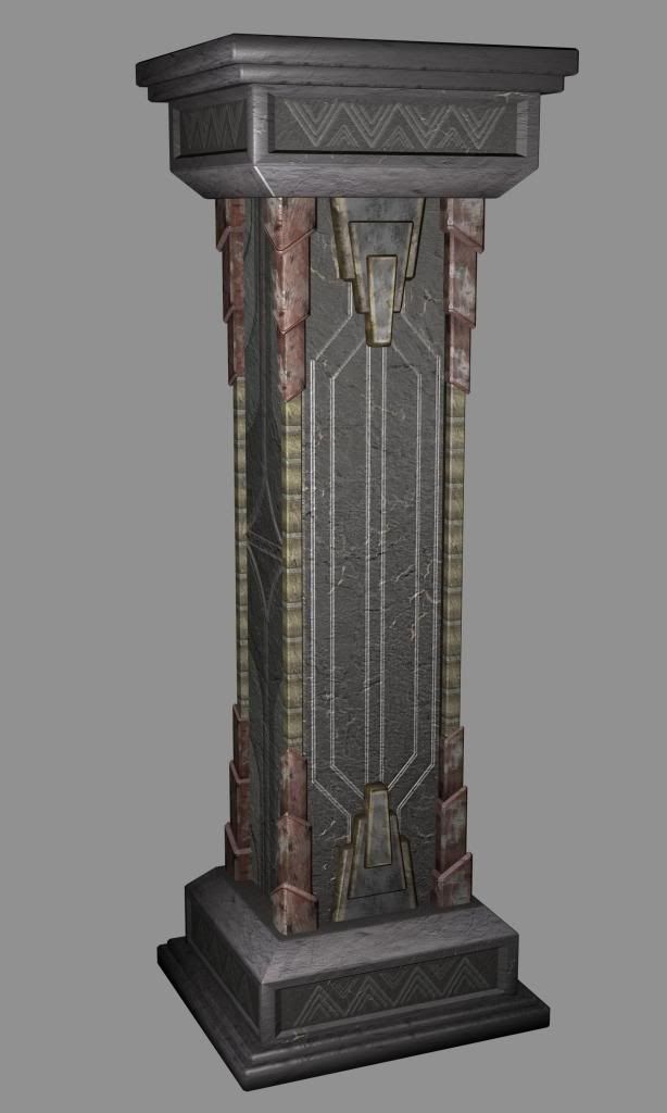
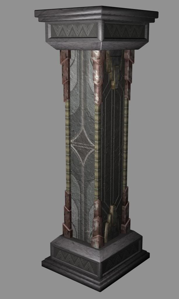
Normals and Diffuse. My next prop I make I'm going to do my normals in Zbrush. I've been learning the program and tried to use it for this piece, but didn't model it quite right. So I made Normals using my old workflow.
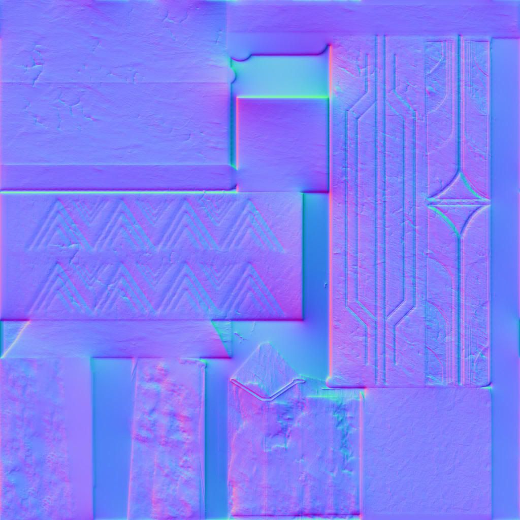
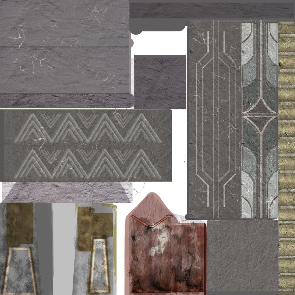
I was aiming for a Art Deco/Weathered look. Kinda like a prop you would see in Bioshock or Gears of War. I've never modeled a Pillar before, so the next one I do will only improve, especially with your critiques!
I'm also looking for any work-flow tips you may have for me to keep in mind when working on future props. Being out of college and having no luck in this job market is really a downer... so I'm going to be working on my skills around the clock until I get a job!
Be brutally honest, it's the only way anyone grows! :]


Normals and Diffuse. My next prop I make I'm going to do my normals in Zbrush. I've been learning the program and tried to use it for this piece, but didn't model it quite right. So I made Normals using my old workflow.


Replies
it looks as if you tried to hand paint it all which can be pretty tough. I would definitely use photos to help create a more realistic texture. im not sure if its cause you wanted to try to hand create everything or if you were unsure about it. using photos is by no means cheating and thats probably one of the first things many artists have to get over, i know i did.
it looks like you may have some overlays of some type of texture but its really unclear.
The biggest problem being caused by the texture is a lack of material definition. I cant see what is supposed to be concrete and what is supposed to be metal. you should utilize your specular to create those specific surface qualities.
study some texturing tutorials to get better results, and i can guarantee you will get 10x better results.
edit: I took a look at your site as well after reading you are job hunting and just out of college. I would say texturing is definitely your weakest skill set so really focus on making some awesome textures. the site design is also kinda screams armature web designer, so i would recommend either re making it soon or having a professional make one. as it is right now, a clean wordpress art blog might be better and more professional looking and allow you to organically add content and updates. it sounds as if you are pretty determined on your path which is awesome man, so hope none of this comes off as too harsh, but ass pats never really get anyone anywhere right :P
finally here is a dope set of tutorial dvds, i would highly recommend checking out, they are game focused and have some awesome content: Eat3d
And about my site, yes I am an amateur web designer haha. I will redo the site as soon as I get some more pieces to show on it.
But yea, texturing is going to be my main priority now. I need to get it down pat, and I thank you for referring me to those DVD's.
Anyone else know of some really kick a** tutorials on texturing? Preferrably free
and yes I am very determined and will stop at nothing until I am creating props that will generate pages upon pages of praise from the talented artists here at Polycount.
thanks so much
Here
ThisONe is really goood..
I like this one its a combo package, not just texturing...
and follow up that with this explains really good techniques in detail... cholden is great! helped me out recently, so I went hunting through his gear, he's on fire, search his threads...
just keeping these tabs above open in firefox for like 2 weeks brought me farther than 2 years of "thinking I know wtf im doing on my own"
then, get some proper concept art. im not in a place to give advice, but if i was to give advice, I would say the biggest thing that helped me, was proper concept art. get something that looks good already, and try to replicate in 3d. Going after a general style is fine, if you have done a bunch of work in that style already, but even then, i bet that guy still uses reference. and a lot of it.
Thanks, and please let me know what I should improve.
Do you have highpolies
I agree
How is that any better?
As for the new column and textures, the mesh silhouette is very blocky. More tris could have been spent on the valve wheel.
The textures seem to have tons of random grunge and noise. I'd consider using some well placed detail before adding the overlays. The scratch marks everywhere aren't doing much for the texture.
Keep at it.
I'm still getting a feel for high rez textures and using Zbrush to make the normals. I will indeed keep at it until I am a very comfortable "current gen" artist
Thanks