The BRAWL² Tournament Challenge has been announced!
It starts May 12, and ends Oct 17. Let's see what you got!
https://polycount.com/discussion/237047/the-brawl²-tournament
It starts May 12, and ends Oct 17. Let's see what you got!
https://polycount.com/discussion/237047/the-brawl²-tournament
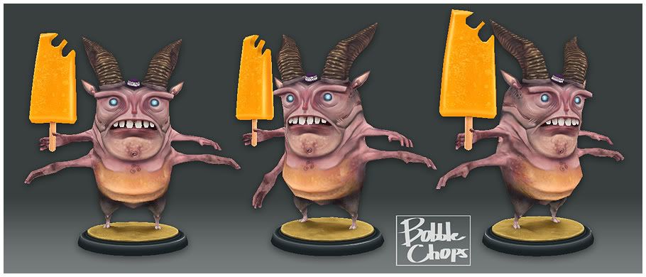
tomb-toothed fatso
Hello,
This is a low-poly model I did a few weeks back.
Has just one 512*512 colour texture.
I'm done with it now but crits and comments are welcome, cheers.....

This is a low-poly model I did a few weeks back.
Has just one 512*512 colour texture.
I'm done with it now but crits and comments are welcome, cheers.....

Replies
Love his expression, looks like he got brainfreeze!
Give us the texture layout.
Just wish you worked on that seam from his lower arm pairs to his torso.
p.s.
Winterlord:ive seen the flats and theyre suh-weeet
Maybe some more detail on the belly would be cool, like a belly-button? That part just seems very spare (might be because there's less texture-space available there?)
flats!
is he animated yet? How does his head bobble?
Besides the bite marks the saturation of the icicle's a little blinding for me.
claydough : Thanks Claydough, I only really modelled him so I could practise my texturing on really, I didn't really plan for any animation. Besides, I can't
skin very well at the moment, so for the time being being he's staying still!:)
MightyPea : Hey thanks MightyPea, suggestion noted.
butt_sahib, : Cheers, yeah the arms were a problem area, mainly for the way I layed out the Uv's
pliang : That's from all the artificial additives in the ice lolly.:)
Any crits on my texture layout would be nice, I originally planned for unique texture space as I was going to create a normal map, but never did in the end. I think I could of layed out the Uv's a bit better, I got a bit of distortion around where the arms meet the body. I'm not sure how I would of done it as its a bit of a weird shape; big fat body with little thin arms.
2 seperate textures (combined here), 512*512 for the body, and 256*256 for the ice lolly.
I also think the transition from belly to leg is a bit of a letdown, and the area could go with some more flesh-folds as well. In general, the colour-transitions are about the only thing that really bothers me, really. If you squint, it almost looks like he's wearing a wife-beater and dark pants, but since that isn't the case, more could be done to make the elements flow together.
See what you did now? Look what you made me do! Everyone was fine and dandy before you went ahead and asked for more comments.
it would add some asymetry as well as tie the icecream into the piece better. Explaining the missing chunks :P
awesome little dude
whats_true, Xaltar: your right. Xaltar, I might just steal your suggestion. Lolly juice or a couple of strands of drool coming from his mouth.
MightyPea:Thanks, this is exactly what I was looking for. HA!, A monster wearing a wife-beater and dark pants?; I think I've found my next character!:poly121: