Home 3D Art Showcase & Critiques

UT3 mesh WIP

made this in 3d max (not the complete model)and imported it to Ut3 . i know the normal map needs more intensity if anyone can post a screenie showing how to link it would be appreciated. other than that C&C would be greatly appreciated.

[URL="javascript:void(0);"]generator.jpg?t=1226698490[/URL]
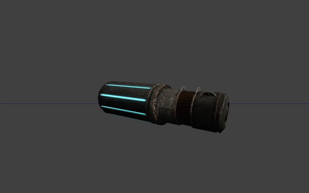
and heres the texture map i created still WIP atm

[URL="javascript:void(0);"]generator_diff.jpg?t=1226698539[/URL]

Replies

  • renderhjs
    Offline / Send Message
    renderhjs sublime tool
    I personally hate turquoise glow in games,- it is overused lately making it look cheap and uninspired, just like to human
    http://www.xbox-view.de/wp-content/uploads/Image/Gewinnspiele/Too%20Human/Asset%201.jpg

    the model is not yet that spectacular as there is not much to see so far, maybe add a description regarding what you are aiming for.
  • oobersli
    Offline / Send Message
    oobersli polycounter lvl 17
    the space with the glowy bits needs more uv space. you have it sharing just as much uv space as the small threaded/slotted part where as its 4 times as small as the glowy bit.
  • duxun
    im making a sci-fi /steam generator. mostly right now im still texturing it and wanted to post my texture work atm.


    oobersli- ok ill make that change.
    renderhjs- well some one said to me once that to get better you have to copy the masters. sorry if you dont like the turquoise color. what color do you suggest ?
  • EvilPixills
    Offline / Send Message
    EvilPixills polygon
    Hey man, looking ok so far. Maybe try a greenish or orange-ish color if the turquoise doesn't end up working in the end. Also are you using a separate emissive map for the glow or are you deriving it from your diffuse map?

    I think your texture has a little too much brown from the rust you might want to try desaturating it a bit and see what works best.

    As for the normal map, everything you need to know should be here. make sure you scroll down to the bottom of the page and it shows you a good couple ways to bring out the detail in your normal maps. Good luck and keep it up!
  • duxun
    EvilPixills- yes i did use a separate map for the emissive glow.im changing the glow color as we speak.
  • duxun
    heres an update on the generator.

    generator_green.jpg?t=1226709899

    and the texture im desaturating the rust atm.

    generator_diff_green.jpg?t=1226710256
  • EvilPixills
    Offline / Send Message
    EvilPixills polygon
    Looking better. I think you could maybe add some more intensity to your glow. Not too much tho, try adding in a bit of white in the center of it thats should make it pop more.
  • mLichy
    I don't know if UE3 supports UV mirroring, but if it does, learn how to use it and do it. It gives you ALOT more UV space to work with if you do it right, and just is a no brainer sometimes. Also, you could probably do a decent amount of UV sharing on this object (overlapping) and just do a greyscale bump or something. It depends on the engine, but greyscale bump maps working fine generally on non organic objects, bu if you want higher res details or nice curves and whatnot, you need normal maps for that.
  • duxun
    mLYCHY: yes i did overlap some of the UV's and im working on a better lay out once i finish modeling and creating a normal map for the generator.
  • butt_sahib
    Offline / Send Message
    butt_sahib polycounter lvl 11
    Hello!
    Agree with oobersli on the uv issue.If it were ONLY the glowy bit, that it would be understandable to give that much space to it; but it goes all the way around and therefore,doesnt really have the uv space it should when compared to the model.
    Heck, i think it would be a nice idea to just unwrap only one glowy bit and mirror it (if you have the geo for it ofcourse)
    As you said that you will be doing a new layout, thsi is something you should consider imho.

    Also, personally,i would take out the glow as is OR make it go all around or atleast have greater area.Seems illogical to have glowy bits going around a generator.Plus, a white or bright blue glow would be nice :P but this is all just personal preference :P

    Love it :D
    Good luck!
  • ae.
    Offline / Send Message
    ae. polycounter lvl 12
    the green glow does not looks as good as the blue glow :)
  • indian_boy
    its cuz its too dark a shade of green i think.

    imo, the technique used to make lightsabers works nice:

    2 layers

    - layer 1 [on top] : white, gaussian blurred, gaussian blurred again
    - layer 2 [bottom] : colour layer [green in this case] gaussian blurred once

    i still agree that the blue looks nicer.
    its overused cuz it looks good imho.

    try some other colours, outside of primary
  • duxun
    yeah ill change colors. i just want to show that i made some changes that were requested.

    generator-1.jpg?t=1226865739

    added more to the model..

    generator_green-1.jpg?t=1226865873

    and heres the texture map i gave more UV space to the glowing part. im still modeling other bigger parts of the generator atm and will incorporate them into the texture soon.

    generator_diff_green-1.jpg?t=1226865918
  • indian_boy
    ur glowing section still needs more UV space

    put a checker texture on ur mesh in ur 3d app, and change the UV layout till the rectangles in that section are more like squares

    the stretching is very obvious, and its one of the larger areas of ur model. it needs to be one of the better looking ones
  • duxun
    indian_boy: alright ill give it more UV space.:)
  • vj_box
    And you also need to have a good specular map,to see some nice specular highlights and variations,which is kinda missing now.
    For a good looking normal map,you can see some of the ut3 materials,and try to replicate the nodes used,that should give u good results.

    Vj
  • duxun
    vj_box: yeah i have a spec map done. what ill do next is put the prop in the world in Unreal and create a simple light set up to show my spec+normals better.currently im taking screenies from the mesh editor.

    heres an update on those UV 's hope its better thanx for the help really appreciate it.

    generator-2.jpg?t=1226902504

    and the texture.

    generator_diff-1.jpg?t=1226902868

    quick edit: heres a pic now using a spec map. after looking at their models i tried to replicate how they created their spec maps so here goes hope im moving toward a decent model. thanx will update soon.

    generator_green-2.jpg?t=1226905794
  • Autocon
    Offline / Send Message
    Autocon polycounter lvl 15
    texture work is looking great, keep it up
  • butt_sahib
    Offline / Send Message
    butt_sahib polycounter lvl 11
    Hey :)
    Good idea to mirror the glowy parts.

    btw, it STILL doesnt have enough uv space :/ not relative texel density! XD
    In the uvmap you posted most recently,one shown here, you can reduce the size of the glowy bit ALOT as it is a constant colour with a constant value.
    2910,generatorgreen2MOQW2.jpg

    For speculars,i strongly advise to check out the masters:
    http://www.iddevnet.com/quake4/ArtReference_SpecularMaps
    Some people here do brillaint speculars aswell such as EQ,perna,jhonny,pior etc (the masters)
  • duxun
    butt_sahib: ok i misunderstood what u wanted to shared more Uv space i thought u meant only the glowing part LOL. now i know that its the top metal part of my texture hehehe... yeah i noticed that when i UV that part i saw it was streched and didnt look right np ill make that change quick. will post im in a few hours its late night here and i need to hit the sac.
  • Snight
    Offline / Send Message
    Snight polycounter lvl 16
    There are many ways to increase your normal intensity, but this is one of the more simple set ups...

    Multiply your normal map by a constant 3 vector increasing the Red and Green channels only.

    You could always do it in photoshop :P

    increase_NORM_intensity.jpg
  • duxun
    ok heres an update on the UV space.

    generator-3.jpg?t=1226953717

    and here is the texture.

    generator_diff-2.jpg?t=1226953800
  • duxun
    Snight: yeah im working on a normal map+spec map atm will post soon. and im still need to model more bigger parts of the generator.
  • Pope Adam
    Offline / Send Message
    Pope Adam polycounter lvl 11
    awesome improvement on the UV layout, way more efficient.

    I personally don't have a problem with the turquoise glow. If your original color glow is what you had in mind then you should stay with it. I see Renderhjs in the first posting said he didn't like it, but that's just one guy's opinion. If you like it, stay with it. there's nothing cheap or uninspired about a certain color under it's own merit. imo

    when comparing two colors against each other, how does ninja turtle ooze green beat out a recent surge of turquoise glow?
  • duxun
    yeah next time ill post some thing more finished with a better layout. im always rushing to show my work too early. lesson learned.
  • Pope Adam
    Offline / Send Message
    Pope Adam polycounter lvl 11
    There's nothing wrong with showing early works in progress. What better way to receive feedback on the fly, and to improve your design process than to post up things while you work on them?

    I reckon you continue to post work as you work on it, if you're interested in the community's feedback as you work.
  • duxun
    ok heres an update on the desing im creating a sci-fi steam powered generator (WIP). screenie is from 3ds max. let me know what you think of my design.

    generatorwipdj6.jpg
  • indian_boy
    wow

    cyber punk and steam punk have been having sex?
    awesome
    i guess this is the baby?


    its gonna be epic if u pull it off

    http://www.crabfu.com/steamtoys/diy_steampunk/
    if that helps any ^
  • duxun
    hahaha how to draw steampunk machines !!! love it !!
  • duxun
    heres a quick update im still working on a design that has more character.

    generatorwipry6.jpg
Sign In or Register to comment.