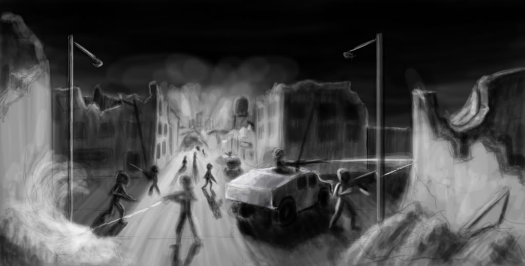
Decontamination (2D Concept Art)
Hey all, I want to see what you all think of this so far. I like the composition, but the execution looks like garbage. I don't know what the deal it, but every time I try to make a scene from imagination, I just get stuck at this stage - a crudely drawn light/dark image. I don't know how to make the jump to a detailed image with overlays (I'm not looking to paint the whole image). I have talked to other people and they say the trick is to start black and white then overlay colors and details, but this piece just seems stuck. Even if I started adding color and such, I think it would still look bad. I have this problem with traditional art too - when working in charcoal (the equivalent of what I'm doing now) I haven't figured out how to make the jump from vague shapes to details.
Here it is:

Any tips on how to proceed?
Ben Day
Here it is:

Any tips on how to proceed?
Ben Day
Replies
Perhaps a bit more dramatic angle and a cleaner execution might be the improvement you want.
Reference for the win!!!!!! I'm not sure I've EVER created a layout without tons of reference pictures. You'd be amazed at how much glancing at that stuff helps you find stuff to add in. Details, ideas, everything. Just type in things like 'firefight', 'military', whatever, and go with what you find :P
Otherwise the composition is pretty good, but the streetlights seem a little too much for 'pushing' the eye to the focal point. Try losing one of them or move where it's pointing to. :P
At the beginning just start with no transparency at all. If need to switch and have a decent overlay effect just type in the transparency on your num-pad, then draw the overlay, pick the color from the just painted area and switch the transüarency back.
With this it will be easier to get clear areas of light and dark, more contrast and in my case it is far easier to get nice silhouettes. Personally I'm much fast when drawing this way and get better results. When your concept is refined enough I'd start getting in some colors.