Joe W.I.P.
Hello,
This is my first post here.
I started this character a while back, but have since stalled on it.
Looking for some inspiration to start back on it.
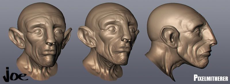
Mudbox head mesh.....
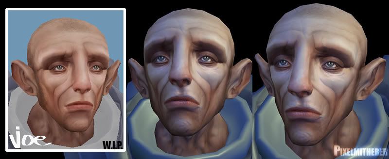
Textured low poly...

Non-lit head mesh in Maya and with colour and normal map in xNormal...
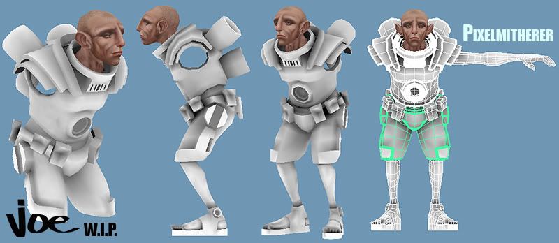
Full shot W.I.P.
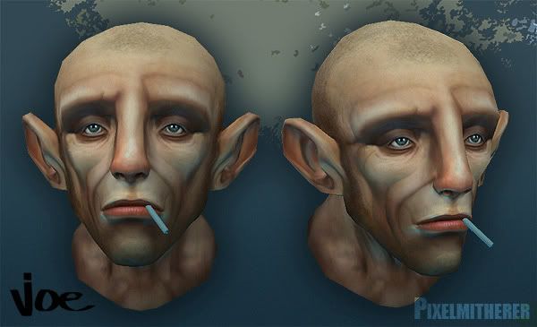
Colour/Normal/Spec map screen cap from Maya...
Comments and crits would be welcome.
This is my first post here.
I started this character a while back, but have since stalled on it.
Looking for some inspiration to start back on it.
Mudbox head mesh.....

Textured low poly...

Non-lit head mesh in Maya and with colour and normal map in xNormal...

Full shot W.I.P.

Colour/Normal/Spec map screen cap from Maya...

Comments and crits would be welcome.
Replies
Personally I find normal maps something that is very hard to get right.
Make them too subtle and nobody can see them, too strong and they have a tendency to kill your work.
cheers for the comment almighty_gir.
If u stalled out on the suit why not try some paint overs on what u got so far?
keep it up cause I wanna see this finished!
I'd definitely like to see more of your sculpt in the final product. Try rendering an ambient occlusion map to help pop it out or just light it better for presentation.
Pretty much agree with everyone else about the normal map, his ears look a little box-like from the front view too. Whole character in the style like that will look awesome
This is true if you're generating a normal map from a height map, but in this case it's more a matter of not having a good lighting setup in the scene you're taking your grabs from, and having lighting painted into your diffuse that is conflicting with the normals.
I like the skin texture though, it looks very gamey.
TWilson:Thanks. Yeah, I did render out an ambient Occlusion map with xNormal and combined it with the texture. But I may go back to this, see if I can bring out some more detail.
perna, Ghostscape: Cheers, I still haven't got my head around alot of aspects of normal maps so this helps alot. I'll make proper lighting my priority.
So its also not advisable to strengthen a normal by making it more contrasty; perhaps laying a 'Hard Light' Layer of itself in Photoshop for example?
pliang: Perhaps I need to take some of the texturing out, although I really need to get this up and running in a game engine like Ued3, see how it copes with real-time lighting.
claydough: HA! Cheers.
I started to rough out some sort of design on the armor, not sure what I'll keep, but good to come up with some ideas....
A little update:
Decided to make him a little more asymetrical; remove one of the arms, and replace it with a mechanical one.
I did a quick paint over as well to decide on the design/colour scheme etc of the armour, not sure about it at the moment tho, seems to have gone a bit Halo-ish?!?
Perhaps need to try out a few more designs.
Crits and Comments would be appreciated.
Killingpeople: HA! I was aiming for misery on this one, pure misery!:) I like the idea of an eyepatch though, that could work!
cep: My avatars from a previous character that I did ...
http://boards.polycount.net/showthread.php?t=57429