Home 3D Art Showcase & Critiques

Prop modeling & texture

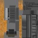
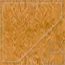
So I'm only allowed to use 128x128 texture maps and no lighting. Please feel free to critique or post here.
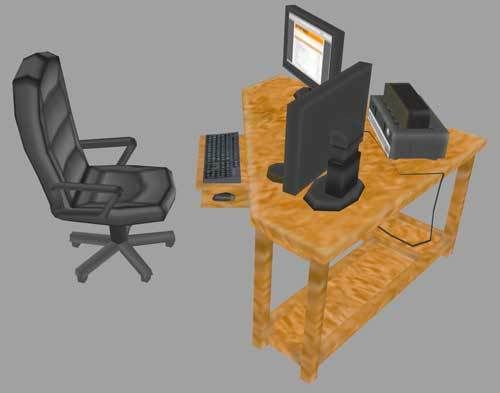
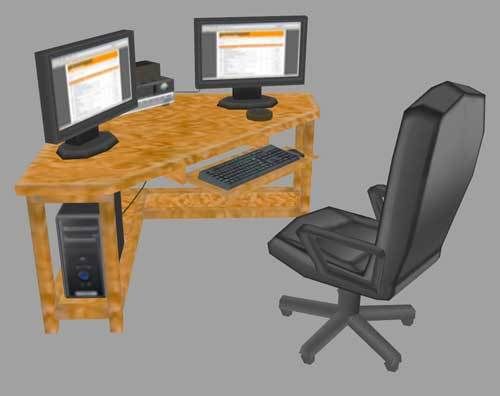
Untitled-5.jpgUntitled-4-1.jpgcomputertxtr.jpgchairdesktxtr.jpgdesktoptxtr.jpg

Replies

  • m.roanhaus
    Offline / Send Message
    m.roanhaus polycounter lvl 14
    Why do you have texture size restrictions? What engine is it for? I'm digging the chair so far but I think it could use a slightly bumpier texture to simulate leather (the chair is leather right?) Maybe cast darker shadows around where the seat meets the legs. Did you render out AO for the objects? Also the wood texture on the desk is much too large. I would scale that texture down to about 1/4th of the size it is now. The keyboard and the tower are perfect though, keep grinding at it, I'm looking forward to seeing it finished.
  • Matroskin
    Offline / Send Message
    Matroskin polycounter lvl 11
    nice low poly stuff.

    I think that table could have some baked AO or blured shadows since it uses its own texture sheet.
    Also even it is a neutral lighting, table could have some vertex color work also to get some AO and basic shading.
  • renderhjs
    Offline / Send Message
    renderhjs sublime tool
    the wood texture is very bad- its blurred (propably resized) and to equal all over. Maybe pick a different wood texture that actually has good quality and sharp details. The rest looks good.

    Check
    http://www.cgtextures.com/
    under wood > Plywood New
  • killingpeople
    Offline / Send Message
    killingpeople polycounter lvl 18
    you'd be better off making the desk a single color
  • Mark Dygert
    Who has a desk (and keyboard tray) made out of plywood? Like KP suggested switch it to solid colors and think about using metal instead.
  • Daaark
    Offline / Send Message
    Daaark polycounter lvl 17
    The desk needs some shading on the texture so the eye can easily pick out the sides from the tops and bottoms. When you use a flat texture like that over a whole model, you need to make sure it doesn't erode away the shape.
  • zerafian
    Vig wrote: »
    Who has a desk (and keyboard tray) made out of plywood? Like KP suggested switch it to solid colors and think about using metal instead.

    LOL, an old roommate of mine made his desk, and it was made of plywood...he covered it though with some kind of wall paper...it was a big mofo.
  • Chunkey
    Offline / Send Message
    Chunkey polycounter lvl 19
    I agree on all that's said about the desk, I'd personally change the texture for the desk completely with something less noisy and contrasty- at the moment it looks messy.

    The PC and chairs look good, though I reckon that for the legs and plastic bits, you could get away with just a few gradients and use a bit of clever uv map manipulation imo.

    keep it going dude, some nice work being displayed there fella :)
  • Kawe
    Offline / Send Message
    Kawe polycounter lvl 8
    why arent the computers browsing polycount forums?
  • StrangeFate
    Offline / Send Message
    StrangeFate polycounter lvl 18
    I'd agree with some of teh commends said.

    When resolution is a problem, or props are meant to be small, less is often more.

    Simplify the wood texture which will make the model less noisy and easier to read from distance.

    Also, Since evrything seems to be custom textured, I wonder if you couldn't bake a simple ambient occlusion for the objects. The table especially would profit a lot from it.
  • Xen415
    Thanks a lot for all the critique. Here's where I'm at as of now, I don't really know anything about ambient occlusion but I've been looking into it. If anyone knows a good tutorial please let me know.

    Untitled-6.jpg


    Oh, and I have texture restrictions because my teacher claims that if we can make it look good at this size higher resolutions will be way easier.
  • renderhjs
    Offline / Send Message
    renderhjs sublime tool
    that's alot better- maybe some LED lights on the panels, shadows on the metal panels, silver wheels on the chair instead of 1 black soup on the total chair.

    but all in all its already pretty nice
  • BradMyers82
    Offline / Send Message
    BradMyers82 interpolator
    Looking really good. I would hit the computer tower with that one pixel black pencil tool to sharpen the image more. It's the only thing that still looks blurry (at least from this angle) at the moment.
  • Snader
    Offline / Send Message
    Snader polycounter lvl 15
    why are the textures jpg's? wouldn't they be more clean as a png/gif?
  • John Warner
    Offline / Send Message
    John Warner polycounter lvl 18
    muuuuuuuuuuuuchhhhh better. cool.

    i can't imagine that you'd have the poly budget to do ambient occlusion. if you did, you could use some flat polies with a flat black texture, that has an alpha gradient on it. that way you could slap it here and there and get some gradients...
  • killingpeople
    Offline / Send Message
    killingpeople polycounter lvl 18
    ambient occlusion is for pussies.

    "... my teacher claims that if we can make it look good at this size higher resolutions will be way easier."

    ur teacher is right in the sense that the techniques are less complicated to teach and learn using lowpoly. understanding these essential foundational skills in this way is a stream-lined nutritional knowledge diet for a developing game artist. you'll be an overpaid game artist with an inflated ego, like me, in no time.
  • Matroskin
    Offline / Send Message
    Matroskin polycounter lvl 11
    ambient occlusion is for pussies.

    AO is very important part same as color etc.
    As to me it is even essential especially for old school cause there is rare or no lighting on objects/characters.
    Where it is possible to add it pays of by adding better shape feeling and definition to the object. It is easy to do with vertex color (and that's how it is usually done in lowpoly environments ) or/and in some parts of diffuse map where uv layout allows to.


    anyways, Xen415, the desk now looks way better, good job.
  • svcoyle
    ambient occlusion is for pussies.

    I believe your texture should hold up without the need for ambient occlusion. Ive seen very often where an artist will paint a crappy texture and try to make it look better with AO.

    But I don't believe its for pussies
  • StrangeFate
    Offline / Send Message
    StrangeFate polycounter lvl 18
    Ambient occlusion is like fashion. If you can wear it with confidence, you'll rock more than ever, if not, it will just make you look dump. Fashion sense can be rather uncommon in these circles.

    Anyway...
    can't imagine that you'd have the poly budget to do ambient occlusion.

    I'd just bake the AO of the lowpoly itself, no need for a hipoly model. We were doing this 6 years ago for all the UT2003/UC meshes, works fine to give lowpoly objects a sense of depth making them a bit easier to read and helps the artist with figuring out where basic shadows should go.

    Using it as a soft overlay to accentuate angles and depth is usually all it takes. It will NOT make crappy textures look good.

    It should be very easy to bake the AO of the model itself into the UV, but how you do it depends of your 3d app of course. I'm sure someone can tell you how if they know what you're using.
  • Minos
    Offline / Send Message
    Minos polycounter lvl 16
    Looks much better now. The problem with your color map is that you probably painted it in a higher resolution and then resized it down. This is bad because you lose fine details, like edge highlights and so on. It also makes things blurry and sharpening your texture wont help either.

    Always paint tiny textures in real resolution and learn pixel art techniques, they work great for such textures. Pixelation forums are a good starting place: http://pixelation.wayofthepixel.net/
Sign In or Register to comment.