New environment work
Hey guys, uni term has started again and its back to solid work. We've got to have 4 showreel type stuff pieces by xmas so I've been working on a couple of things. Lots of pics coming up.
This is the first piece, some of you guys might recognise it from during the summer. It's a simple corridor scene (emphasis on simple), was my first attempt at using UE3. I managed to get it working in game, and set up a simple camera pan and flickering light. The following pics are from the vid if you don't want to watch it, it's all wip atm.
Video

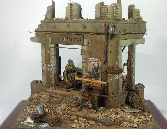
This piece is currently a work in progress, it's based off a small diorama I saw which was really cool so I'm using it as ref and inspiration for something similar. Here's what I've got so far and the last pic is what I'm using for ref.

Reference

Any crits on the 2nd piece and comments about either are much appreciated
This is the first piece, some of you guys might recognise it from during the summer. It's a simple corridor scene (emphasis on simple), was my first attempt at using UE3. I managed to get it working in game, and set up a simple camera pan and flickering light. The following pics are from the vid if you don't want to watch it, it's all wip atm.
Video

This piece is currently a work in progress, it's based off a small diorama I saw which was really cool so I'm using it as ref and inspiration for something similar. Here's what I've got so far and the last pic is what I'm using for ref.

Reference

Any crits on the 2nd piece and comments about either are much appreciated
Replies
On the second model the top part has some crazy geometry. (Did you use an optimize modiifer?) It would be nice to get some of the decorative detail in that top part like the circular decorative elements in the original photo.
I wanted to put that geometry in, but I wanted to try out the sculpting program first lol. Should I go back and sub-d that stuff in before sculpting the damage?
Also, does anyone have good techniques for the rubble and general clutter of the area? Cod4 did that great, shame theres no wires lurking about lol.
I still need a focal point as well, I'm not sure what it could be yet but maybe I will just go with that broken cart in the reference.
that circular detailing could just be a normal map detail. Wont self shadow, but its not that deep anyway
the things with crazy geo you might benefit from making the low poly version by hand, following the topology of your high.
those wires look beefy on the tri count?
As for rubble, just make a mound using your ground texture, throw in some small meshes like wood planks, bricks. You can do a handful of these to make it look pretty detailed - keep them small on count, probably around 500 tris - and then just use a nice normal map surface to fake the smaller detail still.
I'm currenty attending Academy of Art University myself. Still kind of iffy on how I feel about their game design major.
Stronin, I go to the University of Hertfordshire. It's ok, there's some things I wish were done differently buy hey I guess there's no perfect place to go lol. For everything else I want to know there's this place though :P
I wish I could do more to it but I'm starting to realise you can never have enough time to finish something lol. *IF* I do work on it a bit more I would like to add a nested machine gun to the scene to give it more of a battle feel.
All thats left to do now is proper presentation and some sharpening with the maps, I'm going to present it in UE3 with proper lighting as this is just a quick 3 point setup and taken from max viewport. It's meant to follow current-gen game specs (can't really say next-gen any more lol).
Any comments and advice is appreciated, anything I could/should have done differently that you can see from the screens is very helpful