1st and 2nd Full Character Models Ever
Hi all,
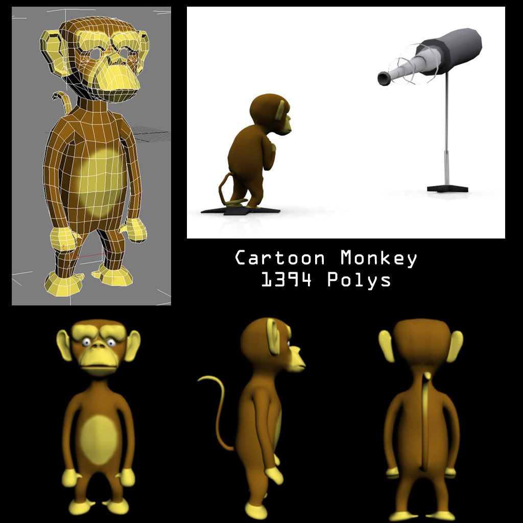
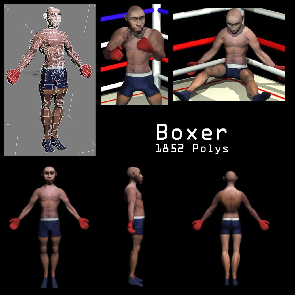
This is my first post been looking for a nice forum to post some work on and get some valuable C&C! So here it is, the monkey was the first ever full character I created and the boxer was the second. Both were made in 3DS Max 7 last year. I havent got any more recent work to show yet but my skills have improved a fair bit since these.
Please go easy on me
Monkey:
Boxer:
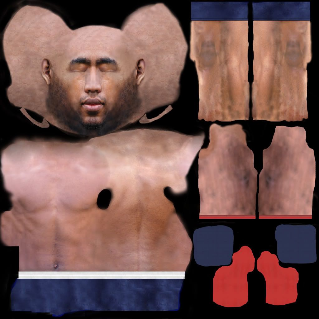
Boxer Texture Sheet:
This is my first post been looking for a nice forum to post some work on and get some valuable C&C! So here it is, the monkey was the first ever full character I created and the boxer was the second. Both were made in 3DS Max 7 last year. I havent got any more recent work to show yet but my skills have improved a fair bit since these.
Please go easy on me
Monkey:

Boxer:

Boxer Texture Sheet:

Replies
but carefull with the photos on the texture. on the renders the legs dont fit the rest of the body's color. also, on the back view the arms are way darker than his back.
also youve got space for different texture on the arms and legs, but they are just mirrored!? waste of uv space.
if you could post some current work would be great to see your progress.
Shaving accident?