The BRAWL² Tournament Challenge has been announced!
It starts May 12, and ends Oct 17. Let's see what you got!
https://polycount.com/discussion/237047/the-brawl²-tournament
It starts May 12, and ends Oct 17. Let's see what you got!
https://polycount.com/discussion/237047/the-brawl²-tournament
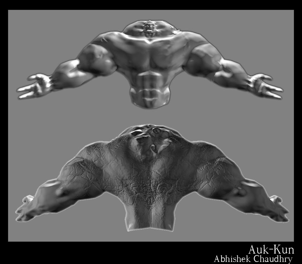
Auk-Kun

Guess who's back?
hey there guys!
remember this:
http://boards.polycount.net/showthread.php?t=51812
?
i doubt most of you do. it wasnt quite a memorable a DW3 entry, considering i didnt finish.
well, recently i was going through some old files in the little spare time i had today, and saw the incomplete zbrush sculpt. a sudden urge to work on it struck me, and i figured 'its now or never.'
ultimately, i want to finish this piece, no matter how long it takes, no matter how much hw tries to stop me
what you see above is just a normal map on the old model. nothing final at all
just a little show of where i'm at right now, though there's a LOT to be redone including the uv template etc]
all i've really added are some rock-type features to his body.
ill start posting more from later on today / tomorrow.
as of now, just wanted to start a forum thread to see what the general public over here thought about the piece so far.
get as many crits in before i plough ahead at full steam
anyway, off to do some hw now
let me know any crits / suggestions you guys have!
feel free to say watever...
Replies
now i must finish my art project, and try and do some 2d art afterwards!
let me know what you guys think
cheers!
Keep at it, we will make a great artist out of you yet.
@dante: tyvm! -D
@Ro-Sham-Bo: ty. in the backstory i explain that he's a human child. hence the human-type face. a close up reveals rock growth on the face though, but considering he's a tower, u would only be able to see the flesh turn into stone in terms of colour from the player's 'view'
@Xaltar: thats sad to hear about ur dw entry.... these are always good motivations, for me at least. i hope u get one done for #4 =D!
as for the legs. they seem overly noisy cuz i had to use 'sharpen' in photoshop to make em clearer. i'll reduce the cracks, though, cuz on second thought, it may be a bit over the top
as for jumping sd levels. ill admit to skipping a lot for the legs, mainly cuz i didnt think of much modifications being possible with them. ill research some crab legs when i get the time, and try to implement those into my lower sub d levels.
one issue i have, however, is that i really did push the body. i took a long time on each sub-d, taking the advice ive constantly been given. im not entirely 100% sure what's wrong this time around. is it that i should have harsher edges for muscle definition? an example might help me understand? no need for paint over or anything, just a few words pointing out a spot and what you'd do to make it 'right' so to speak.
@shepeiro: do you mean the rock + crystal + flesh thing? or.... ?
thanks guys for all the pointers.
updates will probably few and far apart, but i'll keep checking for suggestions and ill keep responding to them too
i have very little time to practice, but the more tips i can get before i next turn zbrush on, the more ill have to go on
thanks again
cheers!